Stone Lithography Starts With the Surface
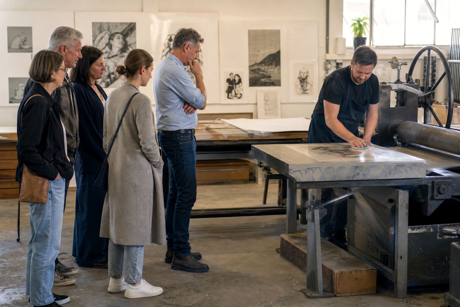
What makes stone lithography work is the natural grain of limestone and the simple fact that grease and water repel each other. The artist draws on the stone with lithographic materials, then the printer treats the surface so the marked areas accept ink while the clean areas hold water. That balance is what gives the medium its rich tonal range, crisp line work and subtle colour layers.
Craftsmanship matters here because the stone is not a passive surface. It must be cleaned, grained, inspected and handled with care at every stage. A stone that is poorly prepared can hold uneven moisture, carry stray marks, or print with unwanted texture. In a working studio in Woodstock, where sea air and changes in humidity can affect drying times, a printer has to watch the stone closely and adjust each step by feel as much as by routine.
Why Preparation Shapes the Final Image
The quality of a lithograph often depends on decisions made before the first proof is pulled. Stone preparation is about creating a stable surface that responds predictably to the artist’s mark. If the grain is too coarse, fine detail can weaken. If the stone is not level, pressure on the press may vary and leave an uneven image. Good preparation gives the artist a fair starting point and gives the printer control over the edition.
- Consistent graining helps the image print evenly across the full sheet.
- Clean stones reduce the risk of ghost marks and unwanted tonality.
- Proper levelling supports accurate pressure from proof to final print.
- Careful drying between stages helps avoid smudging and blurring.
That care also affects how many passes the image can take in a colour edition. When each stone is handled properly, registration stays true and the layers sit where they should.
Proofing Is Where Good Judgment Shows
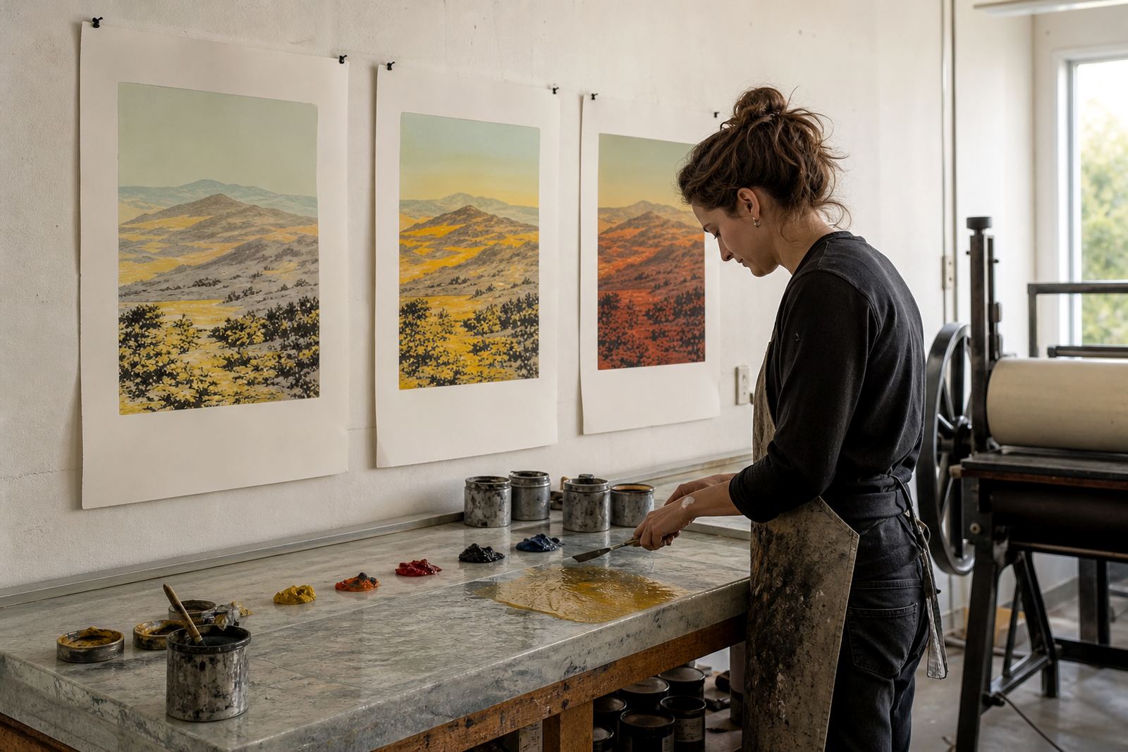
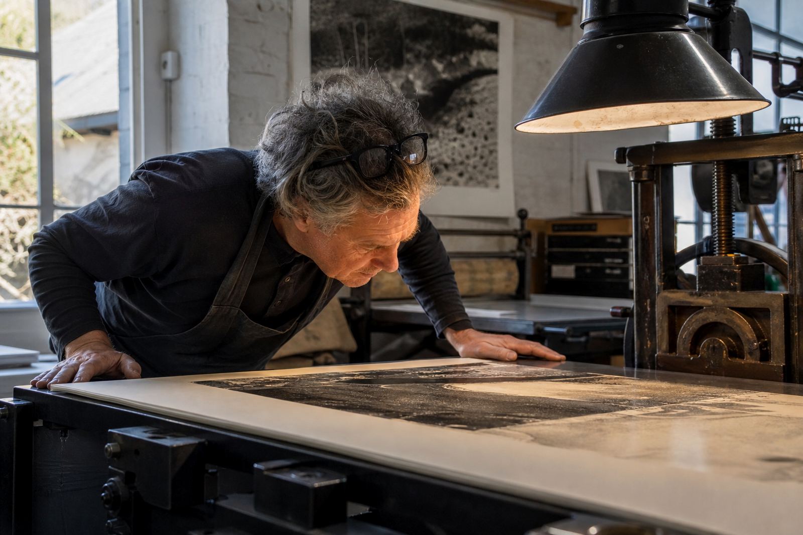
Proofing sessions are where a print becomes a conversation. The artist and printer review each impression, looking at density, colour balance, registration and the behaviour of the drawing on paper. Small changes in pressure, inking or dampening can shift the whole feel of the image. A well-run proofing session is patient, exact and practical, because every adjustment should serve the image rather than force it.
This is where craftsmanship becomes visible to collectors too. A proof is not simply a test sheet. It shows how seriously the studio treats the edition and how carefully the image has been developed. In South Africa, where collectors may view prints in different light conditions at home, in offices or in coastal spaces, a balanced proof helps the work hold up across settings. The goal is not just a pretty print, but a print that stays coherent in everyday light.
- Check registration marks before approving each colour layer.
- Review paper tone, ink density and drying behaviour together.
- Record changes clearly so the edition remains consistent.
Editioning Gives the Work Its Discipline
An edition is a fixed number of impressions printed from the same image under controlled conditions. That discipline is one of the reasons craftsmanship matters so much in lithography. Once the edition is set, the studio has a responsibility to keep each print consistent in tone, placement and handling. The printer must maintain the same approach across the full run, while still recognising that each sheet of paper reacts slightly differently.
Editioning also includes signing and numbering, which confirms the work’s place in the series. Collectors rely on this as part of the print’s integrity. If the edition is carelessly handled, the value of the whole run can be weakened. If it is handled well, the edition carries a clear record of the artist’s intent and the studio’s standard of work.
Paper, Ink and Packing Need the Same Attention
Many people focus on the image and forget that paper, ink and packing are part of the craft. The wrong paper can buckle under dampening or dry unevenly. Ink that is too stiff or too loose can alter the finish. Even the way a sheet is lifted from the press can leave marks if the printer is rushed. Skilled handling protects the surface so the image arrives as intended.
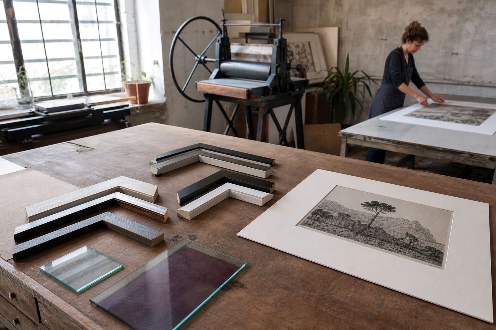
Archival packing matters just as much once the print leaves the studio. For collectors in Cape Town, Stellenbosch, Johannesburg, Pretoria or Durban, the journey from studio to wall may include courier handling, changes in temperature and coastal humidity. Good packing keeps the sheet flat and protected, especially when the work is framed later by the client or a framer of their choice.
- Keep prints flat, clean and separated with archival materials.
- Avoid direct sunlight while the ink is still fully settling.
- Store unframed prints in a dry room with stable temperature.
- Handle edges only, and wash hands before touching paper.
A Woodstock Example of Care in Practice
In a studio like ours in Woodstock, craftsmanship has to respond to real conditions, not ideal ones. On a damp winter morning the stones may hold moisture differently to a dry summer afternoon. That kind of judgement is not glamourous, but it is what keeps the edition clean.
For a collector in Sea Point hanging a print near the coast, or a client in Newlands choosing a framed work for a shaded room, the result of that judgement is visible in the finished piece. The line stays sharp. The colour stays even. The paper feels right in the hand. Careful studio practice is not a side issue in lithography, it is the thing that makes the work hold together from stone to wall.
How Collectors Can Judge Craftsmanship Before Buying
Collectors do not need to know every technical detail to recognise a well-made lithograph. A careful studio usually leaves clear signs in the print itself and in the way it is presented. Ask about the edition size, the paper used, the number of colours, and whether the work was proofed with the artist. If the answers are clear and practical, that is a good sign.
Look at the surface closely. Good lithography should show confidence in the drawing, even colour, clean margins and sound registration where colours overlap. Edges should be tidy, with no unnecessary smudging. If the work is signed and numbered by hand, check that the edition details are consistent and legible. Craftsmanship is not about perfection in the abstract, it is about making thoughtful decisions at each stage so the final print feels settled and honest.