Why stone lithography suits layered colour
In planographic printing, the image is drawn on a prepared stone surface rather than being cut into it or etched deeply. For colour work, each colour is usually separated onto its own stone, so the printer can build the image in layers. That is why a finished lithograph can have a soft hand-drawn quality, yet still carry strong blocks of colour and fine detail.
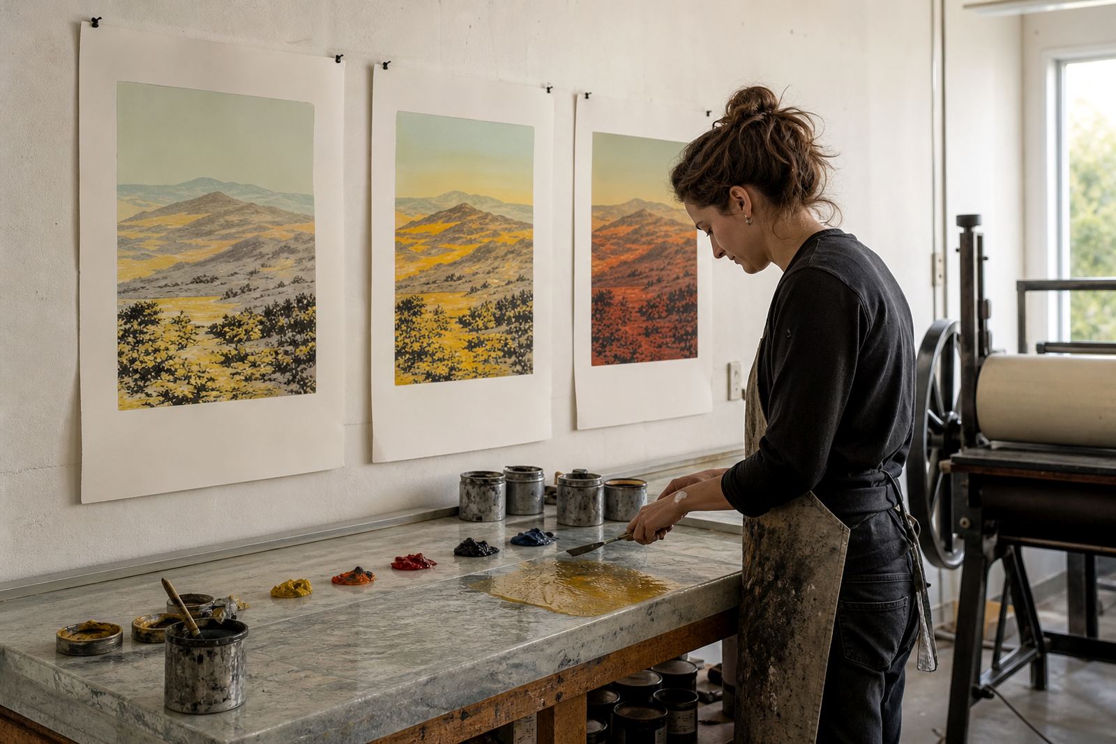
The stone holds grease in the drawn areas and repels water elsewhere. When ink is rolled on, it stays where the drawing was made and lifts cleanly from the rest of the surface. In a multi-colour print, this process is repeated stone by stone. A red shape on one stone, a blue shadow on another, and a final black line drawing can all sit together in one image when the sheets are printed in the right order.
For artists in South Africa, this method works well because it gives real control over tone and layering. A collector in Cape Town may see a print where the first colour is barely visible at first glance, but it quietly shapes the whole image underneath. That depth is what makes lithography different from many digital or mechanical colour processes.
How the drawing on stone becomes a print
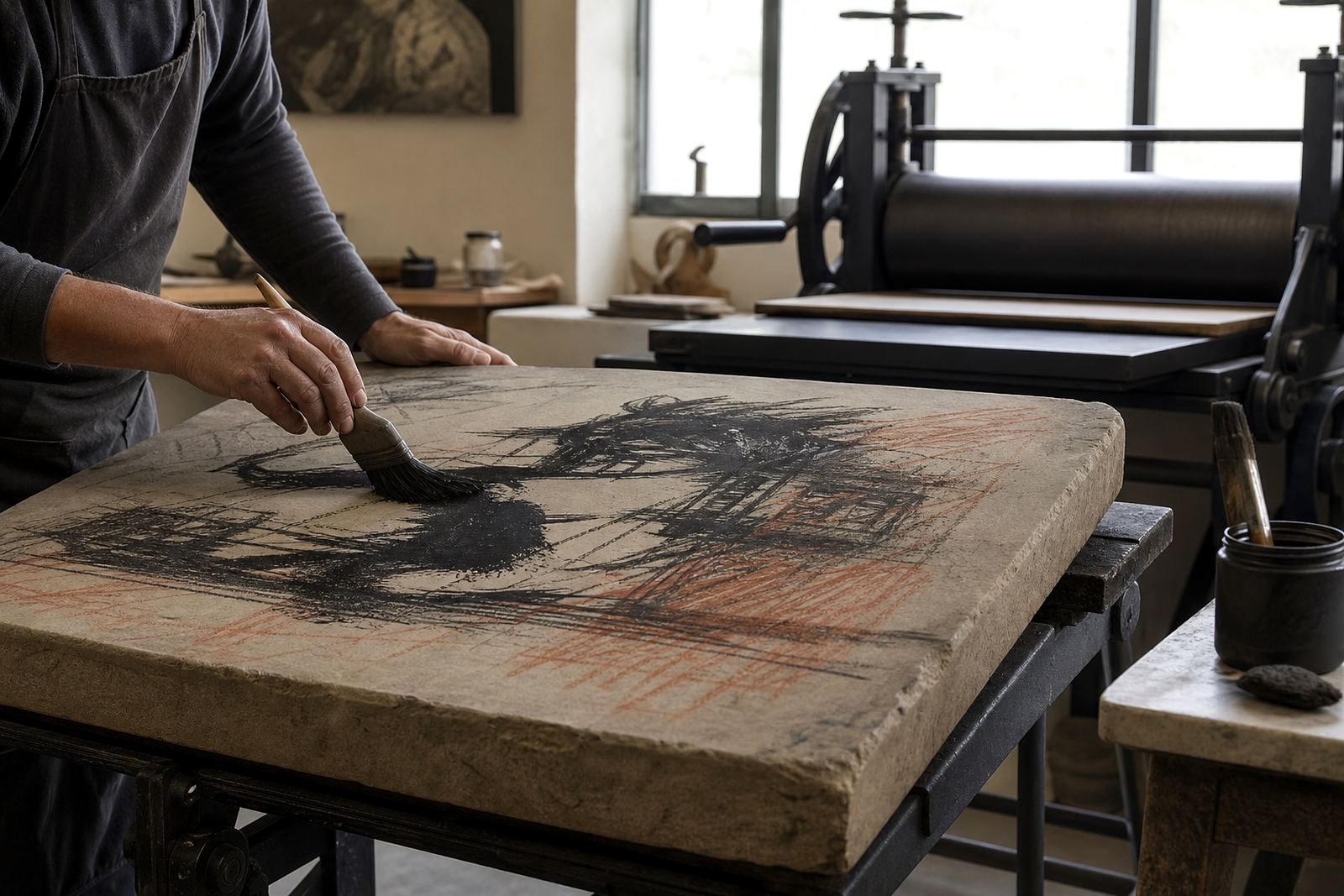
The process starts with a limestone block prepared to a smooth printing surface. The artist draws directly onto the stone with greasy materials, depending on the look needed. Some marks are bold and immediate, others are delicate and washed in, almost like a pencil line or a wash of ink. Once the drawing is complete, the stone is chemically treated so the image areas accept ink and the non-image areas hold moisture.
For colour work, the studio will usually make a separate stone for each colour. That can be done through direct drawing, transfer methods, or by building a colour separation plan from the original artwork. The key is registration, which means aligning each sheet precisely over every stone so the layers sit where they should. Even a small shift can throw off the whole print, so this stage needs steady hands and patience. On a warm Cape Town afternoon, the paper may behave differently from a cool morning, and the printer has to read those changes carefully.
Once the stones are ready, paper is printed one colour at a time. The sheet must dry fully before the next pass in many cases, especially when several layers are involved. That is why a colour lithograph is not made in one rush. It is built, checked and adjusted as the edition moves forward. There is no shortcut if you want clean overlaps and true colour.
What editioning means for collectors
An edition is the agreed number of prints made from a group of stones. In fine-art lithography, each impression in the edition should match the approved proof closely, while still keeping the slight variations that come with hand printing. This is one reason collectors value stone lithographs: they are made in limited numbers, and each sheet comes from the same printing process rather than from a mass production line.
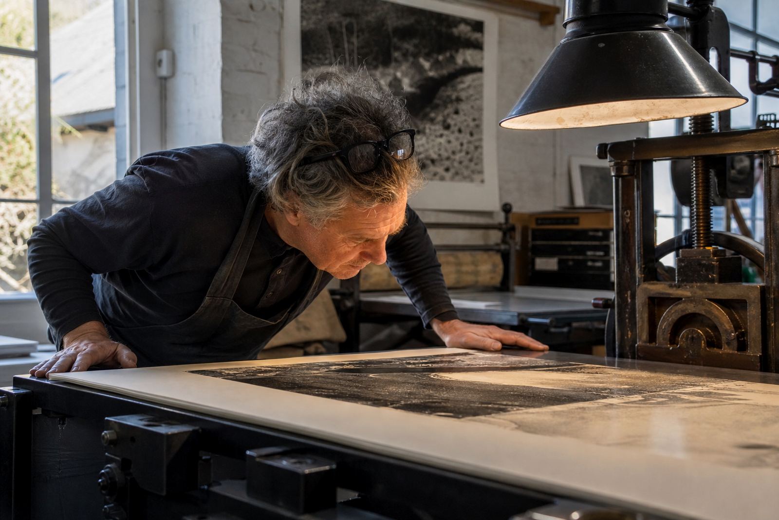
Before the edition is signed and numbered, the studio usually prints proofs and checks colour balance, registration and paper response. If a colour feels too heavy or too pale, adjustments can be made before the edition is completed. Once the artist approves the final state, the edition is printed through to the planned number. Good editioning protects the integrity of the work and helps collectors know exactly what they are receiving.
For someone buying in Johannesburg or Durban, the edition notes matter just as much as the image. They tell you whether the print is part of a small run, whether there were artist proofs, and how the work was handled. A properly editioned lithograph should feel considered from first proof to final sheet, not rushed at the end.
- Ask whether the edition was printed on stone or from a transferred image.
- Check if the print was signed and numbered after approval.
- Confirm the paper type and whether it is suitable for archival framing.
How colour separation shapes the final image
Colour separation is where the studio decides how the image will be divided across stones. Some artists want clear primary colours with visible overlaps. Others prefer subtle tonal layers that blend into one another. A careful separation plan helps the printer decide which marks belong to which colour and where transparent layers should build depth. This is often where a print either comes together well or starts to lose its clarity.
In practical terms, the studio looks at the artwork and asks a few direct questions: Which colour should sit on top? Which layer should carry the darkest accents? Where do we need an outline to anchor the forms? These decisions matter because lithography works best when every colour has a purpose. A soft green made from blue and yellow stones will behave differently from a single mixed green, and that difference changes the whole print.
In Woodstock, where the studio sits close to the hum of the city, the work is still slow and exact. An artist may bring a drawing from Stellenbosch or a finished idea from Pretoria, but the same rules apply once the image reaches the stones. The print has to be planned so it can be editioned cleanly and stored properly after drying.
- Separate by colour need, not just by what looks attractive on screen or paper.
- Keep darks, mid tones and highlights in mind from the start.
- Allow for slight transparency where layers are meant to mix.
What makes a proof different from the final edition
Proofs are working impressions used to test the image, check colour and refine the registration. They are part of the making process, not the finished run. A proof may show a weak area that needs another pass, or a colour that needs to be warmed up or cooled down. In some cases, the proof becomes the guide for the whole edition once the artist approves it.
The final edition is printed only after those checks are done. It should reflect the agreed image and remain consistent across the run. Even so, hand printing means there can be tiny differences from sheet to sheet. That is normal. What matters is that the differences stay within the intended edition and that the quality remains steady from start to finish. If the paper feed slips or the ink is too dry, the print changes and the studio has to correct it.
Collectors often ask whether a proof is better than an edition print. The honest answer is that they serve different purposes. A proof may be more experimental, but the edition print represents the final, resolved work. For most buyers, that final version is the one to frame and keep.
Caring for a colour lithograph once it leaves the studio
A colour lithograph will last well if it is stored and framed properly. Keep it out of direct sun, because strong light can fade paper and some pigments over time. Avoid damp rooms and unsealed walls, especially in coastal areas where humidity can creep in during summer. If a print is unframed, store it flat in archival tissue or a suitable folder, away from heat and pressure.
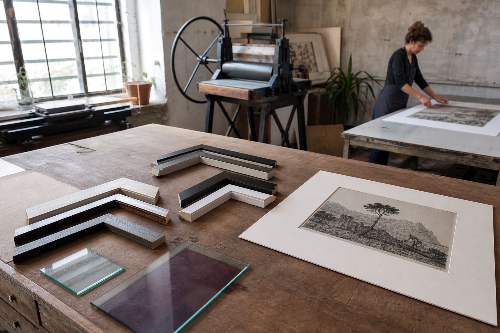
When framing, use conservation-grade materials and avoid anything that traps moisture against the sheet. A print should not be pressed hard against the glazing. Leave a small air gap where possible, and make sure the framer understands that the sheet is hand printed on paper, not a poster or reproduction. For collectors in Durban or Sea Point, this is especially important because the salt air can affect both paper and framing components over time.
If you are unsure about display, ask for collector advice before mounting the work. The goal is simple: keep the colours true, keep the paper stable, and allow the edition to stay in good condition for years. With the right care, a colour lithograph keeps its presence without demanding much from the room it hangs in.