Two drawing tools, two very different voices
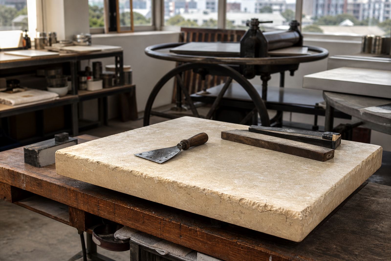
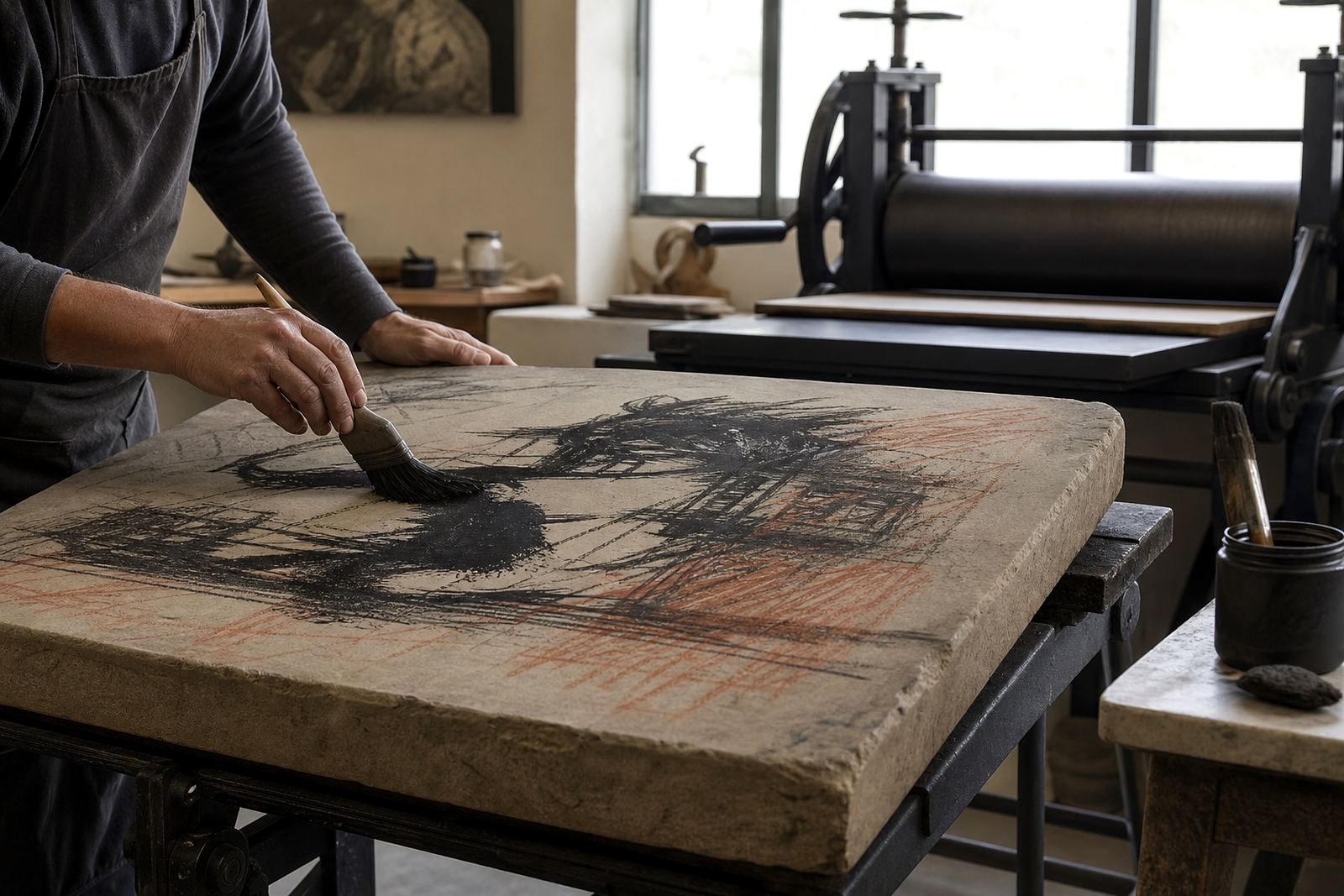
Stone lithography begins with a simple principle: grease and water repel each other. On a finely prepared limestone surface, the artist draws with a greasy material, then the stone is processed so that the drawn areas accept ink while the non-image areas hold water. Tusche and lithographic crayon both use that principle, but they produce different kinds of image.
Crayon gives a dry, direct mark. It can feel like drawing on paper, with a grainy texture and clear pressure from the hand. Tusche is a liquid medium, usually brushed or washed onto the stone. It is better suited to broad tone, flowing edges and shaded passages. In practice, many artists use both in the same image to build contrast and control.
What lithographic crayon does best on the stone
Lithographic crayon is the tool for line, texture and pressure. It can make a fine hairline, a heavier stroke, or a dense area of hatch marks that holds close detail. Because the crayon sits on the stone in a more tactile way, the printed result often carries a sense of touch that collectors notice straight away.
Crayon is especially useful when the artist wants clarity. It suits handwriting, contour drawing, architectural forms and imagery that needs a distinct edge. It also gives the printer strong control during proofing, because the drawn structure is easier to read on the stone and easier to assess when inks are adjusted.
- Best for defined line, crosshatch and visible mark-making
- Useful for textural passages and energetic drawing
- Often chosen when the image needs crisp structure
- Can be combined with tusche to soften selected areas
How tusche creates tone, wash and atmosphere
Tusche behaves more like a liquid drawing medium than a dry crayon. It can be brushed, splashed, rolled, washed or lifted so the stone records tone rather than only outline. That makes it ideal for skies, shadow areas, soft transitions and a sense of depth. It can also create a painterly feel that would be difficult to achieve with crayon alone.
Because tusche can be handled in different ways, it allows a wide range of effects. A diluted wash might print as a gentle grey, while a more concentrated passage can hold rich darks. The edges may be soft or sharply controlled, depending on how the stone was worked. In the right hands, it brings a living, slightly unpredictable quality that suits expressive work.
- Best for tonal areas and fluid transitions
- Good for washes, shadows and atmospheric passages
- Can produce soft edges or bold dark fields
- Often used when the image needs movement rather than strict line
Why many editions use both methods together
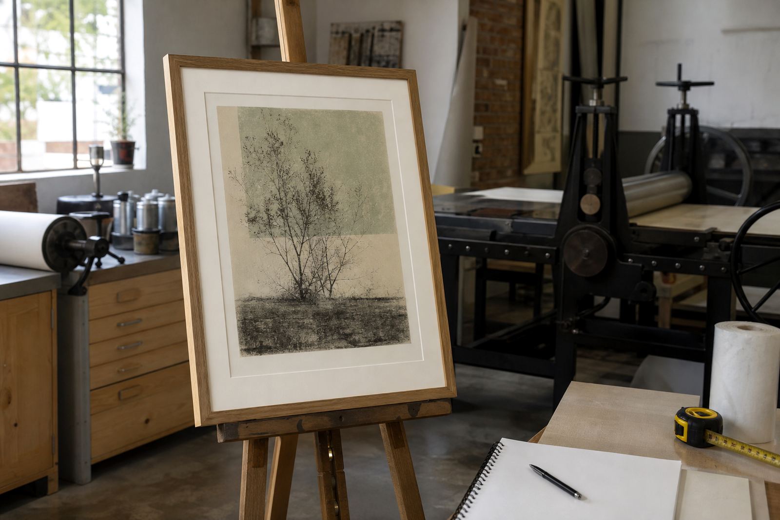
In a studio edition, tusche and crayon are not rivals. They are tools that solve different problems. A portrait may need the structure of crayon around the eyes and mouth, then tusche for the deeper shadow under the chin. A landscape may use crayon for branches or fencing, with tusche for distance haze or cloud forms. The strongest stone lithographs often come from this kind of combination.
At Lithography Art in Woodstock, the choice is usually made with the artist during proofing sessions. A local example would be a Cape Town scene printed for a collector in Sea Point, where the skyline calls for crisp drawn detail but the water or evening sky benefits from tusche tone. That balance helps the image feel rooted in place, without overworking the stone.
When both methods appear in one edition, the printer has to manage ink strength, dampening and pressure carefully so the tones do not flatten out. It is steady work and not something to rush, especially when an edition has to stay consistent from first proof to final sheet.
Edition planning changes the way the mark is read
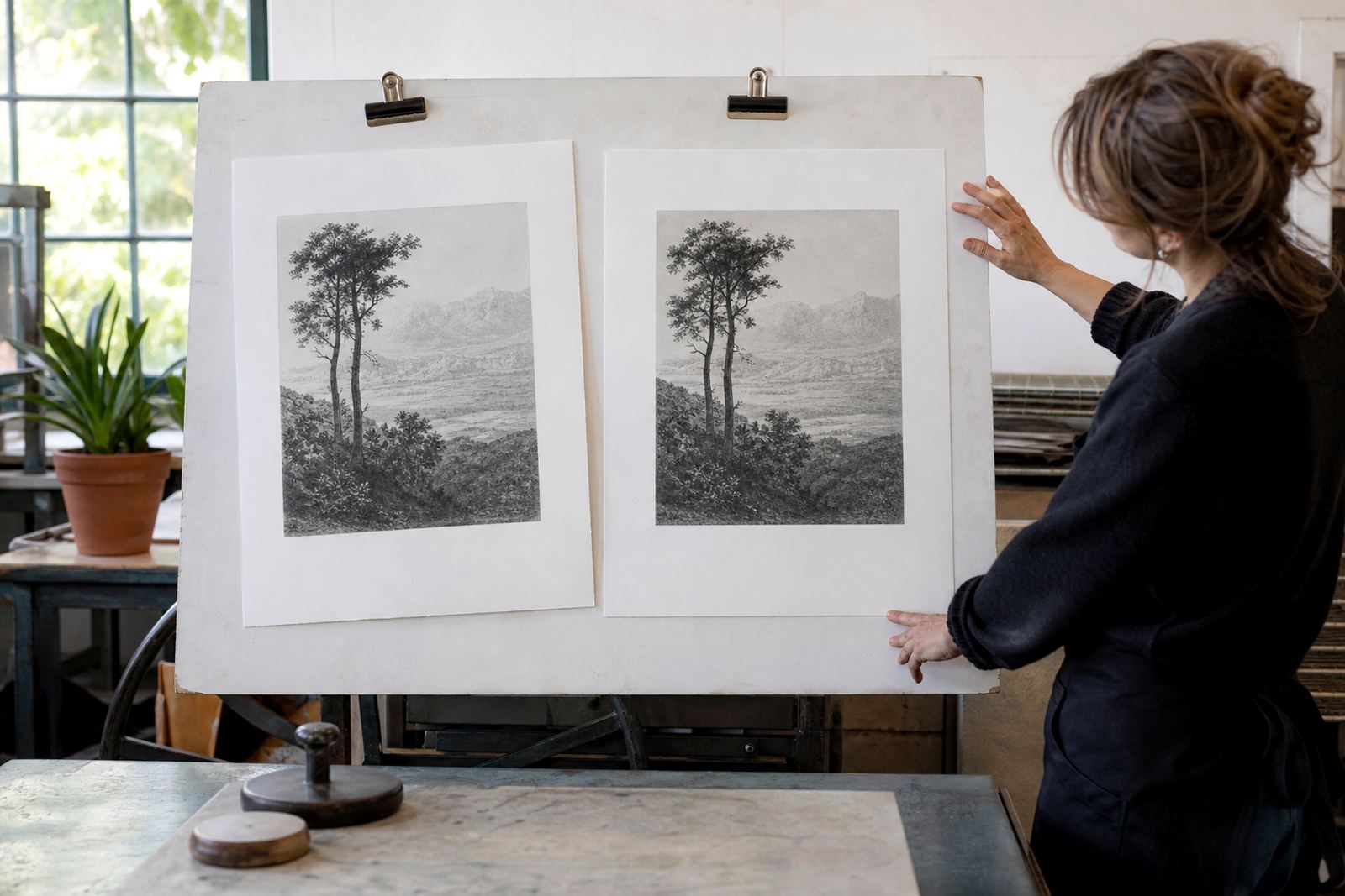
Understanding tusche versus crayon is not only an artist’s concern. It affects edition planning too. A crayon drawing with sharp line may hold proof changes in a different way from a tusche wash, which can shift slightly if the stone is not fully balanced. The printer has to watch how each area takes ink and how each pass through the press behaves.
That is why editioning starts early. Paper choice, stone preparation and colour separation all affect the final result. If a print depends on fine crayon detail, the paper must support a clean impression. If the image relies on tusche atmosphere, the printing pressure and ink density must let the tone breathe. Good edition work keeps these decisions practical, not vague.
- Crayon detail needs clean registration and careful pressure
- Tusche tone may require more testing to hold the intended softness
- Paper surface affects both the line and the tonal spread
- Proofing helps the artist decide where each method belongs
Caring for lithographs that use delicate tonal work
Collectors often ask how to keep a stone lithograph in good condition, especially when the image includes soft tusche passages or lightly printed crayon. The main rule is simple: keep it out of direct sun, away from damp walls and handled by the edges only. Cape humidity can be hard on paper, so archival packing and sensible framing matter more than people sometimes realise.
Use acid free mount materials, and if framing, ask for conservation glass where possible. If the print is unframed, keep it flat in clean tissue and a sealed portfolio. The image itself is stable when cared for properly, but the paper needs protection from moisture and dust.
For editioned work, signing and numbering are part of that care as well. They help record the print’s place in the edition and support orderly handling over time. A well kept lithograph should remain crisp, readable and calm on the page for many years.
Choosing the right look for your next stone lithograph
If you are commissioning or collecting stone lithography, think first about the visual language you want. Crayon gives directness, texture and a hand drawn edge. Tusche offers tone, wash and a more atmospheric finish. The question is not which is better, but which serves the image honestly.
For artists working between Woodstock and Stellenbosch, or collectors in Johannesburg, Pretoria and Durban, the useful step is to look at the subject itself. Strong contour, gesture and linear structure usually favour crayon. Light, shadow and a softer mood usually favour tusche. Many of the most satisfying prints begin when both are allowed to do what they do best.
That is the practical beauty of stone lithography. It is a medium with discipline, but it still leaves room for the hand. And in that space, tusche and crayon can speak in very different voices while still belonging to the same edition.