Stone lithography keeps the hand visible
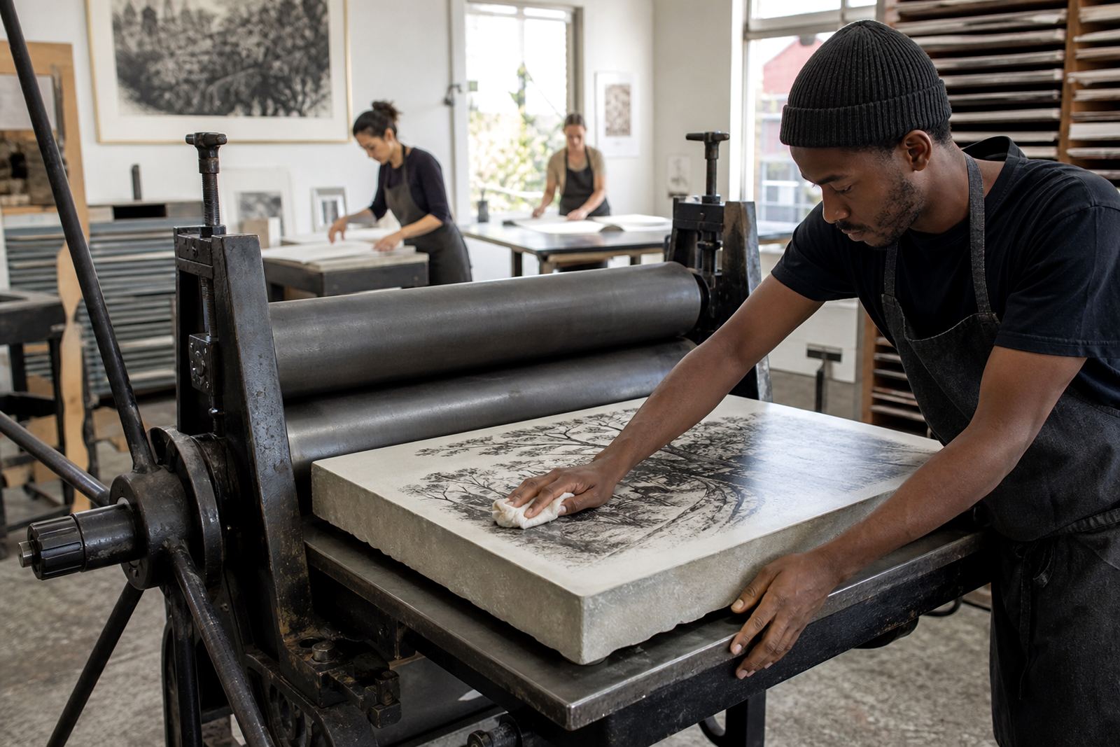
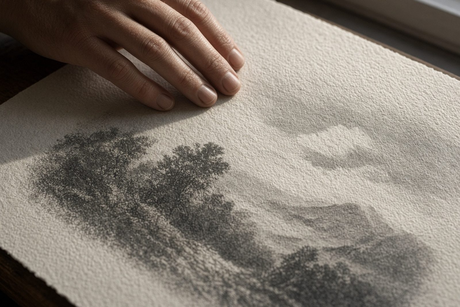
Stone lithography is built around the chemistry of grease and water, but the surface of the stone is what gives the process its character. A drawing made directly on a prepared stone can hold a soft tonal wash, a crisp line, or a broken mark, depending on the tool used and how the artist works. The final print is not a flat reproduction of a digital file. It carries the pressure of the hand, the speed of the mark, and the slight unevenness that comes from printing each sheet through a press.
That is why collectors often notice texture before anything else. A lithograph can look velvety in the dark passages, chalky in the highlights, or sharply linear where the drawing was carried with pencil or crayon. In a well made edition, these changes are deliberate. They are not faults, they are part of what gives the image life.
How drawing method changes the surface feel
Different drawing methods leave different kinds of texture on the stone, and those marks carry through to the print. Greasy crayons can produce a rich, grainy surface that holds tone well. Liquid drawing materials can create crisp edges, splashes, and wash marks. Scratching into the stone or combining mark making methods can introduce fine details and stronger contrast. Even the speed of the artist matters. A quick, confident line often feels different from a slow layered one.
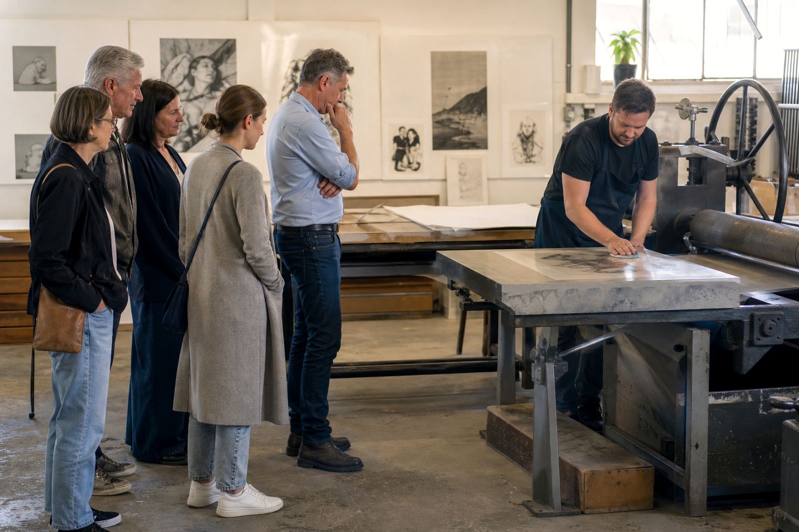
In practice, the studio may test several approaches before editioning begins. This is where proofing sessions are useful, because the artist can see how the drawing reads once it has been printed on paper. A line that seems strong on stone may soften once ink and paper meet, while a pale wash can suddenly become the most expressive part of the image.
- Crayon drawings often give a soft, textured grain.
- Brush and wash work can create tonal depth and open areas.
- Scraped or scratched marks can add clarity and sharp contrast.
- Layered drawings may show more complexity, especially in colour work.
Paper choice can change the look more than people expect
Paper is not just a support. It changes how the ink sits, how the image catches the light, and how much of the stone texture you can see. A smooth paper can bring out fine line work and delicate tonal shifts. A more textured sheet can make the print feel warmer and more tactile, especially where the ink settles into the paper surface. Paper choice can change the feel quite a lot, sometimes more than the drawing itself.
For artists working in Cape Town, especially with changing humidity near Woodstock or Sea Point, paper handling matters as much as paper selection. Sheets need to be stored flat, kept clean, and acclimatised before printing so they do not cockle or curl. In a city where a damp morning can turn into a dry afternoon, the paper has to be managed with care. That same attention helps ensure the edition stays consistent from the first proof to the last sheet.
- Choose smoother paper for fine detail and controlled line work.
- Choose textured paper for a more visible, tactile surface.
- Heavier sheets often handle multiple passes better in colour editions.
- Paper should suit the image, the edition size, and the final framing plan.
Edition consistency depends on more than a good image
In a limited edition, surface texture must stay consistent from one print to the next. That means the stone has to be prepared properly, the ink rolled to the same density, and the paper handled in a steady way throughout the run. Each sheet is printed one at a time, so small shifts in pressure or moisture can change how the surface appears. A strong studio will watch for these shifts and adjust before they become a problem.
This matters for collectors because editioning is not only about numbering and signing. It is about trust. If the first and last print in an edition look materially different, the edition loses coherence. Good edition planning helps avoid that. It sets the paper size, proofing sequence, drying time and packing method before the full run begins, which protects both the artist’s intention and the buyer’s confidence.
An edition that went to Durban
Consider a collector in Durban choosing between two lithographs from the same edition. One sheet was printed on a smoother paper and framed behind glass in a cooler interior, while the other was shown on a more textured paper with a stronger visible grain. The image is the same, but the experience changes with the surface. In coastal light, the smoother sheet may read as cleaner and more reflective, while the textured sheet can feel softer and more tactile. Neither is better in every case, it depends on the room and the image.
For artists visiting the studio in Woodstock, this is often the point where the work becomes practical rather than theoretical. They can compare papers, look at the tonal range, and decide whether the edition should feel precise or earthy. That decision has real value for collectors in Cape Town, Johannesburg, Pretoria or Stellenbosch who want a print that suits the place where it will hang.
How to care for lithographs so the surface stays true
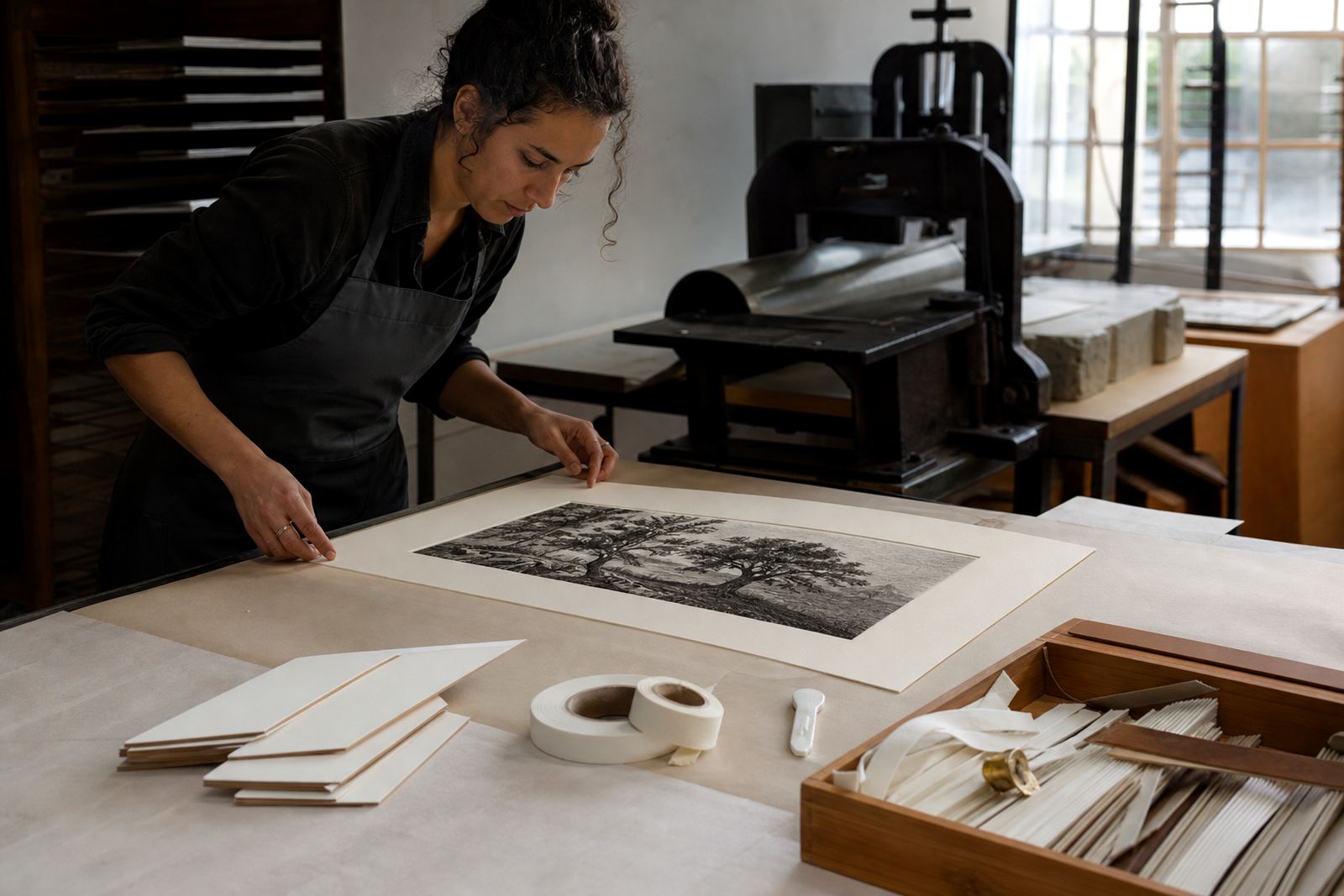
Once a lithograph leaves the studio, good care helps preserve the texture that made it appealing in the first place. Prints should be stored flat, away from direct sunlight, and handled with clean dry hands or cotton gloves when necessary. Framing should use archival materials, with a proper mount and backing board so the paper does not touch the glass. In homes with strong light or variable temperature, this matters even more.
Collectors sometimes think surface texture only concerns the artist, but care after purchase affects the final appearance for years. Dust, moisture and poor framing can flatten a print visually. By contrast, good packing, sensible framing coordination, and a stable hanging position will keep the ink and paper looking as intended. If you are unsure, it is worth asking for collector advice before framing, especially for a limited edition that you plan to keep long term.
- Keep prints out of direct sun and damp rooms.
- Store flat in archival wrapping until framing.
- Use acid-free mounts and backing materials.
- Allow the print to acclimatise before framing in humid weather.