
Begin With the Wall and the Distance You’ll View It From
Before you choose a hanging pattern, stand back and look at the wall itself. A grouping that works in a narrow passage will not always suit a double-volume lounge or a compact flat in Sea Point. Measure the available width and height, then think about where people will view the work from. In a passage or stairwell, a tighter arrangement usually reads best. In a living room, the prints can breathe a little more.
It helps to mark the wall with masking tape or paper cut-outs at the same size as the framed prints. This gives you a true sense of proportion before any nails go in. Keep the centre of the grouping near eye level for the main viewing position, usually around 145 to 155 cm from the floor to the centre point. If the wall sits above a couch or sideboard, allow enough space so the frames do not feel pinned to the furniture.
Choose a Layout That Matches the Prints
Stone lithographs often work beautifully in pairs, trios, or a neat grid, depending on the subject matter and edition size. A series with a shared palette can sit comfortably in a straight row, while mixed image sizes may feel better in a loose salon arrangement. If the prints come from the same edition, they often carry a natural connection through paper, ink density, and format, which makes balancing the wall easier.
- Linear row: Best for equal-sized prints and calm, modern spaces.
- Grid: Good for four, six, or eight prints with similar frame sizes.
- Central anchor: One larger work in the middle with smaller pieces around it.
- Salon style: A collected look with varied sizes, hung in a planned shape.
Try not to mix too many competing orientations unless there is a clear pattern. A wall of portrait and landscape frames can work, but only if the outer edges and gaps are controlled. Otherwise the eye keeps jumping around. A simple arrangement nearly always feels stronger.
Keep Spacing Consistent and Honest
Spacing is what turns a set of prints into a proper grouping. As a general rule, keep the gap between frames between 5 and 8 cm for most home settings. On a larger wall, you can open that up a little more, but stay consistent. Uneven gaps are one of the quickest ways to make a wall feel unsettled. If the room has strong architectural lines, such as a fireplace mantle or a picture rail, use those lines to guide your spacing.
When laying out several works, step back every few minutes and check the overall shape. The group should feel like one composition, not a row of separate items. If one frame looks too dark or too heavy, move it away from the edge or pair it with a lighter image. Small adjustments make a big difference, especially with fine line work and bold colour areas.
- Measure the outer edges of the full grouping first.
- Keep horizontal lines level, especially across a row of frames.
- Leave a little more space around a standout print if it needs room to breathe.
- Check the layout from the main doorway and from the seating area.
Balance Colour, Weight and Paper Tone
Stone lithography can range from soft tonal work to strong colour layers, and the wall needs to balance those qualities. If one print carries a dense dark area, place it opposite a lighter image so the grouping does not lean to one side. If the edition uses several colours, repeat one or two colours across the wall to create visual connection. This is often easier than trying to match everything exactly.
Paper tone matters too. Warm white paper and bright white paper can sit together, but the difference should be deliberate. In a room with lots of natural light, subtle tonal changes are easy to see. In a space that gets afternoon sun from the south or west, avoid hanging prints where the glare will flatten the colour. Coastal humidity in places like Durban or Sea Point also makes good framing important, because paper and mounts need proper protection from moisture.
Frame It for South African Conditions
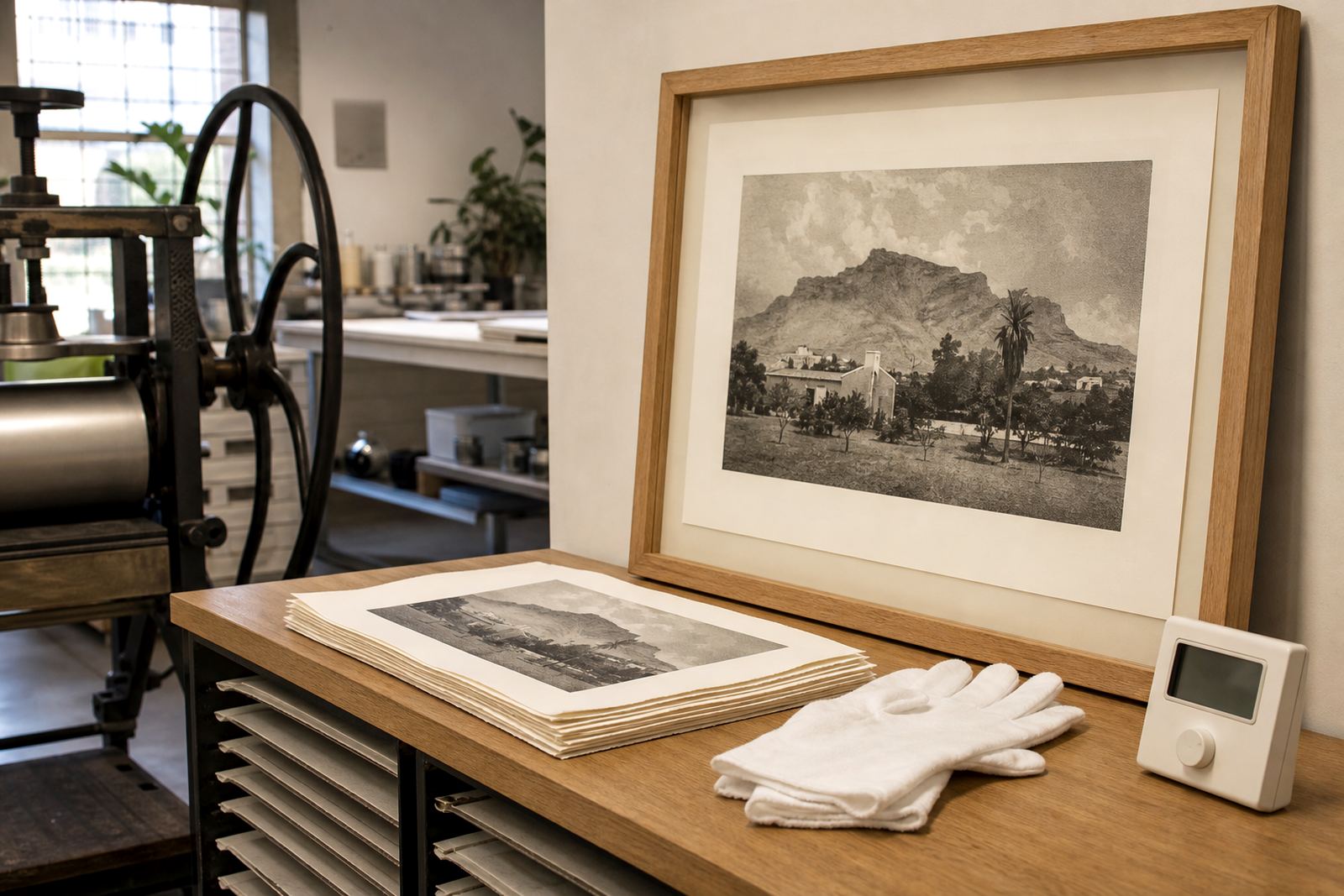
Good framing protects the print and helps the grouping look finished. Use archival mount board and glazing that suits the room, especially if the wall gets strong light or changing temperatures. In older Cape Town homes and apartment blocks, walls can be uneven so it is worth checking fixings carefully before hanging. If the space is close to the kitchen or a seaside opening, make sure the frame is sealed properly to help reduce dust and moisture entry.
For works with a visible edition number and signature, allow enough border space so those details are not hidden by the mount. Where possible, keep every frame at the same depth and edge profile. A mix of thick and thin frames can look busy unless there is a very clear reason for it. If you are unsure, a simple frame in one finish across the whole grouping usually gives the cleanest result.
- Use archival materials for mounts and backing.
- Keep prints out of direct sun where possible.
- Wipe frames with a dry cloth, not a wet one.
Plan the Hanging Order Before You Lift a Hammer
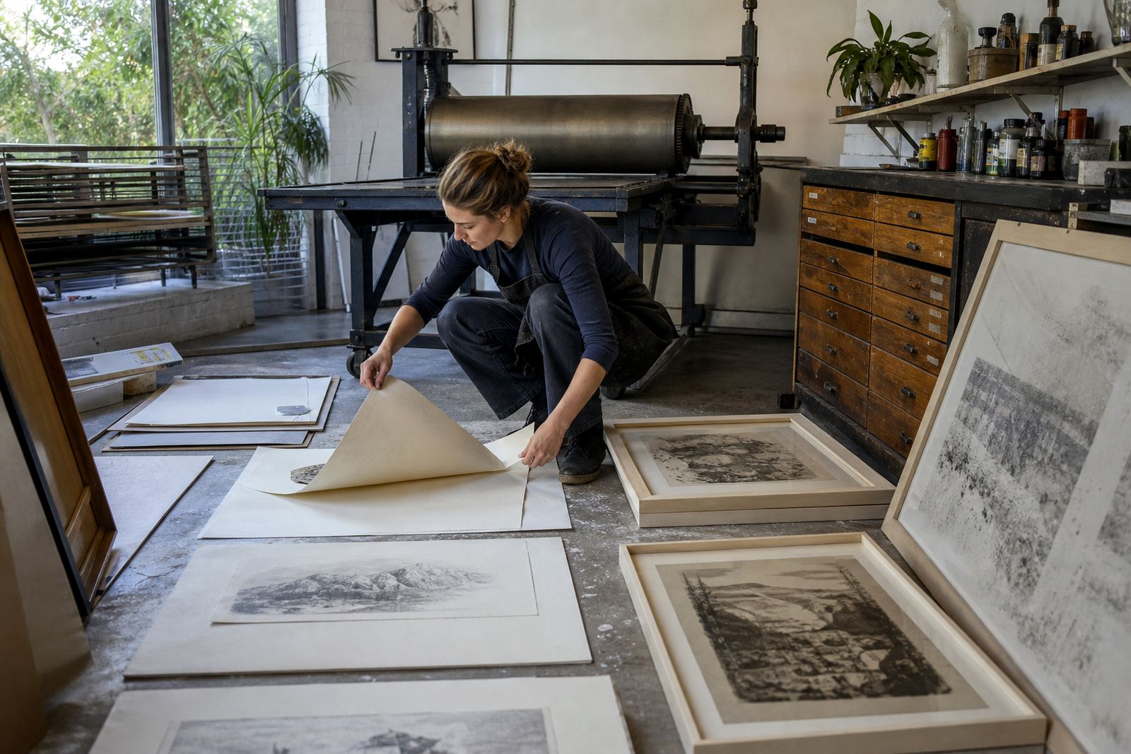
Lay the prints on the floor first and test a few arrangements. Photograph each option so you can compare them side by side. It is easier to spot a strong composition in a picture than in your head. Start with the largest or most important print, then build around it. If the grouping is above a sofa or console, centre that anchor point carefully and work outward from there.
For heavier framed works, especially if you are hanging several in one area, use proper wall fixings suited to the wall type. Brick, plasterboard and concrete all need different support. If the wall is not level, use a spirit level and measure from a fixed point rather than eyeballing each frame. A small tilt becomes obvious once all the prints are up, so take your time.
Simple Checklist Before You Hang
Use this final check before the last nail goes in. It saves a lot of rework and keeps the grouping looking considered rather than rushed. If the wall will sit in a shared family space, ask someone to stand back with you and look at the arrangement from the usual seating position. A second pair of eyes often catches a gap or alignment issue that is easy to miss when you are close to the wall.
- Are the outer edges forming a clear shape?
- Do the gaps stay consistent across the grouping?
- Does the colour balance feel even from left to right?
- Can every signature and edition number still be seen?
- Will the prints avoid direct sun, steam or heavy moisture?
- Are the fixings suitable for the wall material?
Once the grouping is up, leave it alone for a day before making final tweaks. A wall often reads differently once the furniture is back in place and the room has its usual light. If you are collecting prints over time, it is perfectly fine to build the wall slowly, one piece at a time, so long as the spacing and frame style stay consistent.