Why stone lithography works in office interiors
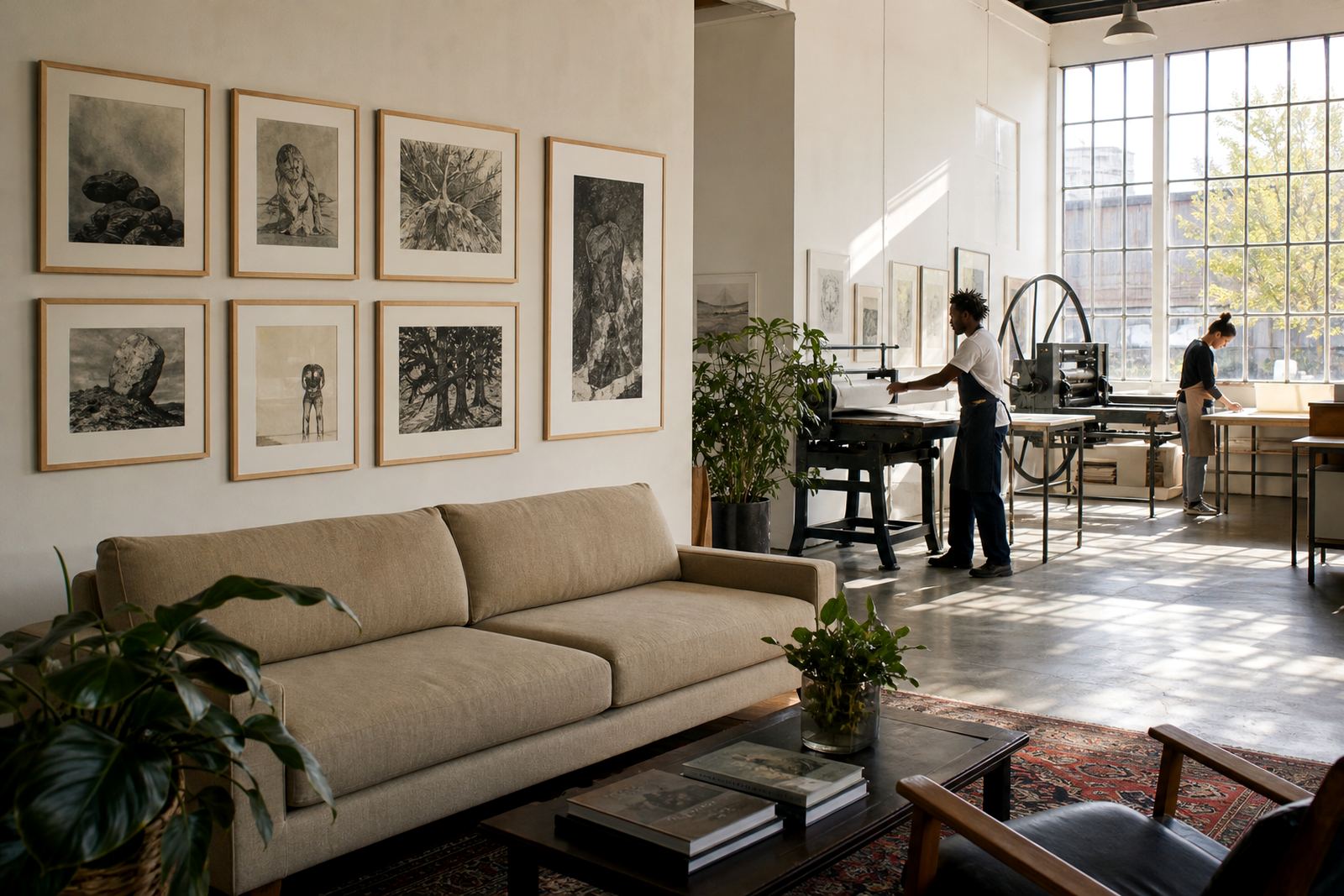
Stone lithography has a natural fit in professional spaces because it carries the warmth of hand-made work without looking loud. Each image is drawn or worked onto a prepared stone, then printed in an edition so the final result has the tactility of fine art and the discipline of repeatable production. That balance matters in offices where the goal is to create calm, not clutter.
In a reception, a corridor, a partner office or a meeting room, a lithograph gives the space something considered and lasting. The marks can be crisp or soft, single-colour or layered with muted tone, which makes the work easy to place in interiors with wood, glass, concrete or painted walls. For businesses in Woodstock, Newlands or Sea Point, it also suits the mix of older buildings and newer fit-outs found across Cape Town.
We work with artists and collectors on limited editions, which means the print remains exclusive and controlled. That is useful in offices because the same image can be specified for a single room or a sequence of rooms without feeling overused.
Typical print sets for reception areas and boardrooms
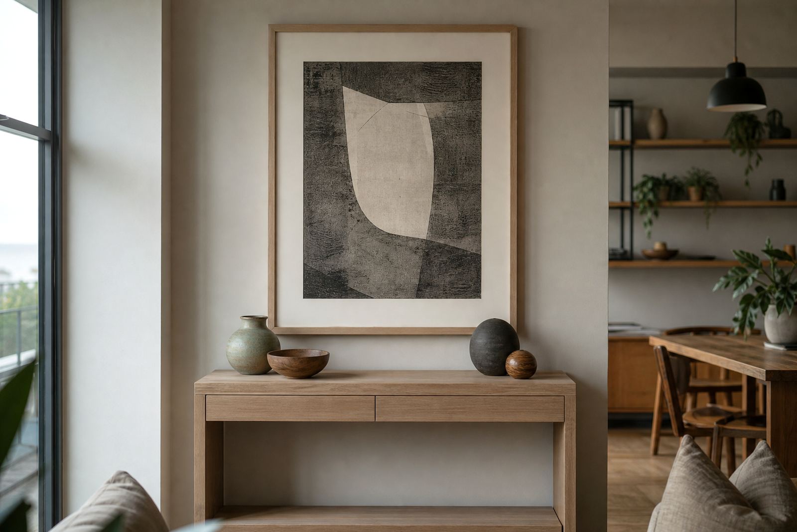
Office clients usually want a small group of works rather than a wall full of separate objects. A pair of medium-scale prints above a sideboard can anchor a reception area, while one larger print often works better in a boardroom where people need clear sightlines and an uncluttered feel. In open-plan offices, a run of related images can guide movement through the space without creating visual noise.
The usual set-up includes the stone lithograph itself, a quality paper choice, edition signing and numbering, and where needed framing coordination. Depending on the wall size and the interior finish, we may also discuss wider margins, matching frames or a consistent hanger line across several rooms.
- Reception walls: one statement print or a paired arrangement.
- Boardrooms: one to three works with measured spacing.
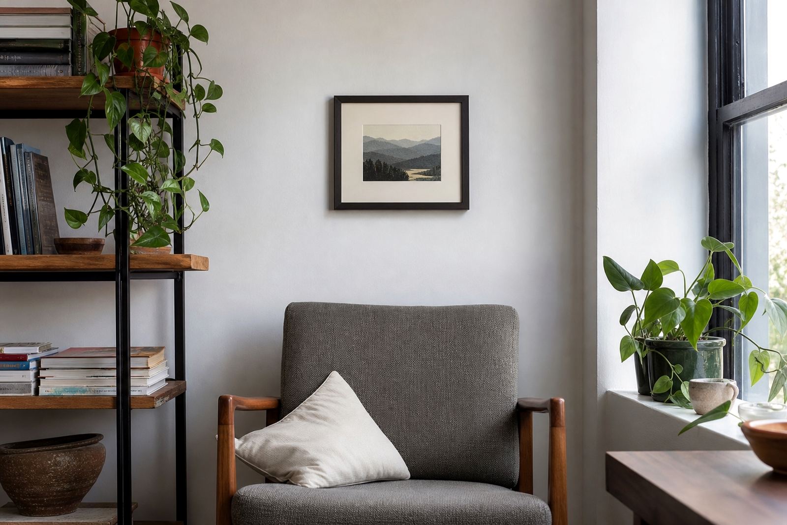
- Private offices: smaller editions that sit comfortably beside shelving or glazing.
- Passage walls: grouped works with repeated sizing for rhythm.
For offices in Johannesburg or Pretoria, where boardrooms often need a more formal look, neutral paper and restrained colour usually work well. In Durban, where light can be stronger and humidity higher, we often suggest framing and placement choices that protect the paper from direct sun and damp air.
Edition planning for commercial spaces
Edition planning matters when a business wants consistency across several rooms or wants to place works over time as the office grows. We begin by looking at the intended wall sizes, viewing distance, framing style and the number of locations where the print might be used. From there we can advise on how many impressions should be pulled, how the edition will be numbered, and whether a proof is needed before final printing begins.
Collectors and corporate buyers sometimes ask for matching works that can be split between sites, for example one set in Cape Town and another in Stellenbosch or Durban. In those cases the edition needs to be planned carefully so the paper, colour and print handling stay consistent from the first impression to the last.
- Edition size should suit the number of rooms and future expansion plans.
- Proofing sessions help avoid surprises with tone, paper response and image placement.
- Signing and numbering should be agreed before the edition is printed.
- Archival packing is worth including if works will be moved between offices.
Our studio in Woodstock handles the practical side of this process with Shailen Naicker, Nomvula Phalatse, Stefan Hattingh, Rukshana Kamaar, Bonga Mngadi and Tegan Jacobs each involved in the parts of the job that need care and continuity.
Layout and lighting advice for calm, professional walls
Good office art placement is mostly about proportion, light and flow. A print should not fight with a TV screen, a noticeboard or a busy reception counter. It should sit where people notice it naturally, usually at eye level in a place with enough breathing room around it. In smaller offices, one carefully chosen lithograph often does more than several small pieces placed too close together.
Natural light needs particular attention. South African offices often get strong daylight, especially in Cape Town and Durban, so direct sun can fade colour over time. If a wall gets afternoon sun, framing with UV-filtering glazing and controlled placement helps preserve the work. In coastal areas, moisture can also affect paper and framing, so sealed backing and archival materials are a sensible choice.
Common mistakes when choosing art for offices
The most common mistake is buying art before measuring the wall properly. A print that looks ideal in a studio can end up too small above a reception counter or too large for a narrow corridor. Another issue is mixing too many styles in one area, which can make the space feel unsettled instead of calm.
People also underestimate framing. A poor frame can cheapen a good print, while a well-chosen frame gives the edition room to breathe. We often advise clients to consider framing at the same time as the print, not months later when the wall is already painted and the office furniture is in place.
- Do not ignore wall size and ceiling height.
- Do not place prints where they catch full afternoon sun.
- Do not mix too many competing colours in one zone.
- Do not use non-archival packing if works will be stored or moved.
Another mistake is treating an edition like disposable décor. Lithography prints are made to last, but only if they are handled properly. Finger marks, damp storage and poor hanging hardware can all shorten the life of the work.
Budget ranges for office projects in Rand
Office art budgets vary widely depending on size, edition complexity, framing and how many rooms need to be covered. For a modest reception or single private office, clients often start with a smaller framed work or a pair of prints. For boardrooms, executive suites or multiple offices, the budget usually grows with the edition plan and the framing specification.
As a general guide, the cost for a lithography project is shaped by the number of stones used, the amount of colour separation required, the paper chosen, the number of proofs and whether archival packing and framing coordination are included. A simple single-work placement will sit at the lower end, while a multi-room office brief with custom framing and edition planning will sit higher.
For businesses in Cape Town, Stellenbosch, Johannesburg, Pretoria or Durban, it is best to plan for both the print itself and the final presentation. That way the work arrives ready for the wall, rather than becoming an unfinished item in storage for months.
Looking after the sheet
Once installed, stone lithographs need only straightforward care. Keep them away from direct sunlight, avoid high humidity where possible, and dust the frame lightly with a dry cloth. If the print is glazed, do not spray cleaners directly onto the glass. For offices near the coast, regular checks are sensible because salt air and damp conditions can affect framing over time.
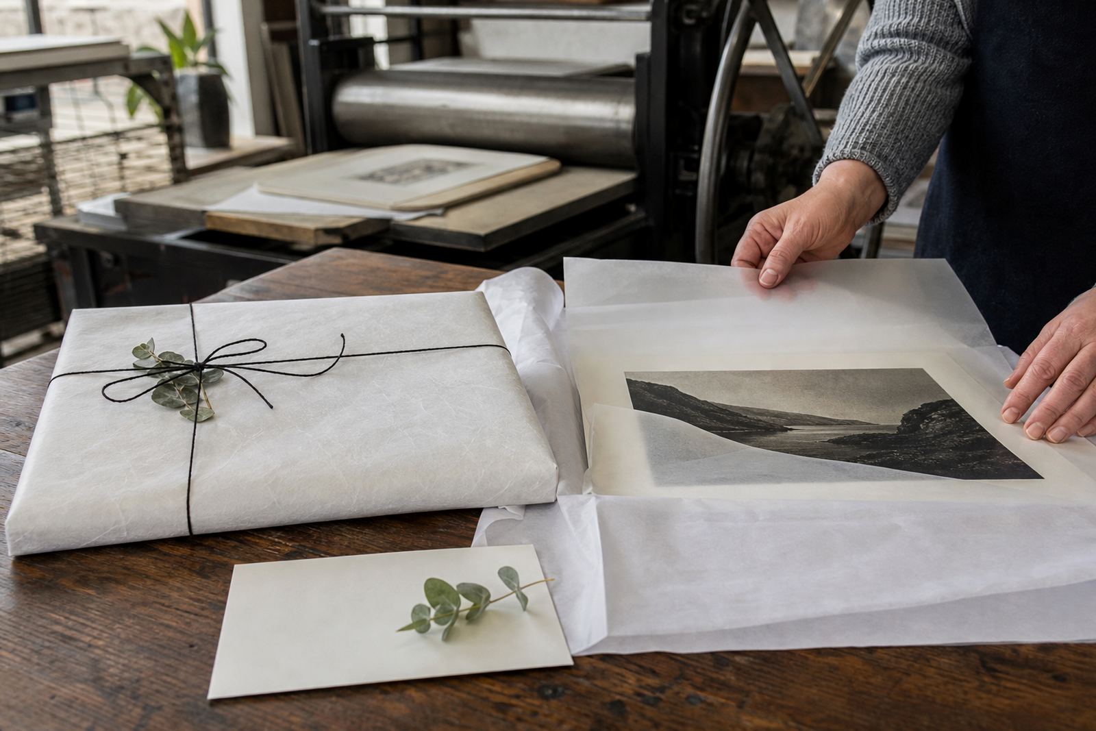
If a print needs to be moved between branches or taken home by a collector, archival packing is the safest approach. Store it flat or upright only when properly supported, and never in a hot vehicle for long periods. Good care keeps the paper stable and the edition looking the way it should for years.
Clients can use the enquiry form on our contact page to discuss a project, request studio visits or get advice on a specific wall. We work from Woodstock, Cape Town, and regularly assist offices and collectors across South Africa.