
Why stone lithographs work so well at home
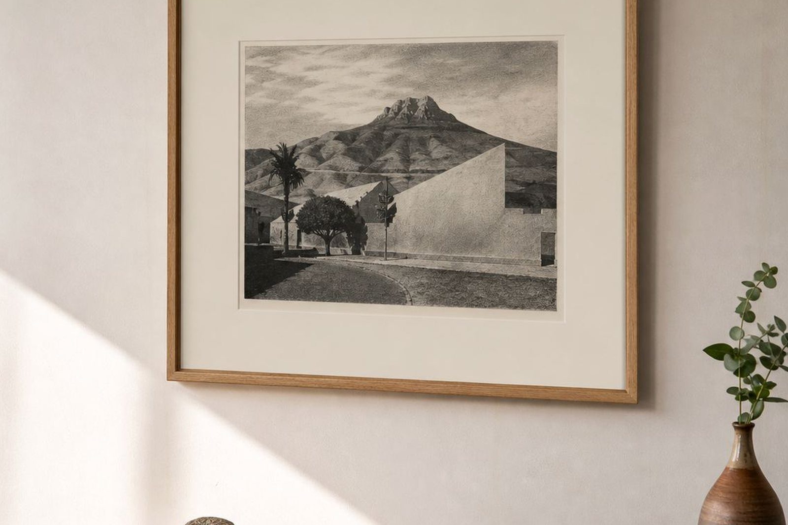
Stone lithography has a character that suits interiors. Each image is printed from a limestone surface that carries the artist’s drawing, then transferred to paper through a hand-pressed process. The result is often soft at the edges, rich in mark-making, and full of small tonal shifts that reward close viewing. In a home setting, that gives the work a quiet presence rather than a loud one, which is why many collectors place lithographs in lounges, hallways and bedrooms.
For homes in Cape Town, Stellenbosch, Johannesburg, Pretoria and Durban, the appeal is practical as well as visual. A limited edition print can be easier to place in a room with changing light than a glossy reproduction, and a properly framed lithograph handles everyday living well if it is kept out of direct sun and away from damp. We print in a way that respects the paper, the ink and the edition, so the finished work is ready for private collections, gifts and long term display.
- Best for quiet wall spaces that need depth, not clutter
- Suitable for single works or grouped editions
- Works well with natural wood, painted walls and simple framing
- Can be collected in small steps over time
Choosing the right room and wall size
Room choice changes how a lithograph is experienced. A lounge usually suits a larger sheet or a pair of related prints, while a study often benefits from one strong image at eye level. Bedrooms tend to work best with calmer colour fields and slower compositions. In passage walls, where people walk past rather than sit and study, the print should still be readable in motion, with a clear focal point and enough margin around it.
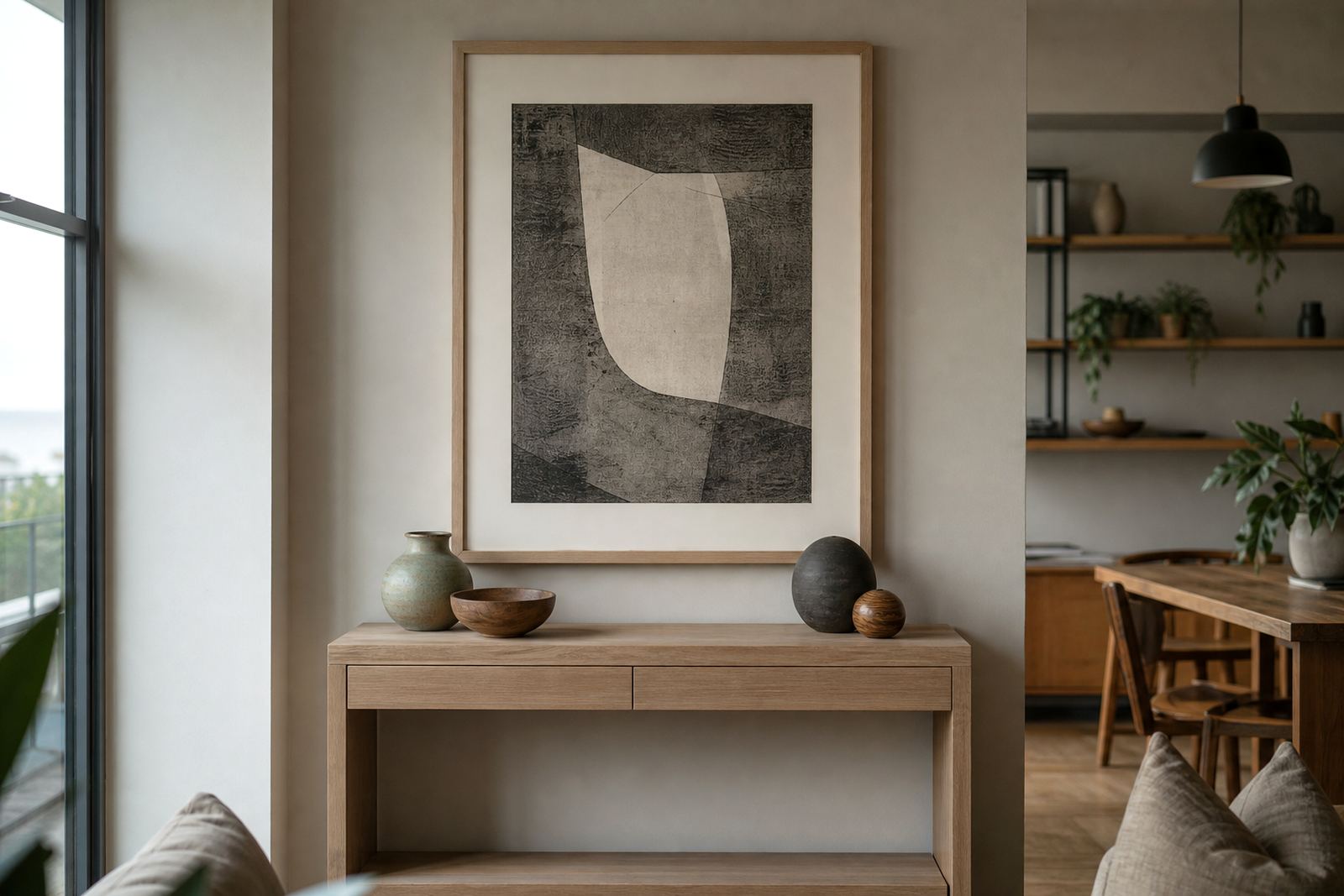
We often advise clients to think about furniture lines before frame lines. A print above a sofa should not crowd the ceiling and should sit comfortably over the backrest. In a study, the print can sit slightly lower so it feels connected to the chair and reading area. In narrow passages, a vertical format can keep the wall from feeling chopped up, especially in apartments and older Cape Town homes where wall lengths are limited.
- Measure the wall, then subtract the furniture height below it
- Leave breathing space around the frame, especially on smaller walls
- Choose horizontal works for wide lounges and vertical works for tight passages
- Use one large print or a controlled pair rather than too many small frames
The usual studio set up behind a home edition
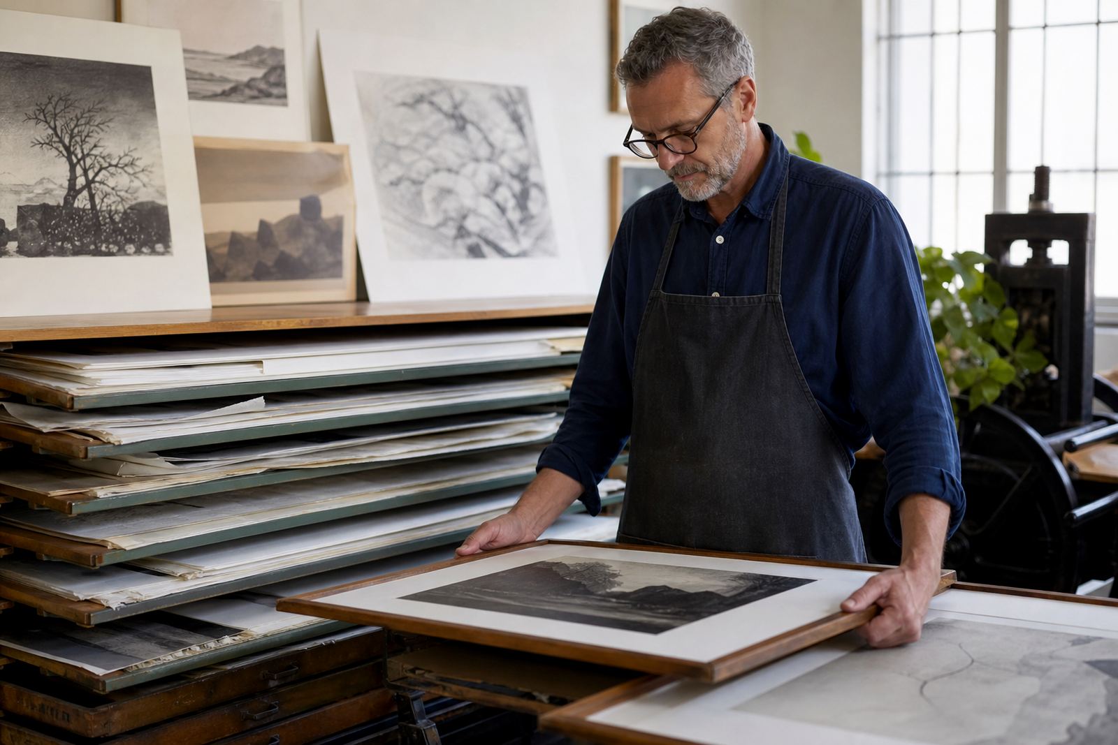
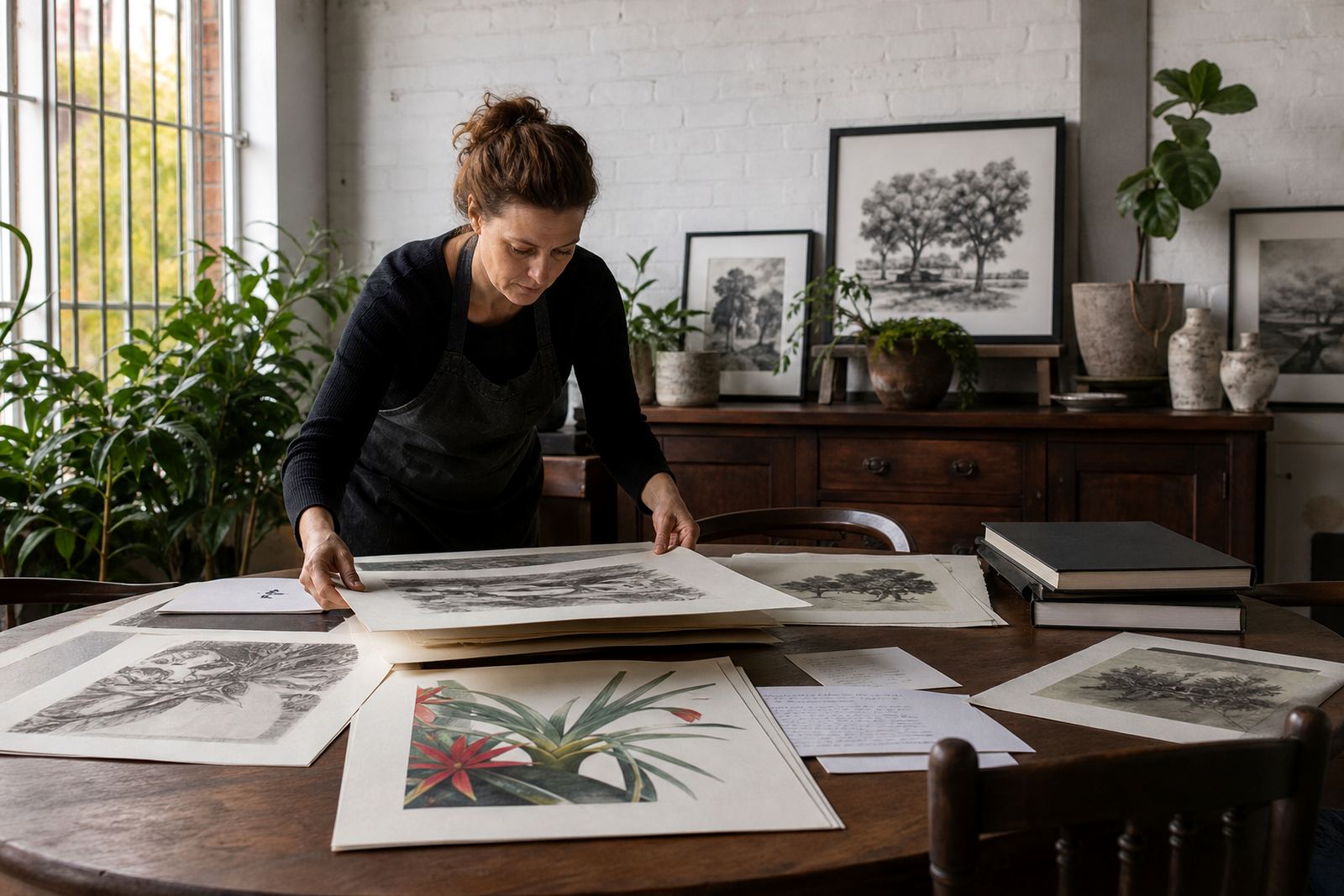
Home interior commissions usually move through a fairly clear studio process. The artist brings the drawing or image plan, we review edition size and paper choice, then make proofs to settle tone, colour and layout. From there the stone is prepared, the image is built up in layers, and the final edition is printed, signed and numbered. The team may also handle colour separation if the image needs more than one stone or more than one pass through the press.
For home interiors, clients often want a piece that looks finished but not overworked. That means careful paper consultation, sensible margins for framing, and editioning that keeps every sheet consistent. We also arrange archival packing so the work can travel safely to Johannesburg, Durban, Pretoria or anywhere else in South Africa without handling damage. It is a practical process, and it needs patience, because stone lithography rewards exact timing and steady pressure.
- Stone preparation and drawing on limestone
- Proofing sessions to settle tone and colour
- Edition planning and numbering
- Archival packing and framing coordination
How to plan a print that sits comfortably with your furniture
A home print should speak to the room, not fight it. If your furniture is already detailed, a lithograph with simpler lines can give the wall some rest. If the room is plain, a print with stronger colour or more visible stone texture can bring life without needing more objects. In coastal areas such as Sea Point, where humidity can affect paper and frames, good framing with sealed backing and archival materials is worth the extra care. In older houses, especially where paint finishes vary, neutral mats and clean frame profiles keep the work looking settled.
Collector advice matters here too. A limited edition should not be chosen only because it matches a cushion or rug. It should still feel right in six months when the room changes. That is why we suggest viewing the print at the size it will hang, not only as a small proof. A work that feels too tight on the wall can be hard to live with, while a slightly larger sheet may actually settle the room better.
Simple planning points often help more than trend driven choices:
- Match frame depth to the style of the room
- Keep paper away from direct afternoon sun
- Allow space above sideboards, consoles and reading chairs
- Ask for framing coordination before final packing
Common mistakes collectors make in living spaces
The most common mistake is buying for the sofa rather than the wall. A print can look good in a gallery setting and still feel wrong at home if the proportions are off. Another mistake is choosing a busy frame that competes with the image. Stone lithographs already have texture and depth, so the framing should support the work, not shout over it. People also sometimes hang editions too high, which makes the image feel detached from the room.
We also see prints placed too close to open windows in Cape Town and Durban homes, where salt air and direct light can age paper faster than expected. Bedrooms are another place where poor placement shows up quickly. If a work is above a bed, it should be secure, level and well spaced. Loose fittings are not worth the risk. Archival packing and careful mounting help, but the final location still matters.
- Do not hang at standing eye level if the work is meant for seated viewing
- Do not use cheap backing board that can warp in humidity
- Do not crowd several editions onto one wall without a plan
- Do not place paper art near steam, open windows or strong afternoon sun
Budget ranges for home interiors in Rand
Budget depends on whether you are buying a single print, framing one edition, or planning a small grouping for more than one room. As a general guide, collectors often start with a modest budget for the print itself, then allow a separate amount for framing, mounting and packing. If you are furnishing a first apartment in Woodstock, a family home in Stellenbosch, or a city flat in Johannesburg, it is usually better to spend carefully on one strong work than to spread the budget too thin across several weaker choices.
We can help with edition planning so the result stays within the intended range, and we can advise whether one large sheet or two smaller works will make better use of the budget. For clients who want to build a wall over time, a first purchase can be the starting point for a longer collection rather than a once off buy.
- Single print projects often suit entry level to mid-range budgets
- Framing can make a meaningful difference to the final total
- Edition size and colour complexity may affect the work involved
- Collector advice helps avoid spending on the wrong format
How to request a studio visit or enquire about a home wall
Clients reach us through the enquiry form on our contact page, and from there we can discuss the room, the wall size and the type of edition that suits the space. If you are in Sea Point, Newlands, Woodstock or anywhere else in Cape Town, a studio visit can help with paper samples, proofing and framing direction. For clients in Pretoria, Durban, Johannesburg or Stellenbosch, we can still guide the process with clear measurements and careful packing.
Bring the measurements of the wall, a few room photographs and any notes about colour or light. That makes it easier to plan an edition that feels settled in the home from the start. Whether the goal is one statement print or a quiet group for a passage wall, the aim is the same: a lithograph that feels at ease in the room and still feels worth keeping years later.