Why stone lithography suits hospitality spaces
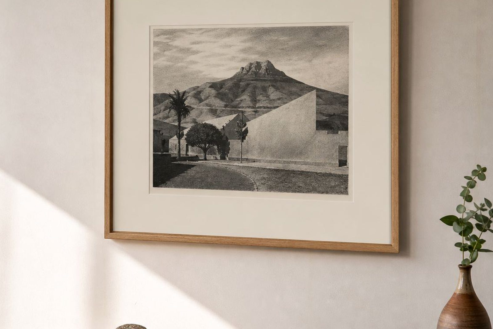
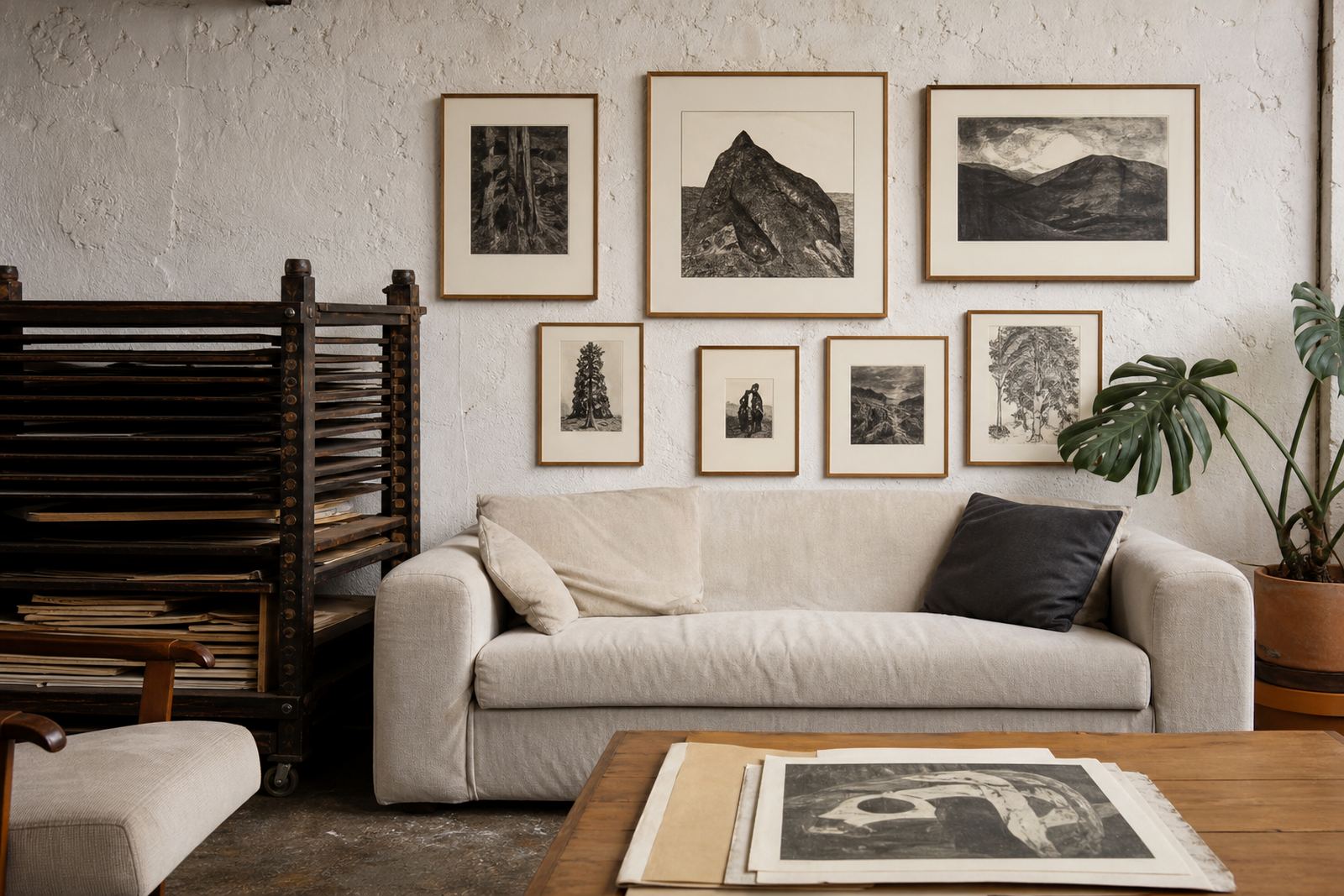
Stone lithography works well in hospitality interiors because it has a lived-in softness that sits comfortably with timber, linen, plaster and painted walls. Each print carries the hand of the artist and the printer, so the finished work feels personal rather than over-produced, which suits guesthouses and small hotels that want a welcoming, thoughtful atmosphere.
In Cape Town and other coastal towns, we also think about humidity, sun exposure and rooms that may be opened and closed many times a day. A good lithograph, properly printed on suitable paper and framed with care, can hold its presence without looking harsh. It gives a reception area or breakfast room a quieter kind of confidence.
Typical print set for guesthouses and reception areas
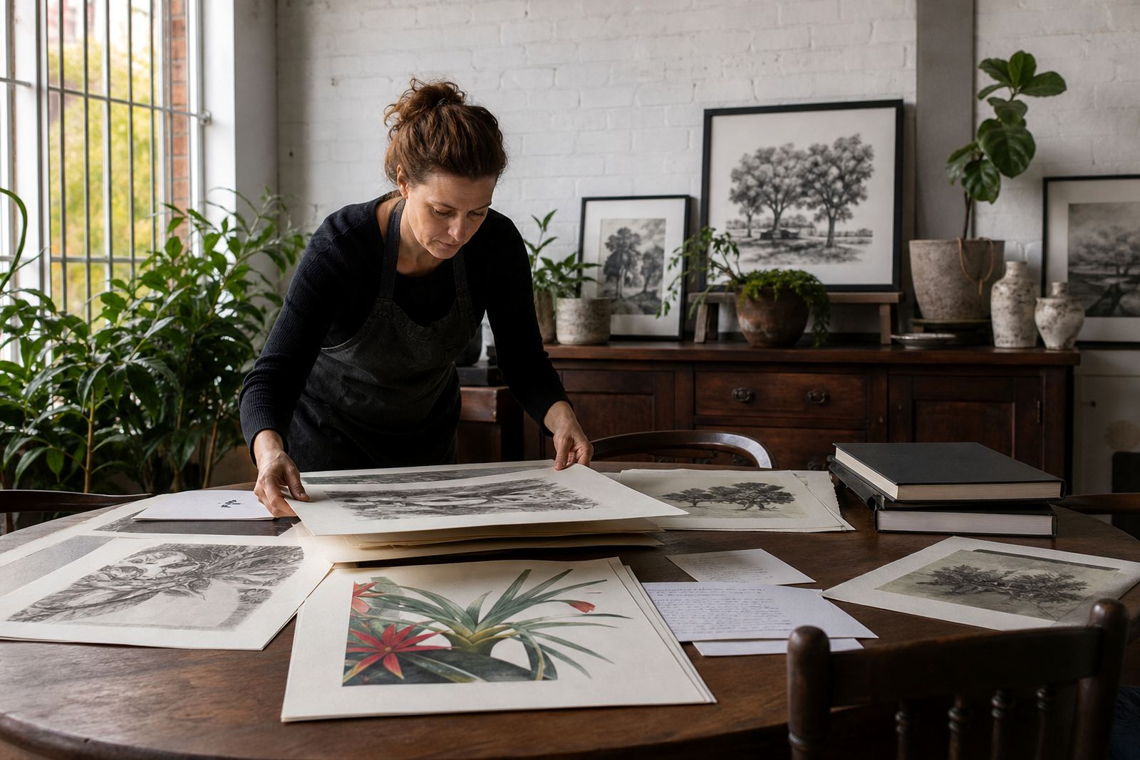
Most hospitality clients come to us looking for a small group of works that can carry a whole space. That might mean one strong statement print for reception, a pair for a corridor, and smaller works for rooms or stair landings. We often help with scale so the art does not get lost above a couch or overpower a narrow passage.
- One or two feature prints for reception, lounge or check-in points
- Matched works for corridors, stairwells or room clusters
- Smaller editions for compact walls near doorways or reading corners
- Framing that suits the finish of the property, from simple timber to slim black or white frames
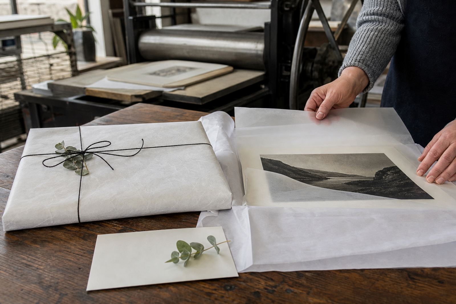
- Archival packing for safe storage of extra prints on site
Where the building has a lot of movement, such as a busy foyer or breakfast room, we often suggest stronger paper, good glazing and secure hanging hardware. It saves trouble later.
Stone lithography process from studio to wall
Stone lithography starts with a prepared limestone surface. The artist draws directly onto the stone with greasy materials, then the image is chemically fixed so ink will later adhere to the drawn areas and repel from the rest. Each colour requires careful planning, and for multi-colour work the print may pass through the press several times with exact registration. It is slow, but that is part of what gives the print its quality.
For hospitality projects, that process lets us control colour harmony across a set. A guesthouse may want warm earth tones in the dining room, softer neutrals in bedrooms, or a brighter accent in a lobby. We can discuss paper choice, colour separation and edition size before printing starts, so the final set feels consistent across the property.
- Stone preparation and image drawing
- Proofing sessions to test colour and placement
- Edition planning for the number of prints needed
- Signing and numbering once the edition is approved
- Archival packing for delivery or storage
Layout and hanging advice for welcoming interiors
For hospitality spaces, the best results usually come from careful spacing rather than crowding too many works onto one wall. A print needs breathing room, especially in reception areas where guests are making first impressions. In longer passages, repeating a consistent size or frame style can make the route feel calm and considered.
We also advise on sightlines. A print near the front door should be visible from a standing position, while works in a lounge should be placed where seated guests can take them in without strain. In bright north-facing rooms, avoid direct sun if possible and use proper glazing or UV-filtering solutions where suitable. Coastal humidity in places like Sea Point and Durban can also affect paper and framing if the materials are not selected carefully.
- Hang at eye level where possible, not too high
- Leave enough wall space around each work
- Match frame finishes to the property style
- Use secure fixings in plasterboard or older masonry walls
- Plan for cleaning access and easy replacement if a room is refurbished
Common mistakes we help clients avoid
One of the most common mistakes is choosing art that is too small for the wall. In a guesthouse lobby or a high-ceilinged stairwell, small prints can disappear and make the space feel unfinished. The opposite problem happens too, where oversized work crowds furniture or competes with signage and lighting.
Another issue is poor framing. Thin mount board, unsuitable backing or cheap glass can shorten the life of a print, especially where there is salt air or strong light. We also see clients order without thinking about edition continuity. If they need additional rooms fitted out later, it helps to choose an edition plan that allows for practical expansion, or a matched suite from the start.
Finally, some interiors rely on one-off impulse buys instead of a planned group. That can lead to clashing tones and uneven presentation. A short planning session saves money later and keeps the property looking intentional, not patched together.
Budget ranges in Rand for hospitality projects
Budgets depend on the size of the edition, the number of colours, the amount of proofing and whether framing is included. For guesthouses and boutique stays, we usually work within a practical range so the art collection feels coherent without overextending the fit-out budget. A small, well-chosen set for one room can be different from a full property rollout across several spaces.
As a guide, a modest project may start with a few framed prints for reception and common areas, while a larger property can plan for multiple walls and corridor groupings. Printing and editioning costs are affected by paper, size and complexity, and framing is usually a separate line item. We can discuss options for phased purchasing, which is useful when a property is opening in stages or refreshing one area at a time.
- Smaller single works for accent walls or bedrooms
- Mid-sized sets for lounge, dining and reception areas
- Grouped commissions for several rooms or a full corridor run
- Archival packing and storage for spare prints
- Collector advice if the owner wants to build a longer-term art programme
For many hospitality clients, the right approach is not the most expensive one, but the one that is well planned and easy to maintain.