What the brief asked for
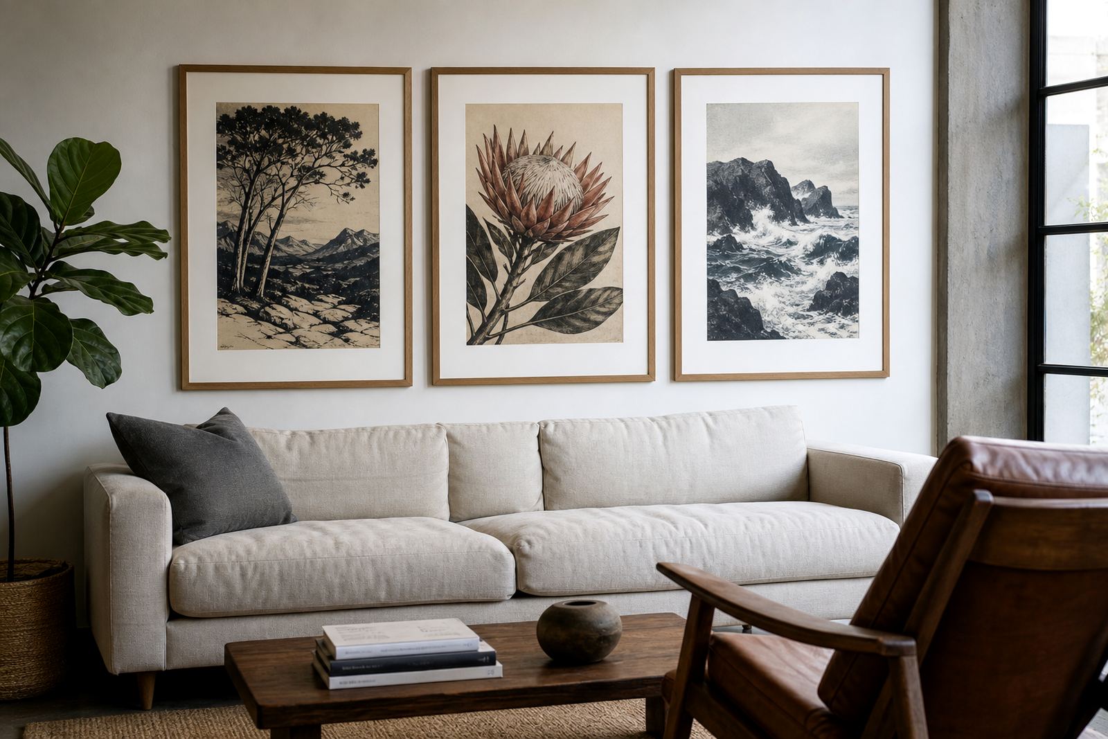
The client was an independent artist based in Stellenbosch working with a botanical subject that needed soft greens, fine line work and a calm, natural finish. The brief called for proof development before full edition printing, with each pass checked carefully so the final images would hold detail across the whole edition. Because the imagery relied on subtle variation rather than heavy contrast, the proofing stage had to be exact and repeatable.
We agreed to work from a small group of stones and build the colours step by step. That let us test how the image behaved on paper, how much ink each layer could carry, and where adjustments were needed in the key areas. In projects like this, a rushed proof can flatten the drawing, so we kept the pace measured and practical.
How stone lithography shaped the proofing
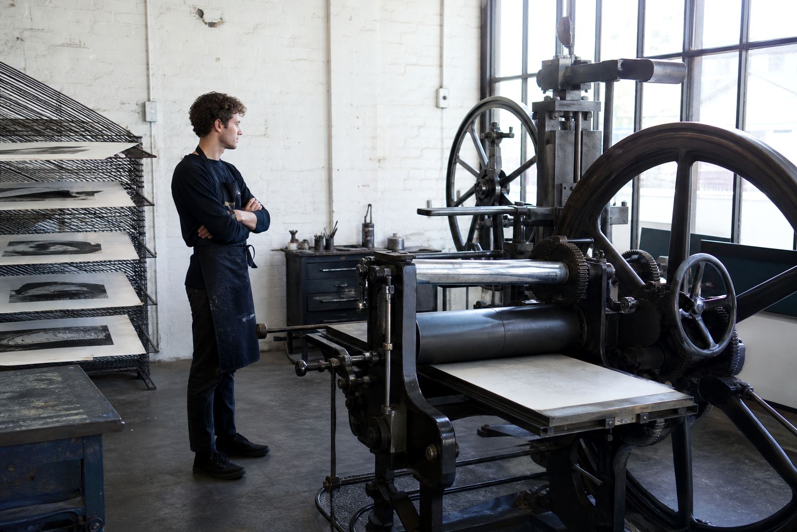
In stone lithography, the image is carried on a smooth limestone surface in a planographic process. The image is drawn or transferred onto the stone, then treated so the drawn areas accept ink while the non-image areas hold moisture and reject it. That balance is what gives lithography its fine detail, tonal range, and the slight living quality collectors value in a hand pulled print.
For this set, we used proofing to test how each colour sat against the base drawing and whether the botanical forms stayed sharp without becoming hard. Because stone retains a lot of nuance, it can reward careful handling, but it also asks for discipline in dampening, rolling and registration. The same marks that look gentle on the stone can shift if the paper, ink or pressure changes, so the proofing stage is where most of the decisions are made.
- Stone surface prepared for consistent ink acceptance
- Multiple colour passes checked against the drawing
- Registration confirmed before edition printing
- Tonal areas balanced for fine botanical detail
Proof stages and colour adjustment
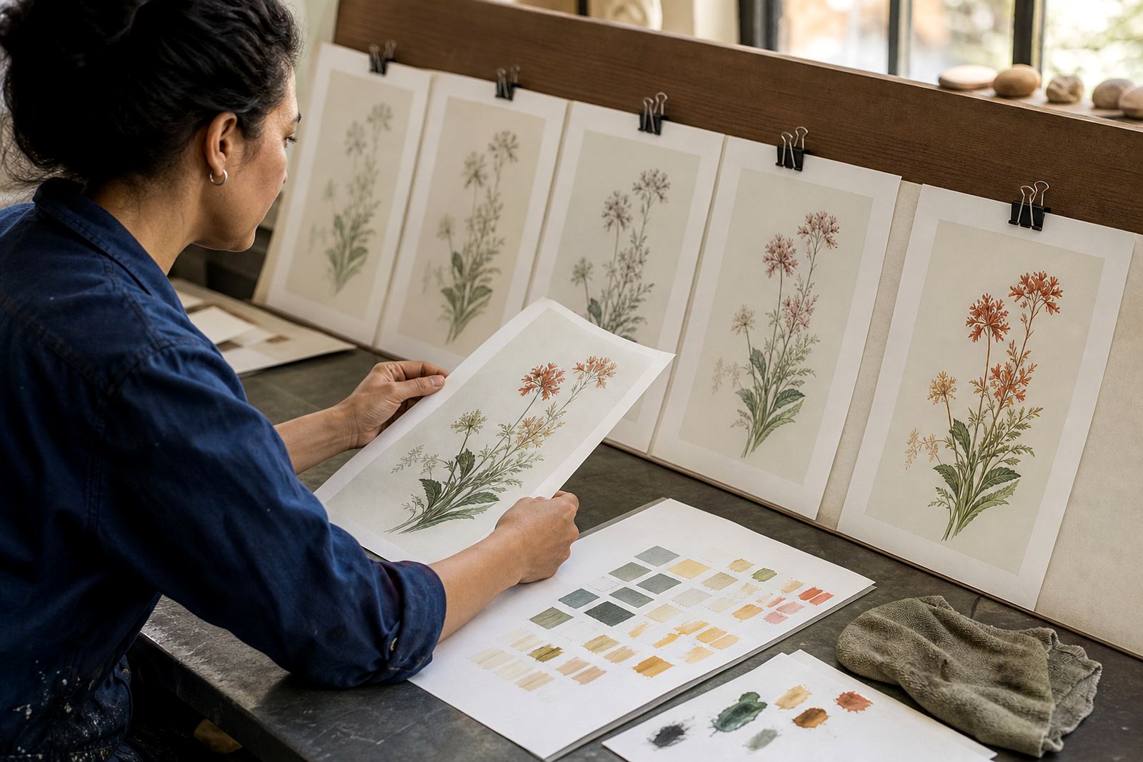
We began with a key proof from the main image stone, then introduced colour in separate layers. Each proof was inspected for density, edge clarity and how the greens reacted in brighter and shaded areas. Where the botanical forms needed more structure, we adjusted ink strength and reduced pressure. Where the image needed softness, we eased back on the roll and allowed the stone texture to speak a little more.
The process took three weeks from first proof to approved colour direction. That included time for drying between pulls, review with the client, and minor corrections to alignment and tone. The aim was not to make the print look louder, but to make the colours sit together naturally. In one proof round the upper leaf area read too cool, so we warmed that layer slightly and the image settled properly.
- Week 1: key drawing proof and paper selection
- Week 2: colour tests and registration checks
- Week 3: final approval proof and edition notes
Paper, editioning and handling choices
Paper choice matters in lithography because the sheet has to receive the ink cleanly and dry without warping. For this project we reviewed a few paper weights and surfaces before settling on a sheet that held the detail well and gave the botanical image enough body. The client wanted an edition suitable for sale to collectors, so we also considered how the sheet would perform in framing and storage across different climates, from Cape Town’s coastal humidity to drier inland conditions.
Editioning was kept tight and clear. Nomvula Phalatse oversaw the print pulls, while Bonga Mngadi assisted with numbering and sequence control. Shailen Naicker reviewed the proof direction with the artist, and Rukshana Kamaar handled the edition notes and collection details. Stefan Hattingh managed stone preparation and day to day studio checks, which helped keep each impression consistent from the first proof to the final sign off.
- Paper selected for fine detail and stable drying
- Edition plan set before the final proof round
- Sheets numbered and checked in order
- Handling kept minimal to protect the surface
The results for the botanical set
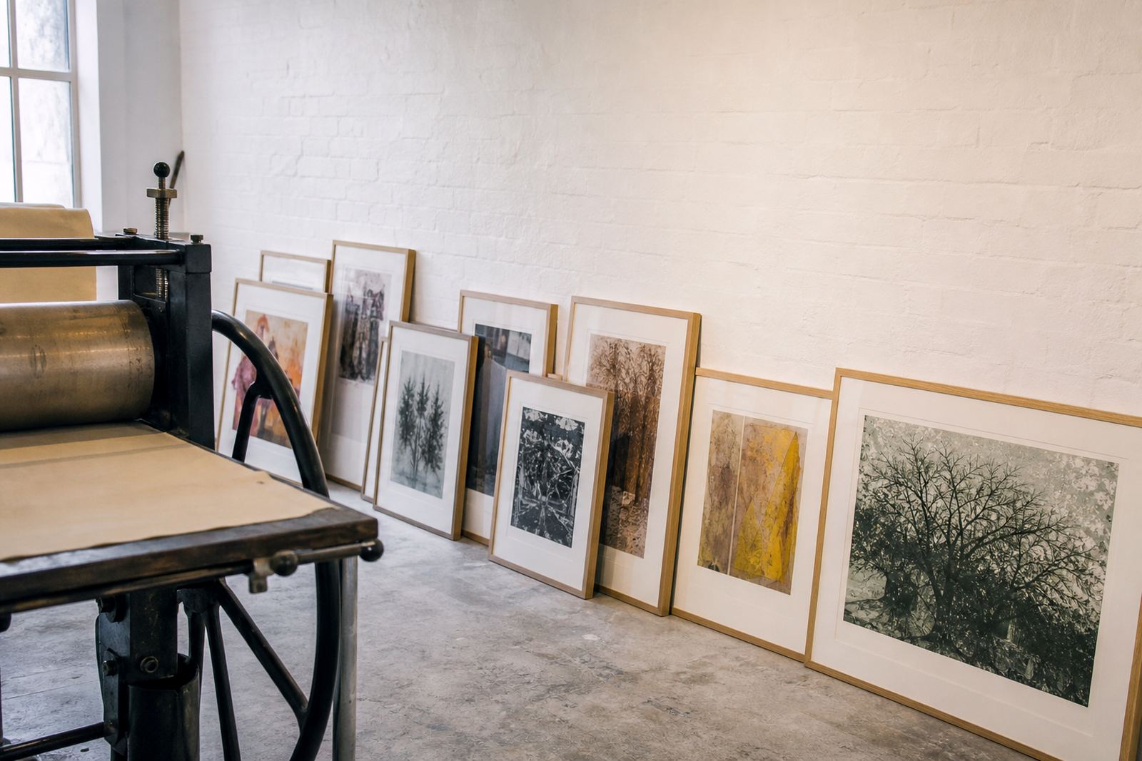
The final proof direction gave the image a quieter, more confident colour structure. The greens no longer competed with the line work, and the flowers retained their shape without feeling stiff. That balance is important in fine-art lithography, because the print should feel handmade yet controlled. The result was an edition ready for collector presentation, with enough tonal depth to work in both private homes and gallery viewing rooms.
We also supplied practical advice for storage and care. Prints should be kept flat, away from direct sun and handled with clean dry hands or cotton gloves. If a collector is framing straight away, a spacer or window mount helps prevent contact with the image surface. For homes near the coast, especially places like Sea Point or Durban, we suggest extra caution with damp walls and sudden temperature changes. Even in the Western Cape, sea air can affect unframed work if it is stored carelessly.
What we would repeat on the next edition
If we were repeating this kind of botanical proofing project, we would keep the same slow proof ladder and the same paper testing method. It gave the client confidence and kept the final edition clean. We would also allow time for one extra colour review, because subtle plant imagery often changes more than expected once the first layer is down. A small correction early on saves a lot of trouble later.
For artists working from Stellenbosch, Cape Town, Johannesburg or Pretoria, proofing is often the stage that defines the whole edition. It is where the image finds its voice, and where the technical choices become visible. At our Woodstock studio, proofing is always treated as part of the artwork rather than a side task, and that was exactly the right approach here.
- Keep proof stages separate from final edition pulls
- Allow time for drying and rechecks between colours
- Choose paper only after test impressions
- Record every adjustment for future reprints
Edition details
| Project type | Stellenbosch studio proofing for a botanical image set |
|---|---|
| Process | Stone lithography with staged colour adjustment |
| Timeline | 3 weeks from first proof to approved direction |
| Location | Woodstock, Cape Town studio with client input from Stellenbosch |
| Output | Limited edition proof development and final print guidance |
| Services used | Stone Lithography Printing, Edition Planning, Proofing Sessions, Colour Separation, Paper Consultation, Editioning, Signing And Numbering |