The brief from a Salt River gallery team
The client was a gallery-style team in Salt River, Cape Town, working with an artist on a limited edition for a local presentation and a small collector release. The brief was clear from the start: keep the drawing quality of stone lithography intact, hold the colour work steady across the edition, and make sure each sheet was ready for framing and careful handling from the moment it left the studio.
Because the work was intended for a public-facing presentation, there were a few practical constraints. The edition needed to be consistent across the full run, the paper had to accept layered colour without buckling, and the final sheets had to suit a gallery wall as well as private collection storage. We also had to allow for drying time, signing and numbering, and safe packing for clients across Cape Town and beyond.
Stone lithography suits this kind of job well because it preserves a very direct mark. The image is drawn on limestone with greasy materials, then chemically prepared so the printed areas attract ink while the non-image areas hold water. That allows fine tonal shifts, crisp lines and a softness in the mark that many artists prefer for edition work. It is also a process that rewards patience, which matters when the result has to feel consistent from first proof to final print.
How we planned the edition and proofing
Before any printing began, we set up the edition plan with the artist and gallery contact. That meant deciding the final print size, the number of impressions in the edition, the order of colours, and where proofing would stop. In stone lithography, those decisions affect everything that follows, so getting them straight early saves time and paper later.
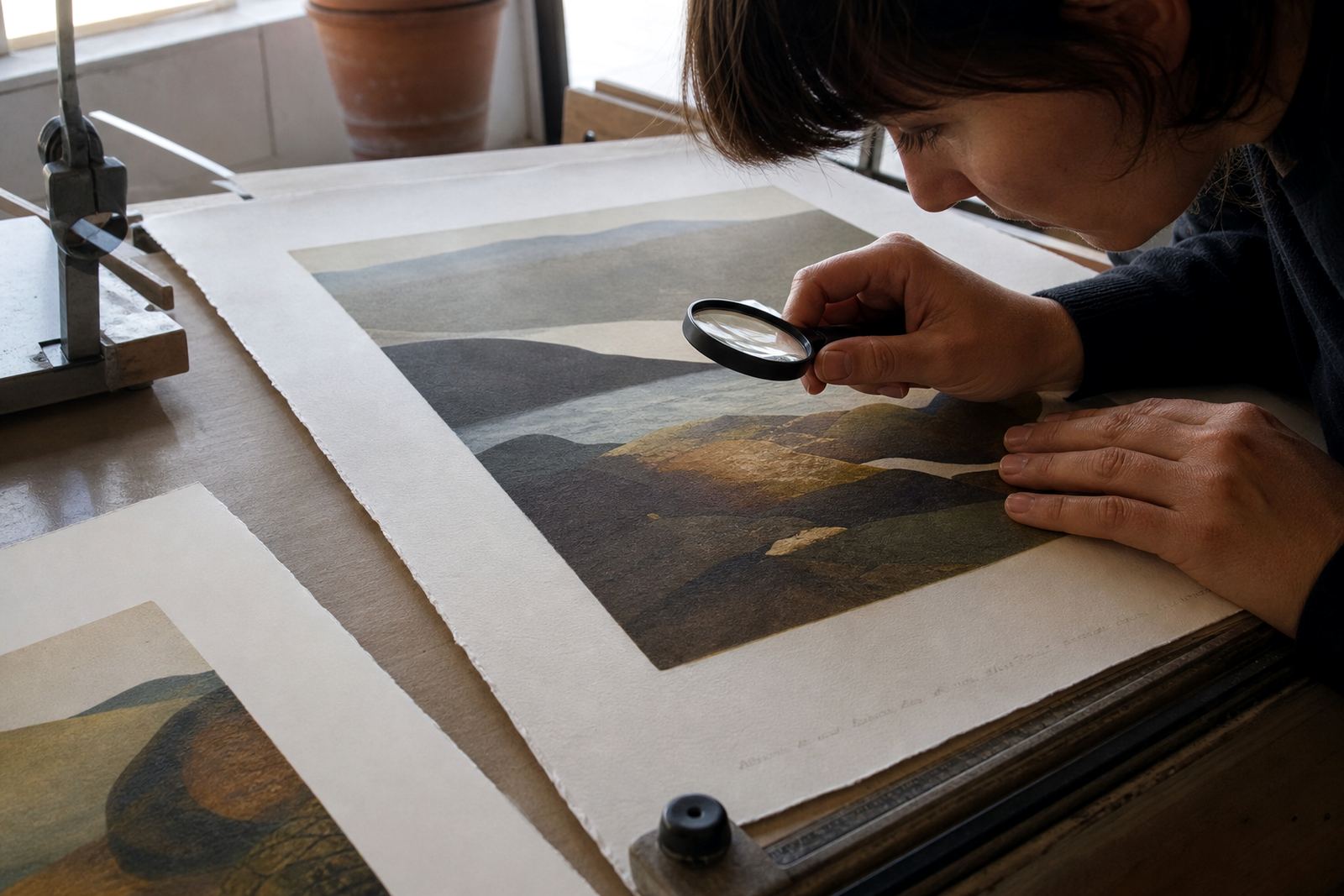
We ran a proofing session to test the balance between image areas, edge detail and colour strength. This included checking how the paper took the first layers and how the later colours sat over the earlier ones. In one section, the tonal range needed a softer hand so the image would not feel heavy under gallery lighting. That kind of judgement is part printer skill, part practical trial.
- Edition size confirmed before production began
- Proofs reviewed for tone, registration and paper response
- Colour sequence adjusted to suit the final artwork
- Signing and numbering planned for the drying stage
The whole planning phase took the first week and a half of the project. That gave us enough room to correct small registration shifts, refine the inking approach, and confirm that the paper choice would remain stable in Cape Town’s changeable humidity. On the coast, paper can move a bit more than expected, so we always build that into the schedule.
Printing on stone with care and control
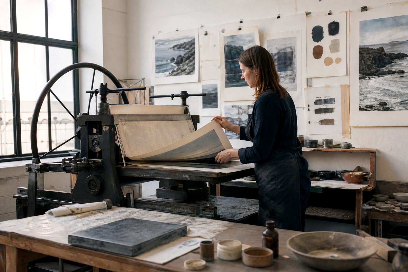
Once the edition was approved, printing moved into the main production phase. Stone lithography begins with the prepared limestone matrix, which is dampened before each impression and rolled with ink only where the image has been established. Because the process is hand-led, each pull needs close attention to pressure, moisture and registration.
For this run, we worked in controlled batches so the ink density stayed even from sheet to sheet. We also kept a close eye on drying intervals between colour layers, which is especially important when a print carries more than one tone or a fine overprint. A small shift can change the whole reading of the image, so we checked every pass against the same standard. The artist was invited in for press checks at the key stages, which kept the edition aligned with the original intention.
The production stage ran over three weeks in total. That included preparation, proofing, final printing and the first drying period. It was a focused schedule, but not rushed. In our experience, the best editions are made when everyone knows what must stay fixed and where there is room for small adjustments. That approach helped us keep the mood of the work intact without losing consistency.
Paper, finishing and archival packing
Paper selection was an important part of the job because the artwork needed a surface that could take both pressure and layered colour without losing detail. We advised on a paper with good wet strength and a clean edge for presentation framing. The sheet size was chosen to leave a proper border around the image, which is useful for handling, signing and later mounting. For collectors, that margin matters as much as the printed area.
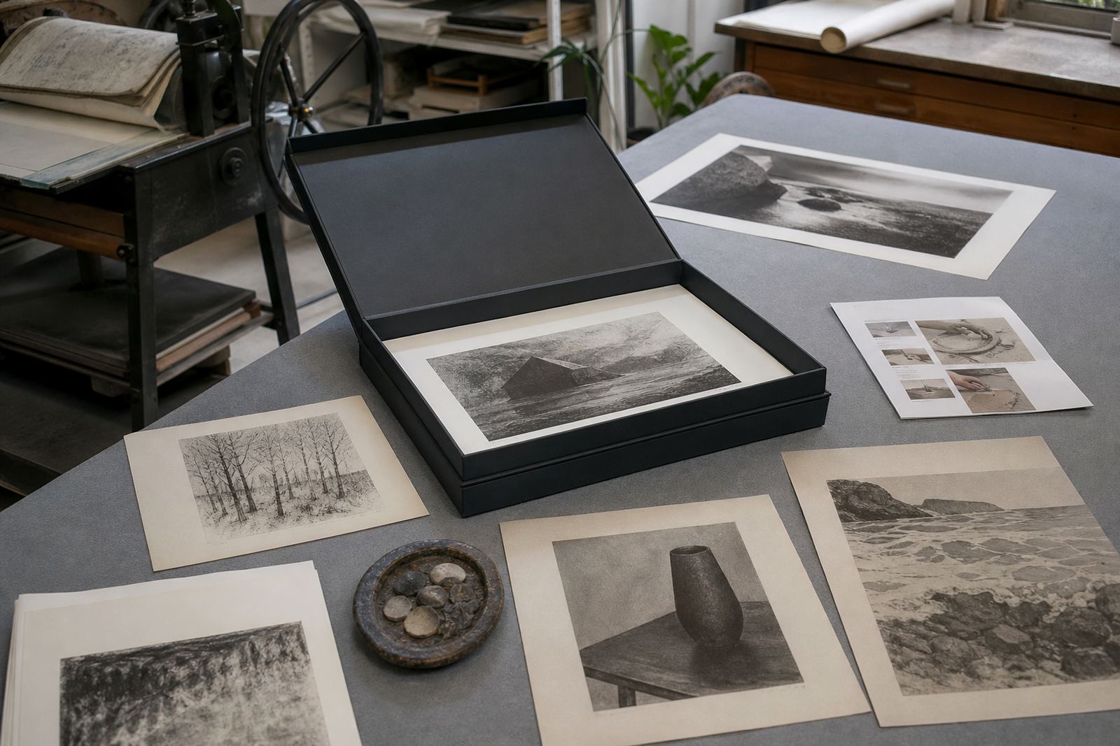
After printing, each sheet was dried flat and checked for surface marks, ink consistency and registration. We then handled signing and numbering according to the agreed edition plan. Where the gallery needed presentation-ready sets, we also arranged archival packing so the prints could travel safely to other parts of South Africa. That included protective interleaving, rigid support and careful wrapping for movement through courier networks and hand delivery alike.
- Paper chosen for print stability and clean presentation borders
- Flat drying used to reduce curl and surface distortion
- Each print inspected before signing and numbering
- Archival packing prepared for travel to collectors and galleries
This part of the project is often overlooked, but it affects the life of the print more than people realise. A well printed edition can still suffer if it is packed badly or stored in damp conditions. For South African collectors, especially in coastal areas like Durban and Sea Point, we always recommend acid-free storage and keeping prints away from direct sun, steam and high heat.
What the gallery-style run achieved
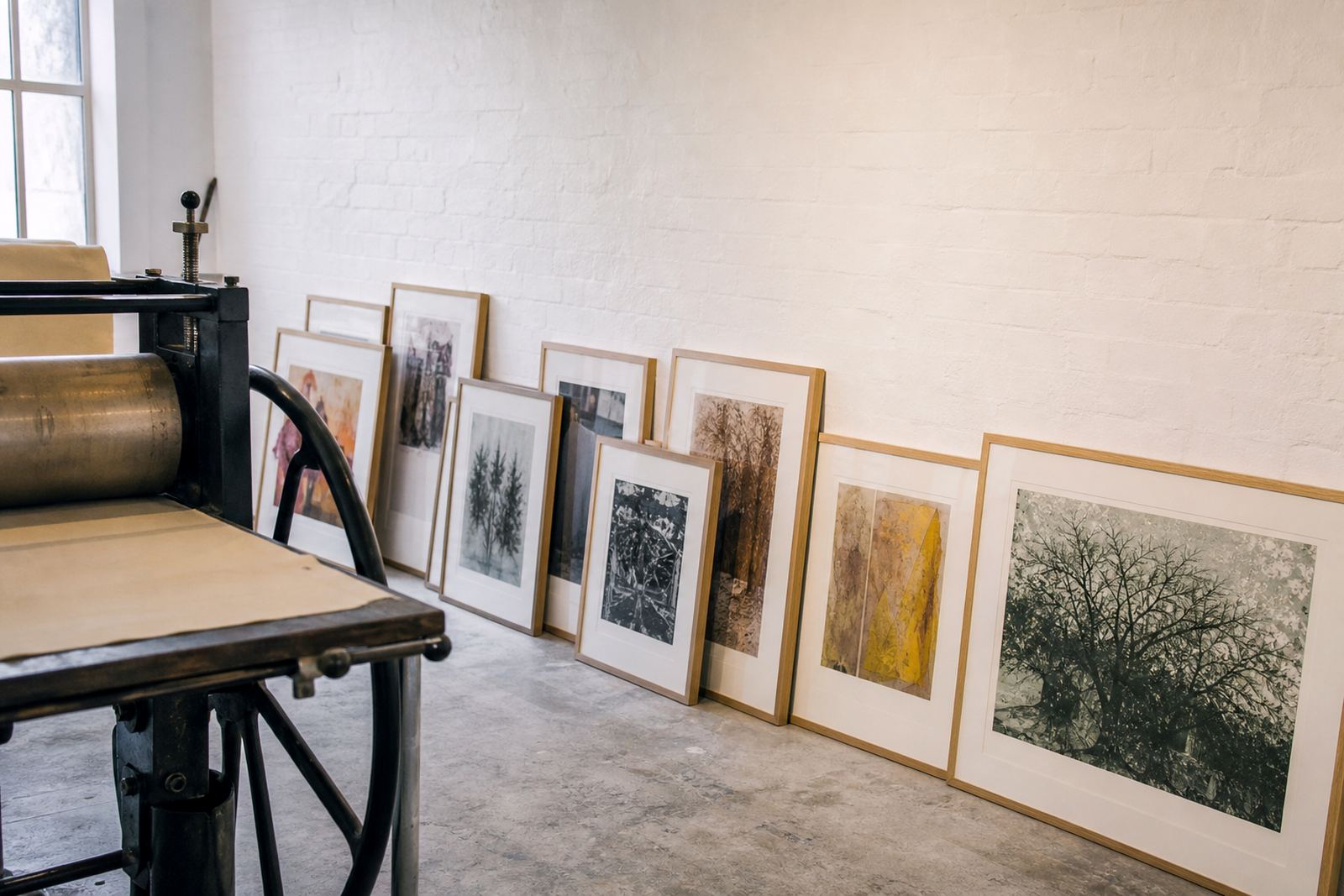
The result was a clean, consistent edition that suited the gallery-style presentation in Salt River and also held up well for collectors taking work home. The image retained the softness and tonal depth that make stone lithography distinctive, while the colour remained stable across the run. The final sheets were ready for framing, and the edition notes were clear for anyone handling the work later.
From a studio point of view, the project worked because the plan was realistic. The artist had room to refine the image, the gallery knew what could be achieved in the time available, and the edition size matched the production pace. That made it possible to keep quality high without unnecessary pressure on the stone or the paper. It also meant the finished prints could move from studio to wall with very little extra intervention.
If we were to repeat the job, we would follow the same structure: early proofing, fixed edition planning, and a clear drying schedule before signing. We would also keep the final paper choice and packing method exactly as tested here. Those decisions protected the work during a period of mixed weather and busy local logistics, and they would do the same again.
What we would do again on a future edition
For a similar project, we would again start with a short planning session on edition size, colour order and final use. That is the most efficient way to keep a print job on track, especially when the work must suit both a public presentation and private collecting. We would also keep the proofing stage tightly focused so the artist can make decisions with the actual printed surface in front of them, not a digital mock-up.
We have found that stone lithography works best when the studio, artist and collector expectations are all clear from the outset. That allows the image to develop naturally while still meeting the practical needs of a real edition. For this Salt River project, the approach gave us a good result and a straightforward handover, which is exactly what a serious print run should deliver.
Edition details
| Project type | Limited edition stone lithography run for a gallery-style presentation |
|---|---|
| Location | Salt River, Cape Town |
| Production period | 3 weeks |
| Edition format | Signed and numbered limited edition |
| Studio services | Edition Planning, Proofing Sessions, Colour Separation, Paper Consultation, Editioning, Archival Packing |
| Final use | Gallery presentation and collector sales across South Africa |