A student brief that needed real studio discipline
The brief was to help a young artist understand how a drawing becomes a finished stone lithograph and how an edition is planned from the first mark to the final signed print. The work came to us through our enquiry process from Hatfield, Pretoria, and the edition was handled at our Woodstock, Cape Town studio with regular mentor check-ins throughout.
The artist wanted a print that felt direct and personal, but still followed the standards expected by collectors. That meant balancing freedom in the drawing with the discipline of stone preparation, proofing and edition control. We kept the edition small and manageable, so the student could take part in each stage and see how decisions at the stone affect the final image.
- Project type: mentored student edition
- Client location: Hatfield, Pretoria
- Studio base: Woodstock, Cape Town
- Print method: stone lithography
- Edition format: limited edition with proofs
Why stone lithography suited the image
With stone lithography, the image sits on a flat stone rather than being cut or etched into it. The artist draws on the stone with greasy materials, the surface is then treated so that ink accepts only the drawn marks and repels the non-image areas with water. It is a demanding process, but it rewards careful drawing with rich tone and a very direct mark.
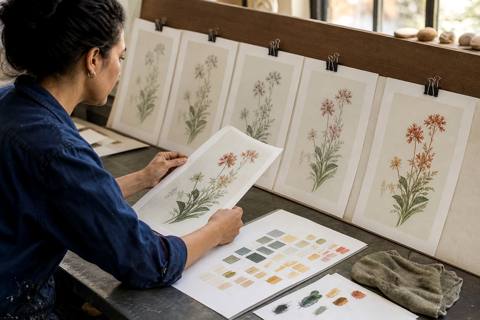
For this edition, the student wanted soft tonal shifts and crisp line work in the same print. Stone lithography allowed us to build that contrast through drawing pressure, tusche washes and controlled rolling of colour. In South African light, strong contrast can get lost very quickly if the image is not handled well, so we kept close watch over density, registration and paper response from the first proof onward.
- Stone surface prepared for even ink transfer
- Drawing carried tonal and linear detail
- Proofs used to judge contrast and registration
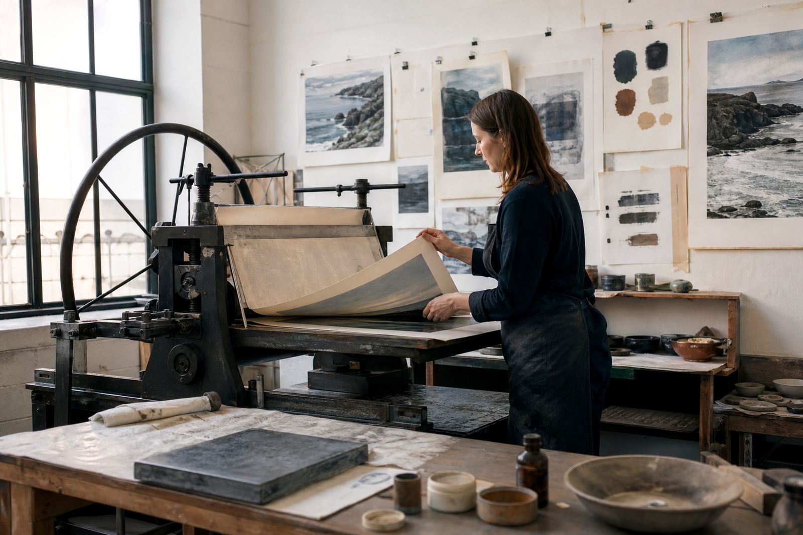
- Final edition printed with hand-fed passes
Constraints, teaching points and studio limits
The main constraint was time. A student project needs enough room for learning, but not so much that the edition drifts or the paper handling becomes inconsistent. We planned the work in a compact sequence and used each stage as a teaching point. The artist needed to understand how moisture, ink viscosity and pressure affect a stone, especially on days when Cape Town humidity changes the way the surface behaves.
We also had to keep the edition practical for long term storage and shipping. The paper had to suit the image, the margins had to allow proper handling, and the final sheets had to be safe for collectors in other cities without scuffing or cockling. That meant careful paper consultation, drying time between pulls and neat archival packing at the end.
- Printing window: 3 weeks
- Proofing sessions: 2
- Edition size: small limited run
- Paper choice: archival printmaking paper with good surface strength
What we supplied in the workshop
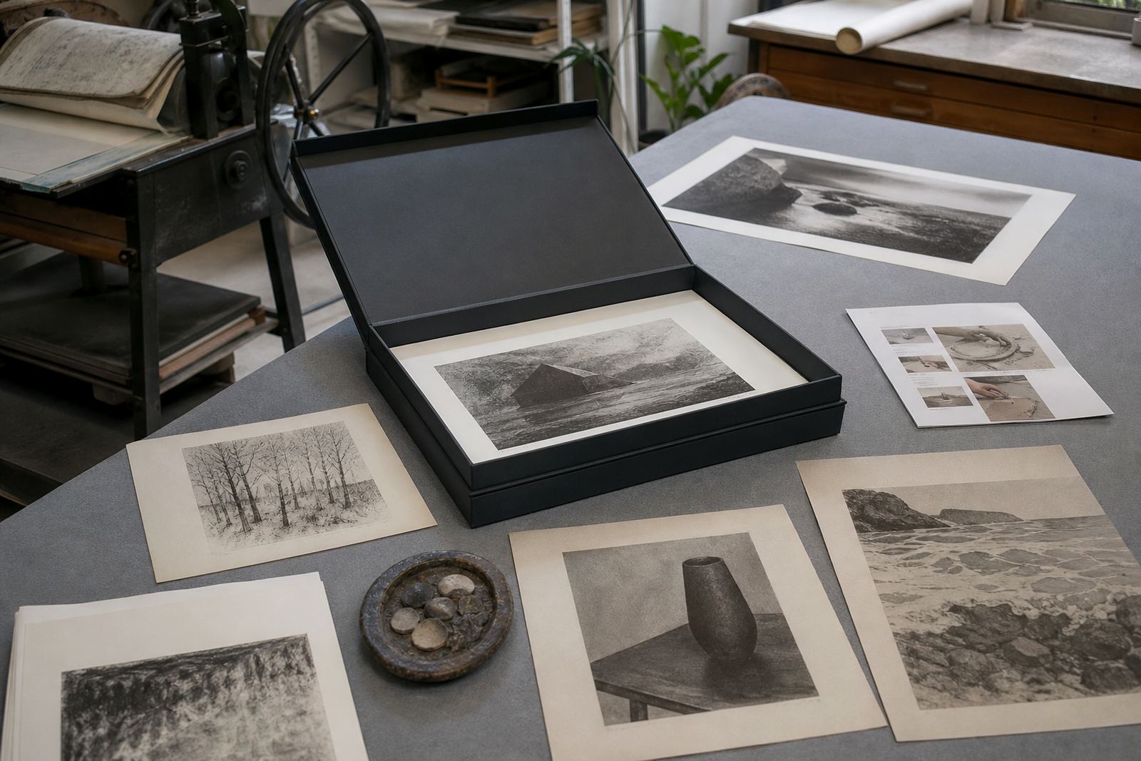
We handled the technical backbone of the edition while keeping the artist involved in decisions. That included stone preparation, image transfer, proofing, colour separation for the print layers and the final editioning run. During the process, the student sat in on pull decisions, registration checks and the signing stage, so the edition was not just produced, it was understood.
Our role also covered practical studio guidance. We explained how to read a proof, how to spot weak tone before it becomes a fault in the edition, and how to judge when a stone is ready for the next pass. In a working print studio you cannot guess, you test, and that habit was one of the most useful parts of the project.
- Stone preparation and graining
- Proofing and image adjustment
- Colour separation for layered printing
- Editioning, signing and numbering
- Archival packing for collection and transit
How the edition resolved on press
The final prints held the detail the artist wanted, with a clear separation between drawn line and tonal field. Because the edition was closely managed, each sheet stayed consistent across the run. The student could see how slight pressure changes alter the image, and how important it is to keep ink and dampening steady from the first print to the last. That lesson matters whether a print stays in Cape Town or travels to Johannesburg, Durban or Pretoria.
By the end of the edition, the artist had a better grasp of the full lithographic workflow and a print that could stand on its own as a finished collector's work. The project was small, but it covered the essentials: process, discipline, judgement and final presentation.
- Clean line preserved across the edition
- Even tonal build on final sheets
- Consistent registration through the run
- Collector-ready presentation on completion
What we would repeat on the next student edition
For another student edition, we would still use the same structure: a clear brief, a short proofing cycle and close involvement from the artist at each turning point. That approach works well for a student because it keeps the learning focused and stops the project becoming too technical too fast. It also gives collectors a print that feels resolved, not overworked.
For young artists entering stone lithography, the most useful thing is often not more theory, but a clear view of how the stone behaves under real studio conditions. That is where confidence grows. The process teaches patience, and it rewards exact work. For a first serious edition, that combination is hard to beat.
- Keep the edition size realistic
- Plan proofing before final printing
- Build in drying and handling time
- Protect the sheets with proper archival packing
Edition details
| Project | Hatfield Student Edition |
|---|---|
| Client type | Young artist, Hatfield, Pretoria |
| Studio location | Woodstock, Cape Town |
| Process | Stone lithography with proofing and editioning |
| Timeline | 3 weeks |
| Deliverables | Limited edition prints, signed and numbered, archival packed |