A coastal brief with strong colour and soft edges
The client was an independent visual artist based in Durban, working from a small studio near the beachfront and preparing a new body of work for collectors in KwaZulu-Natal and further afield. The brief asked for a print that felt close to the sea without becoming literal: colour-rich, atmospheric and built from layered wash textures that could hold movement, salt air and the changing weather along the coast.
From the outset, the main requirement was clarity in the edition. The image needed to keep the softness of hand-drawn marks while still producing a clean and repeatable final print. Because the edition would travel to collectors in different parts of South Africa, the artist also wanted paper and packing that would stand up well in transit and in long term storage.
- Client type: independent artist
- Town: Durban
- Edition goal: limited fine-art release for collectors
- Visual direction: coastal atmosphere, layered wash texture, strong colour transitions
Why stone lithography suited the image
Stone lithography works from the simple principle that grease and water repel each other. The image is drawn or built up on a prepared limestone surface, then processed so the drawn areas accept ink and the non-image areas hold moisture. It is a hand driven print method, which makes it well suited to subtle tonal changes, visible mark making and the slight variations that collectors value in a fine-art edition.
For this project, the stone process gave us the right range for layered washes and colour passages that needed to feel light, mineral and a little uneven in the best sense. We could hold the softer transitions in the sky and water while keeping stronger edges where the composition needed structure. That balance is difficult to achieve with a flat digital look, but stone handles it well when the drawing is built carefully and the stones are prepared properly.
- Process used: stone lithography on prepared limestone
- Method: multi-stone colour printing
- Key advantage: tonal variation and hand-drawn texture
- Edition control: consistent hand printing with small natural variation
Planning the edition from proof to final run
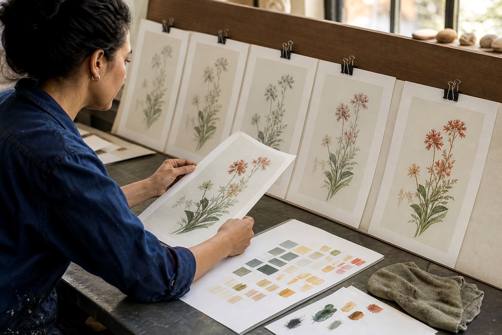
We started with edition planning and a technical review of the artwork. The image was separated into colour layers so each tone could be printed cleanly, and we tested how the washes would sit on the chosen paper. In a coastal subject, colour balance matters a great deal because cooler sea tones can easily go flat while warm sand notes can become muddy if the sequence is not set correctly.
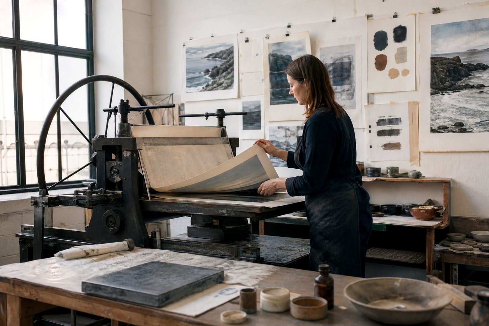
Several proofing sessions followed. These let us adjust the strength of each stone, refine the overlap between colours and settle the registration so the layers aligned across the full edition. We also checked how the paper responded in the studio, especially during cooler winter mornings in Cape Town when humidity and drying times can shift a little. That kind of care saves trouble later on.
- Proofing sessions: multiple rounds before final printing
- Technical focus: colour separation and registration
- Paper choice: archival fine-art sheet selected for surface and stability
- Studio note: drying and handling adjusted for Cape Town humidity changes
Printing, signing and numbering the edition
Once the proofs were approved, the edition moved into final printing. The stones were prepared and brought to press in sequence, with each colour applied by hand. That process takes patience because every impression has to sit neatly with the one before it, and any shift in pressure or moisture can show immediately in the finished sheet. For this release, we kept close control through the run so the image stayed balanced from first print to last.
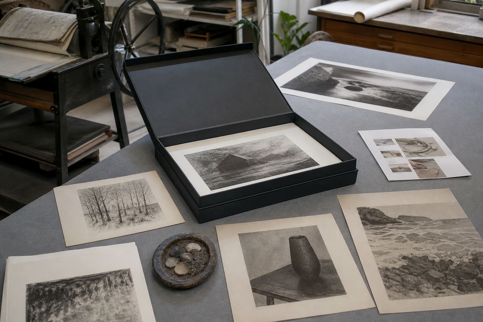
After printing, each sheet was dried flat and checked before signing and numbering. Editioning was handled carefully so the artist could present a consistent, limited run to collectors. We also kept aside a small number of studio records for future reference, which is useful if additional sheets are ever requested or if a collector needs details about the print state later on.
- Printing method: hand pulled edition on press
- Editioning: signing and numbering completed after drying
- Quality checks: sheet by sheet inspection
- Edition format: limited fine-art print run
Packing for collectors along the coast and inland
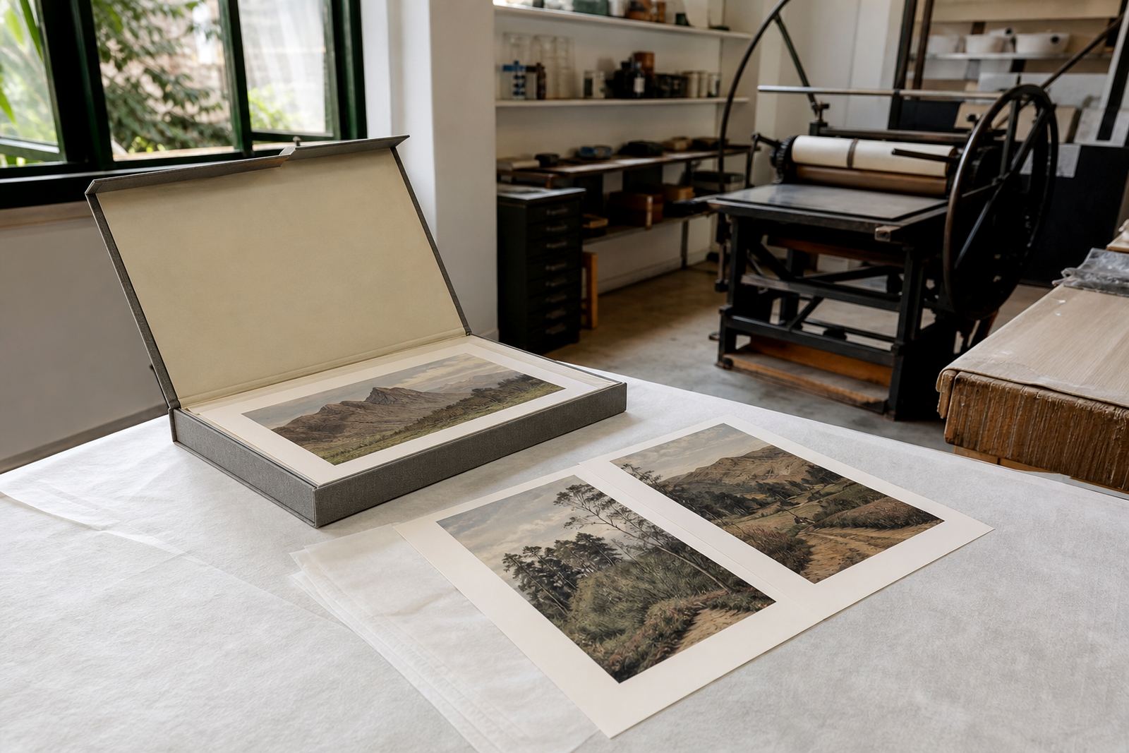
Because the prints were going to collectors in Durban, Cape Town, Stellenbosch, Johannesburg and Pretoria, packing had to be practical and protective. We used archival packing materials, interleaving and rigid support to keep the sheets flat and safe during transport. Coastal humidity can be hard on paper if works are left exposed, so the packing stage matters as much as the printing stage.
Framing coordination was also part of the service. Some collectors preferred to keep the prints unframed until they were ready to hang them, while others asked for guidance on framing choices that would suit the paper and the colour range. For those decisions, we advised on glazing, backing and placement so the print can be displayed without unnecessary risk from sun, dust or moisture.
- Packing: archival materials and rigid support
- Delivery context: coastal and inland destinations
- Collector support: framing coordination and care advice
- Handling note: keep prints dry, flat and out of direct sun
What the release achieved and what we would repeat
The final release kept the atmosphere of the coast while still reading as a fine-art lithograph with clear structure and depth. The washes came through with good softness, the colour layers held their place, and the edition retained a handmade feel from sheet to sheet. The result gave the artist a body of work that could be shared confidently with collectors across South Africa.
If we were to do a similar release again, we would follow the same approach: start with tight edition planning, allow for enough proofing time, and choose the paper only after testing the image on press. For a coastal subject, that process is worth it because the final result depends on small decisions made early. A good stone lithograph is built step by step, not rushed. That was the case here, and it paid off well.
- Timeline: planned and produced over several weeks
- Result: colour-rich limited edition with strong tonal range
- Repeatable approach: proof carefully, then print with consistent pressure and moisture control
- Best practice: allow time for drying, checking and safe packing
Edition details
| Project type | Limited edition stone lithography release |
|---|---|
| Client base | Independent artist in Durban |
| Studio location | Woodstock, Cape Town |
| Printing method | Multi-stone colour lithography |
| Edition services | Proofing, signing and numbering, archival packing |
| Collector destinations | Durban, Cape Town, Stellenbosch, Johannesburg and Pretoria |