Brief from an Observatory collector client
The brief came from a private collector in Observatory who wanted a compact release of abstract lithographs for a small group of buyers in Cape Town and other major centres. The work needed to feel disciplined and quietly expressive, with enough colour variation to give each print its own character while still keeping the edition consistent across the run.
The client wanted prints that would be suitable for framing and long term keeping, so we planned the project around stone lithography, edition control and archival packing from the start. The release was intended for collectors who understand the value of hand printed work, not mass production, and the final editions needed to reflect that level of care.
- Project type: small collector release
- Location: Observatory, Cape Town
- Edition format: limited edition lithographs
- Finish: archival packing for collector delivery
Why stone lithography suited the edition
At the heart of stone lithography is the natural repulsion between grease and water in a planographic process. The image is drawn or prepared on a stone surface, then treated so that ink adheres only to the image areas when the print is pulled. It is valued for the way it can hold subtle marks, tonal shifts and layered colour with a very direct hand made quality.
For this release, the process was a good fit because the artwork depended on soft edges, textured fields and restrained colour changes rather than hard mechanical repetition. Stone gives a particular depth to those areas, and each proof can be checked carefully before the edition is completed. In a small edition, that level of control matters alot.
- Best suited to tonal, layered and drawn imagery
- Allows accurate proofing before full editioning
- Gives a distinct surface quality that collectors recognise
Edition planning, proofing and colour separation
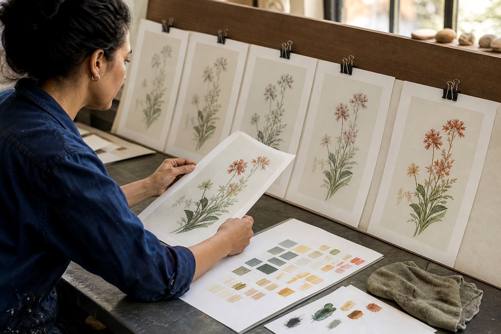
We started with edition planning and colour separation so the final print set would stay consistent from the first proof to the last sheet. Because the release was small, every colour decision had to work within a tight range of ink mixes and stone registrations. The goal was to keep the edition coherent while still giving each layer enough room to breathe.
Proofing sessions were used to test balance, density and drying behaviour on the chosen paper. We also checked how the images would handle Cape Town humidity in the studio and during packing, because moisture can affect paper movement and drying times. This is especially important for collectors close to the coast or receiving work in summer months.
- Proofs reviewed for tone, balance and registration
- Colour layers adjusted before the final edition run
- Paper selected for stability, surface feel and presentation
- Drying time allowed between stages to protect the edition
What we supplied in the studio
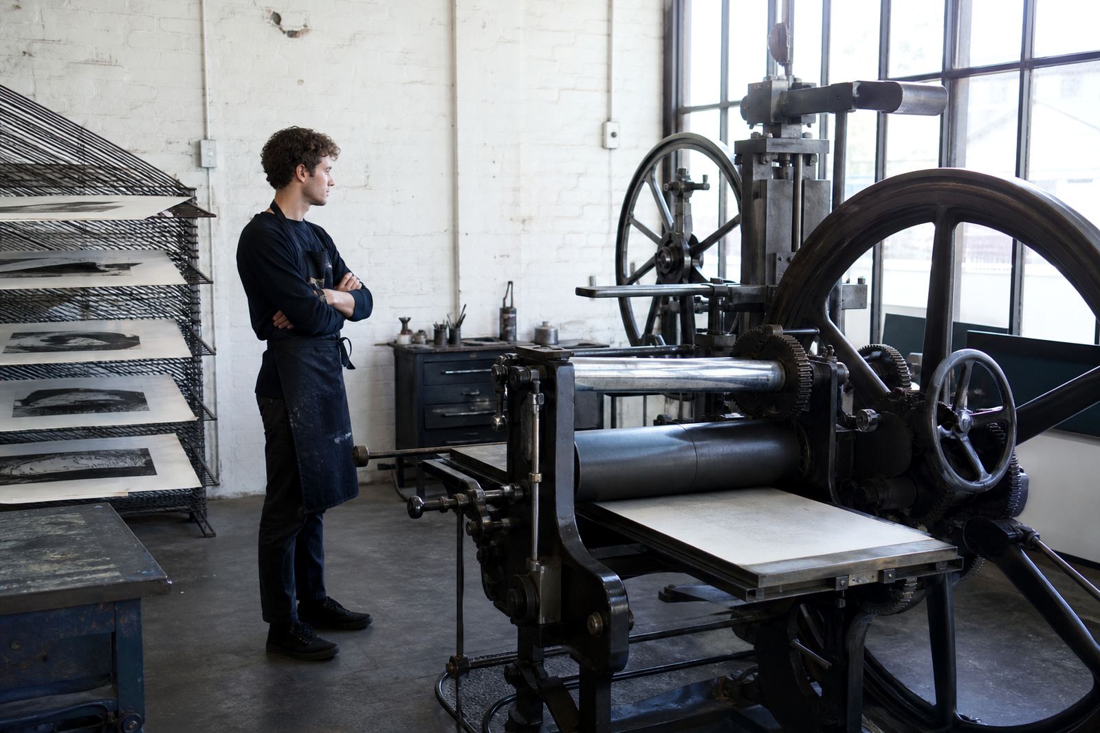
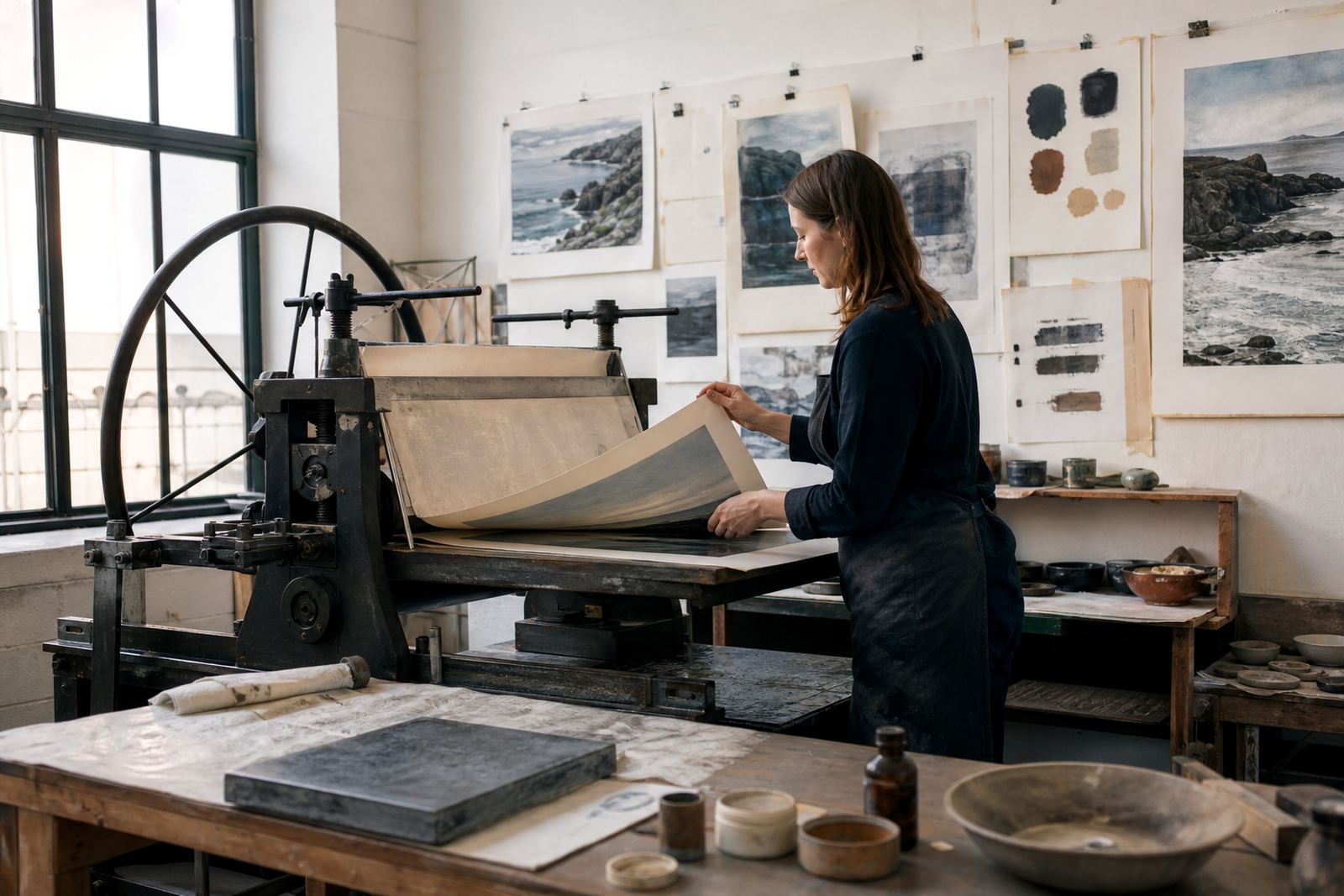
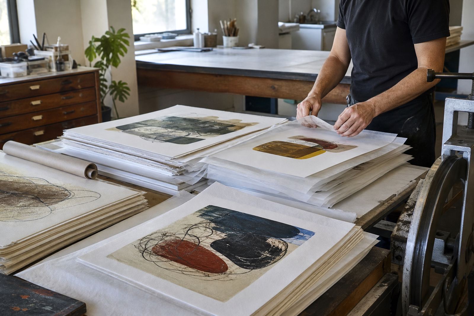
Our studio handled the stone preparation, printing, signing and numbering, then completed archival packing for the finished release. The edition was printed in Woodstock with close attention to the stone surface, ink consistency and paper handling. Shailen Naicker oversaw the project flow, while Nomvula Phalatse led the printery work on press.
Stefan Hattingh managed technical support and press readiness, Rukshana Kamaar coordinated the edition records, Bonga Mngadi assisted with numbering and handling, and Tegan Jacobs handled collector communication. That split of responsibilities kept the release moving in an orderly way, with each sheet checked before it left the studio.
- Stone preparation and press setup
- Editioning, signing and numbering
- Archival packing for collector delivery
- Studio visits for review and sign off
Timeline and delivery across South Africa
Because the edition was intended for delivery to collectors in different towns, we prepared the packing to travel well and to protect the prints from handling, dust and moisture. That included careful interleaving, flat support and protective wrapping.
- Week 1: planning and proofing
- Week 2: final colour work and printing
- Week 3: signing, numbering and packing
- Delivery focus: Cape Town, Stellenbosch, Johannesburg, Pretoria, Durban
Results and what we would repeat for print collectors
The release finished as a compact set of well matched lithographs with clear edition control and clean presentation. The abstract imagery carried through the stone process with enough variation to keep each print lively, while still reading as a unified collector release. The packing also meant the work was ready to be sent out or stored without fuss, which matters for collectors who keep their prints unframed for a time.
If we were to do the project again, we would keep the same process of early proofing, small batch colour checks and archival finishing. That approach suits collector releases because it protects the edition and leaves less room for avoidable handling issues. For future work of this kind, we would also repeat the same careful paper review and packing method, since it held up well in transit and in storage.
- Strong consistency across the limited edition
- Clean presentation for collectors
- Archival packing suited to storage and framing later
- Process to repeat: proof, print, sign, pack
Edition details
| Project | Observatory Collector Release |
|---|---|
| Project type | Small limited edition abstract lithographs |
| Client location | Observatory, Cape Town |
| Studio base | Woodstock, Cape Town |
| Timeline | 3 weeks |
| Deliverables | Printing, signing, numbering, archival packing |