Why paper matters in stone lithography
In stone lithography, the image is drawn on a prepared limestone surface with a greasy medium, then the stone is treated so that ink stays only where the drawing was made. Because the process depends on fine contact between stone, ink, damp paper and press, the paper is not just a support sheet. It is part of the image making itself.
A good lithograph paper should receive the ink cleanly, hold a crisp edge, and cope with repeated passes through the press without tearing or cockling. For artists working on limited editions, that consistency matters from the first proof to the last signed print. For collectors, it affects both the look of the work and how it ages over time.
- The wrong paper can blur detail or flatten colour.
- Paper that is too brittle may crack at the deckle or fold.
- Heavier sheets often suit hand printing better, especially for large stones.
The fibres and surface that suit lithographs best
Most fine-art lithographs are printed on acid-free, archival paper made for printmaking. Cotton fibre papers are widely used because they are strong, absorb moisture well, and handle pressure from the press without losing integrity. Some papers are smooth, while others have a light tooth that can give the print a softer finish.
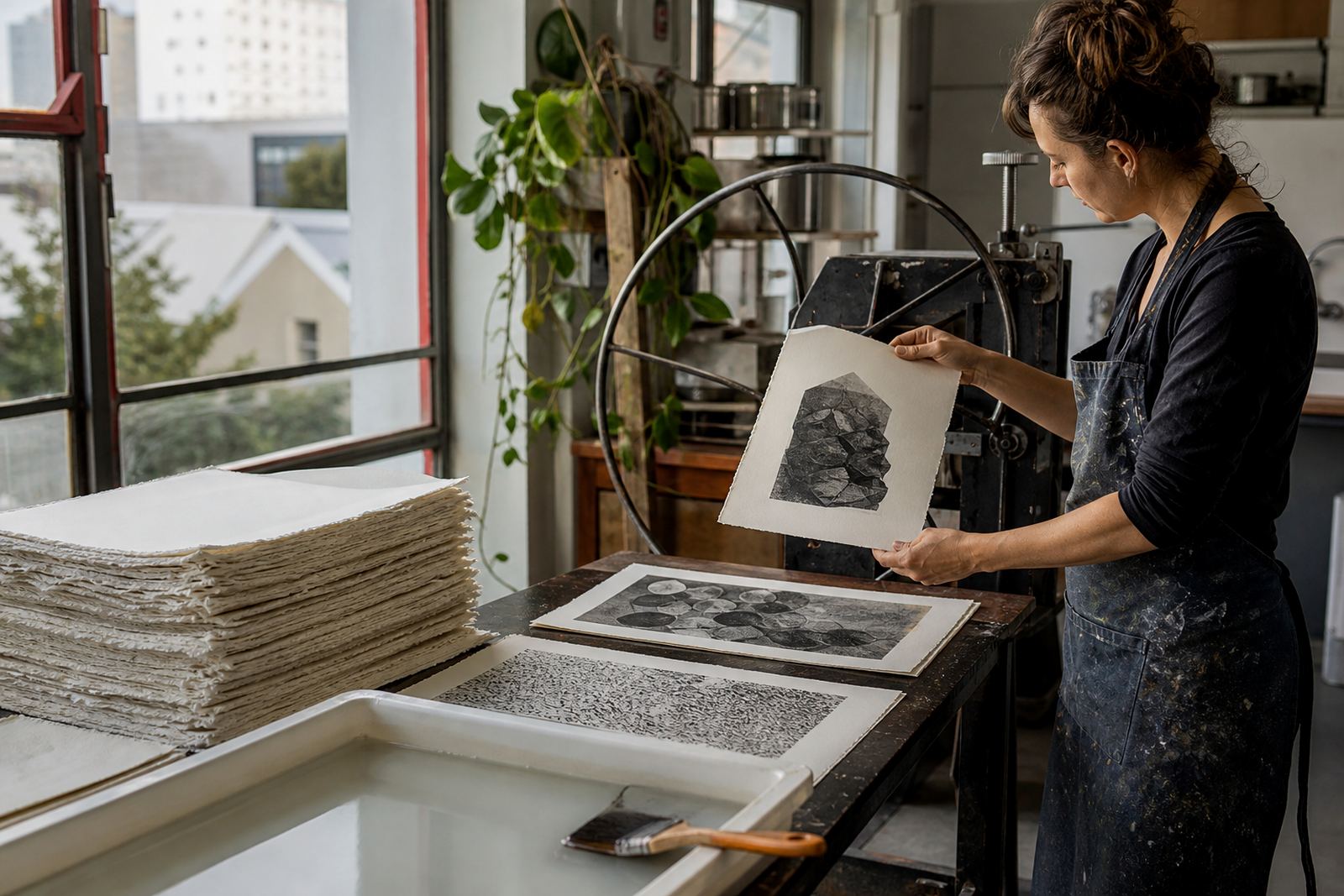
The surface choice changes the final look. A very smooth sheet can show subtle tonal work and fine lines clearly. A more textured surface may give a print a warmer, more handmade character. In our Woodstock studio, paper choice is usually tested during proofing because the same stone can behave differently on two sheets from the same mill if the sizing or finish differs slightly.
- Look for 100 percent cotton or another recognised archival fibre content.
- Check that the paper is acid-free and lignin-free.
- Ask whether the sheet is sized internally, externally, or both.
- Choose a paper weight that suits the image and edition size.
Choosing paper for editions, proofs and final prints
Edition planning starts with paper, not after it. The sheet size has to suit the image area, the margin requirements, and the way the print will be signed and numbered. A collector-friendly edition usually has enough margin for handling and framing, while still keeping the image present and balanced on the page.
Proofs are useful because they show how the ink sits on the paper before the full edition is run. If a colour looks too dense, or if the sheet feels too absorbent, the printer can adjust the dampening, pressure, or ink strength. This saves time and paper, and it keeps the edition consistent. In practice, a small change in paper can mean a visible change in the printed result, so it pays to settle the paper choice before the edition begins.
- Plan for full margins if the print is to be framed with space around the image.
- Allow extra sheet size for proofing and trimming tolerance.
- Keep the edition paper consistent from start to finish.
- Store unused sheets flat, away from dust and humidity.
How Cape Town conditions affect paper
South African collectors often live with quite different conditions from one region to another. In Cape Town and Sea Point, coastal humidity can cause paper to wave slightly if it is stored badly. In Johannesburg and Pretoria, drier air can make sheets more brittle if they are exposed to direct sun or sudden temperature changes. Even in Woodstock, where studio conditions are managed carefully, paper needs stable storage to stay flat and clean.
For artists and collectors, that means paper handling starts long before framing. Keep prints in a dry room, away from kitchen steam, bathroom moisture and strong sunlight. If a print is delivered from the studio, leave it in its protective packing until you are ready to frame or inspect it. That small delay can prevent surface marks and handling wear.
- Do not store prints near windows, heaters or air conditioners.
- Avoid rolling or folding finished lithographs unless the printer advises it.
- If a print arrives with slight waviness, let it settle in a stable room before framing.
What collectors should ask before buying
Collectors do not need to be paper specialists, but a few practical questions can make a big difference. Ask what paper was used, whether the edition was printed on the same sheet throughout, and how the print should be handled for framing. If the work is part of a limited edition, the paper choice should support that edition for years, not only for the day of purchase.
Signed and numbered lithographs should be accompanied by clear edition information, and the paper should be suitable for archival packing and storage. If the paper is thick and absorbent, it may hold the image beautifully but need a deeper frame rebate. If it is lighter, it may suit smaller works or portfolios more comfortably. The right fit is practical as much as aesthetic.
- Ask whether the paper is archival and acid-free.
- Confirm the paper size and image size before framing.
- Check whether the print should be mounted or left float mounted.
- Request guidance on handling if the edition includes delicate margins.
Care, framing and long-term storage
Once a lithograph leaves the press, paper care becomes the collector’s responsibility. The safest approach is gentle handling with clean, dry hands or cotton gloves if the print is already framed or polished. Never wipe a print surface and do not use tapes or adhesives on the artwork itself. If the paper carries deckle edges, those edges should be respected rather than pressed flat into a tight mount.
For framing, use conservation-quality materials, UV-filtering glass or acrylic, and a mount that keeps the paper off any glazing. That matters in Durban as much as in Pretoria, because heat and sunlight can still fade inks and age paper unevenly. For unframed prints, store them flat in archival sleeves or interleaving tissue in a dry cupboard, not in a garage where dust and damp can creep in.
- Frame away from direct sun and coastal moisture.
- Use acid-free mount board and backing.
- Never store prints under heavy objects.
- Inspect stored sheets every few months for foxing, waves, or insect damage.
From the press room: An edition table
When a collector in Stellenbosch compares two lithographs, the difference may not be the image alone but the paper under it. One sheet may have a soft white tone and a smooth surface that suits fine linework, while another has a warmer colour and more texture that brings out the hand-printed character. In a limited edition, that choice is part of the artwork’s identity, not an afterthought.
That is why paper consultation sits alongside stone preparation, proofing and editioning in a professional lithography studio. The goal is simple: choose a sheet that suits the image, holds the edition together, and travels well from the press to the collector’s wall. In a country where prints may move from Woodstock to Johannesburg, or from the studio to a coastal home in Durban, paper has to do real work, not just look good.
For artists and collectors alike, the best paper is the one that lets the lithograph speak clearly and age with dignity.