
Start With One Strong Line Of Sight
Before you choose frames or hammer in a nail, stand in the room and look for the place your eye lands first. In many Cape Town homes that might be the wall opposite the entrance, a stair landing, or the long wall in a living room that gets the best natural light. Grouping works best when the prints are seen as a whole from a normal standing distance, not only up close.
Stone lithographs carry fine tonal shifts and layered marks, so they benefit from calm around them. If the wall is already busy with shelves, mirrors or patterned upholstery, keep the grouping tighter and simpler. A clean line of sight helps the prints do the work without fighting the room.
Choose A Layout That Matches The Room's Shape
The shape of the wall should guide the arrangement. Long horizontal spaces suit a row or a loose band of works, while a narrow wall often looks better with a vertical stack or a small column of related prints. If you are hanging above a couch, keep the group centred and leave enough space above the furniture so it does not feel crowded.
- For a wide wall: use three to five prints in a horizontal grouping.
- For a narrow passage: try a vertical line with even spacing.
- For a corner or stairwell: stagger the heights so the eye moves naturally upward.
- For a collection that grows over time: start with one anchor print and add around it.
A simple paper template on the floor can help you test the arrangement before making holes in the wall. This is especially useful in rentals where you may need to avoid overdoing the patching later.
Let Editions Speak To Each Other
Editioned lithographs work well in groups because they already share a visual language. You do not need every print to match exactly, but there should be some link between them, whether it is palette, paper tone, scale, or subject matter. A colour-heavy print can sit beside a softer monochrome work if the framing and spacing keep the pair balanced.
Think about how the prints converse. Two works with strong red accents may feel too heavy together unless a lighter piece breaks the rhythm. A group of drawings, proofs and finished editions can also work if the overall mood is consistent. Collectors often find that one or two recurring colours across different lithographs make the arrangement feel intentional rather than random.
- Link works with one shared colour, even if the rest of the palette differs.
- Mix large and smaller prints only if the spacing stays consistent.
- Repeat the same frame finish for a cleaner read across the wall.
- Keep highly detailed works away from very busy decorative walls.
Frame For Tone, Not Just Protection
Framing can either unite a grouping or pull it apart. If the prints are from the same edition family, similar frames and mounts will usually help them sit together. Where the works vary in size, a consistent frame finish can still tie them into one group, even if the mounts need slight adjustments. Neutral timber, black, and white frames are often the easiest starting point for a collection that may grow over time.
When you are hanging in coastal areas like Sea Point or Durban, keep an eye on moisture and choose materials that hold up well in humid conditions. A good framer can advise on glazing, mounts and backing that protect the paper from dust and damp. In older homes with uneven plaster, it is worth checking that each frame sits level, otherwise the whole group can look a bit off even if the spacing is fine.
Balance Colour So The Wall Feels Calm
Colour grouping is less about matching everything and more about managing the energy of the wall. A set of strong, saturated lithographs can look powerful in a dining room or entrance hall, but in a smaller flat it may feel too dense. To soften the arrangement, place lighter prints at the edges or break the sequence with a work that has more open paper space.
Collectors in Johannesburg or Pretoria often hang prints in rooms with larger windows and stronger indoor lighting, which means colour reads more sharply through the day. In those spaces, it helps to step back and view the grouping in morning light and again at night. A print that feels balanced in the afternoon can look much heavier under warm lamps after dark.
If the room already has a strong colour on the walls, let the prints echo it in small ways instead of competing with it. Sometimes one muted work is enough to settle the whole grouping.
Protect The Paper While You Enjoy It
Lithographs are made on paper, so care matters even after the work is framed. Avoid hanging in direct sunlight, near open windows that bring in dust, or above heaters and fireplaces where heat can dry the paper unevenly.
- Dust frames with a dry soft cloth, not a wet one.
- Do not spray cleaner near the glazing.
- Keep hanging hardware checked so the group stays level.
- Use archival packing if you need to store a print between seasons.
If you rotate works during the year, handle them with clean dry hands or cotton gloves. That small habit goes a long way, especially for collectors who move pieces between a city home and a holiday place near the coast.
A Woodstock Example That Works In Real Life
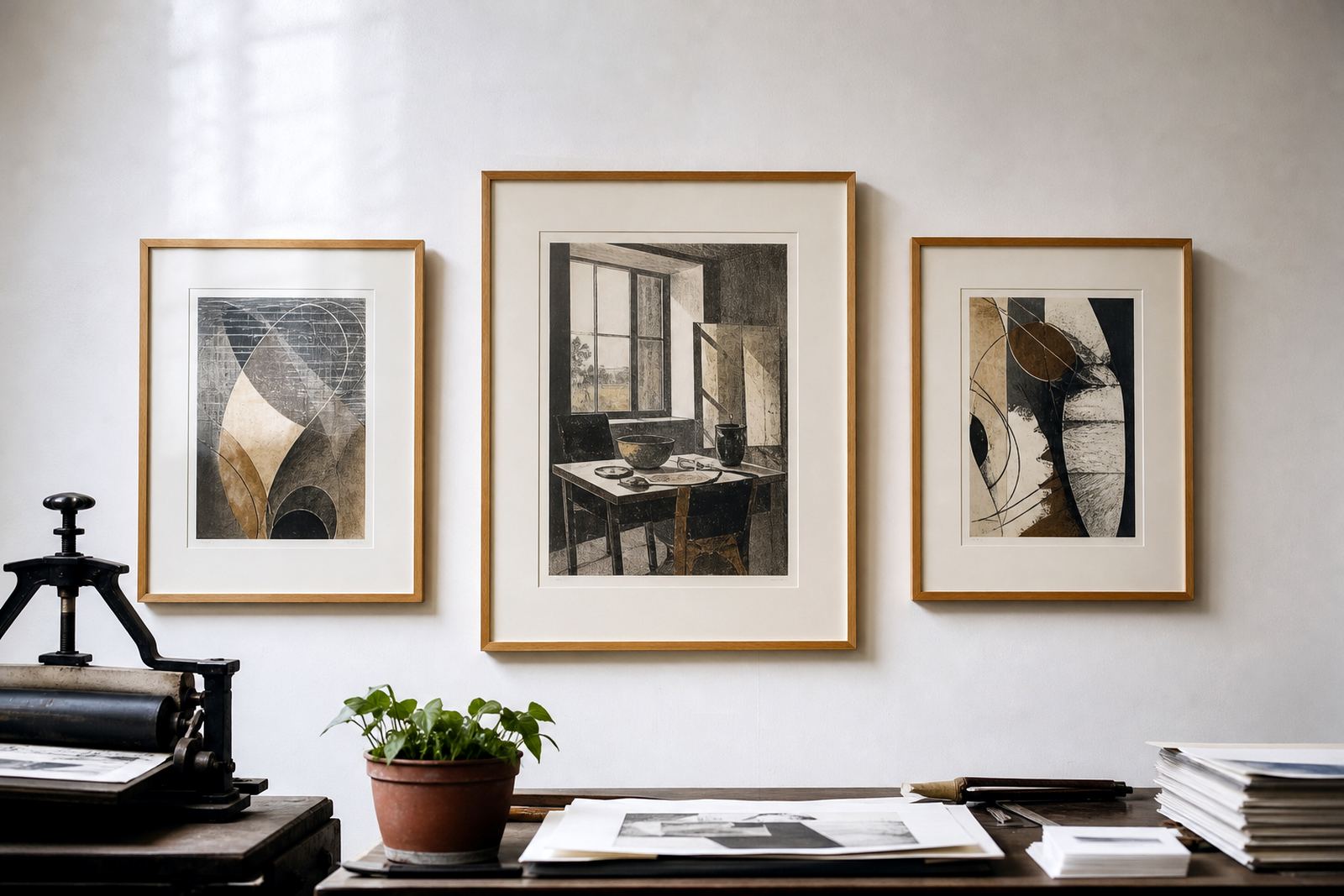
In a Woodstock apartment with a narrow lounge wall, a practical grouping might include one larger lithograph in the centre and two smaller works placed beside it at matching height. The frames can share the same finish, while the paper tones vary slightly to keep the wall from looking flat. This type of arrangement suits a space where the sofa sits close to the wall and the walkway is tight, because the eye can still travel across the group without the room feeling cluttered.
That is the real strength of grouping at home: it lets a collector build a conversation between prints rather than treating each one as a separate object. With good spacing, careful framing and a little restraint, a wall of lithographs can feel collected over time instead of assembled in a hurry.