What the Woodstock brief asked for
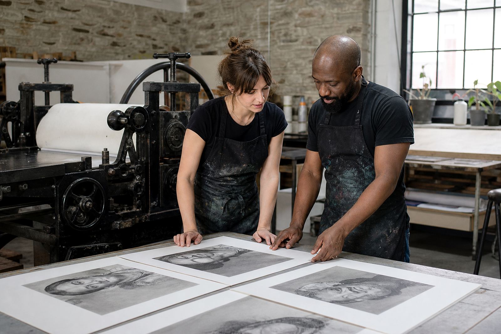
The client was a small independent artist group based in Woodstock, Cape Town, with collectors already lined up in Cape Town, Stellenbosch, Johannesburg, Pretoria and Durban. Their brief was clear: produce a limited edition portrait series with strong tonal depth, soft transitions in the face and hands, and enough consistency for the edition to hold together as a body of work. They wanted the hand of the artist visible, but not the noise that can come from an unplanned print run.
The work needed to stay true to stone lithography, which means drawing or image-making on a prepared limestone surface, then processing the stone so oil and water repel each other in the right places. It is a method that rewards patience. Every mark matters, and in portrait work that counts even more because changes in tone show up straight away. The artist wanted a refined finish, with paper that could carry the fine detail without losing the warmer grey values that make a portrait feel alive.
- Project type: neighbourhood collaboration
- Edition style: short-run limited edition
- Subject matter: tonal portrait lithographs
- Delivery areas: Woodstock, Cape Town and major South African centres
Stone lithography process and edition planning
We started with edition planning, then moved into stone preparation and proofing. For a portrait edition, planning matters as much as the print itself. We mapped the image into tonal zones, discussed the intended edition size, and agreed on where the first proofs should sit in relation to the final state. This kept the print run disciplined and avoided drift between one sheet and the next.
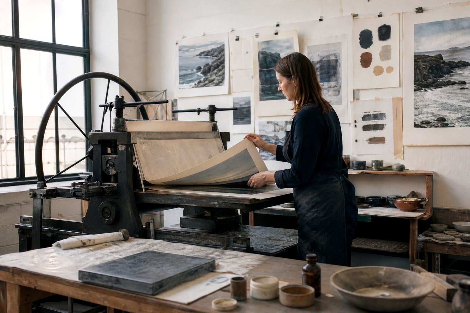
The stones were grained and prepared for image transfer, then worked through a series of test proofs to find the right balance of line, wash and tonal body. In lithography, small shifts in ink loading, dampening or pressure can alter the result, so the proofing sessions were used to settle the image before the edition began in earnest. We also checked paper behaviour, because some sheets take moisture differently and can affect edge clarity. That is one of those things that only shows itself once the press is running.
- Stone graining and image preparation
- Proofing sessions to settle tonal balance
- Paper consultation before editioning
- Controlled inking and press registration
Constraints that shaped the job
The main constraint was time. The artists needed the edition ready within a few weeks, while still allowing space for proof review and one final adjustment stage. Another constraint was the tonal range itself. Portrait lithography can lose detail quickly if the image is pushed too hard, so we had to hold the mid-tones and keep the shadows open enough to preserve facial structure. That meant resisting the urge to overwork the stone, which is often the quickest way to flatten a print.
We also had to plan around practical studio conditions. For this project, we kept the workflow compact and used a clear print sequence so there was no bottleneck when the final edition sheets came off the press. A missed step in editioning can cost a whole morning, so the order had to be right from the start.
- Timeline: 4 weeks from first proof to final packing
- Main risk: tonal loss in portrait shadows
- Workflow: proof, approve, print, sign, pack
What we supplied in the studio
Our part of the job covered the full editioning chain from stone prep to archival packing. Shailen Naicker oversaw the project, with Nomvula Phalatse leading the press work and Stefan Hattingh handling technical setup and stone care. Rukshana Kamaar coordinated the edition records, Bonga Mngadi assisted with signing and numbering, and Tegan Jacobs managed client communication and collection timing. That mix matters on a project like this because fine-art printing is never just one task, it is a sequence that has to stay aligned.
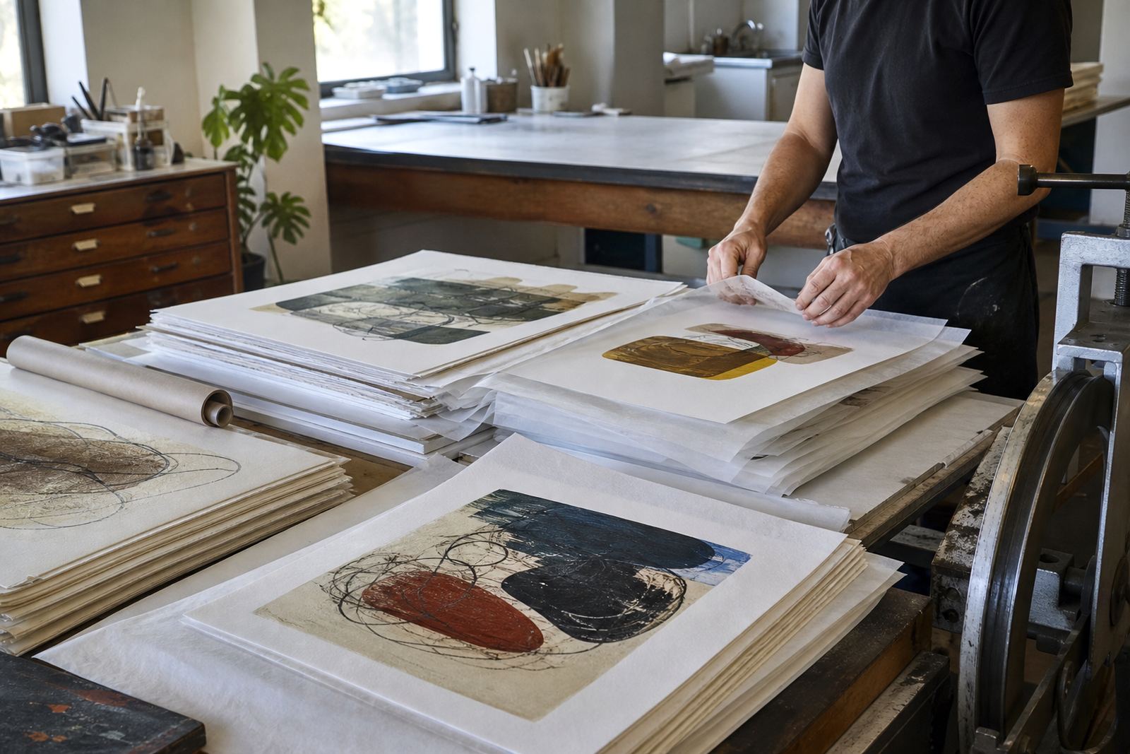
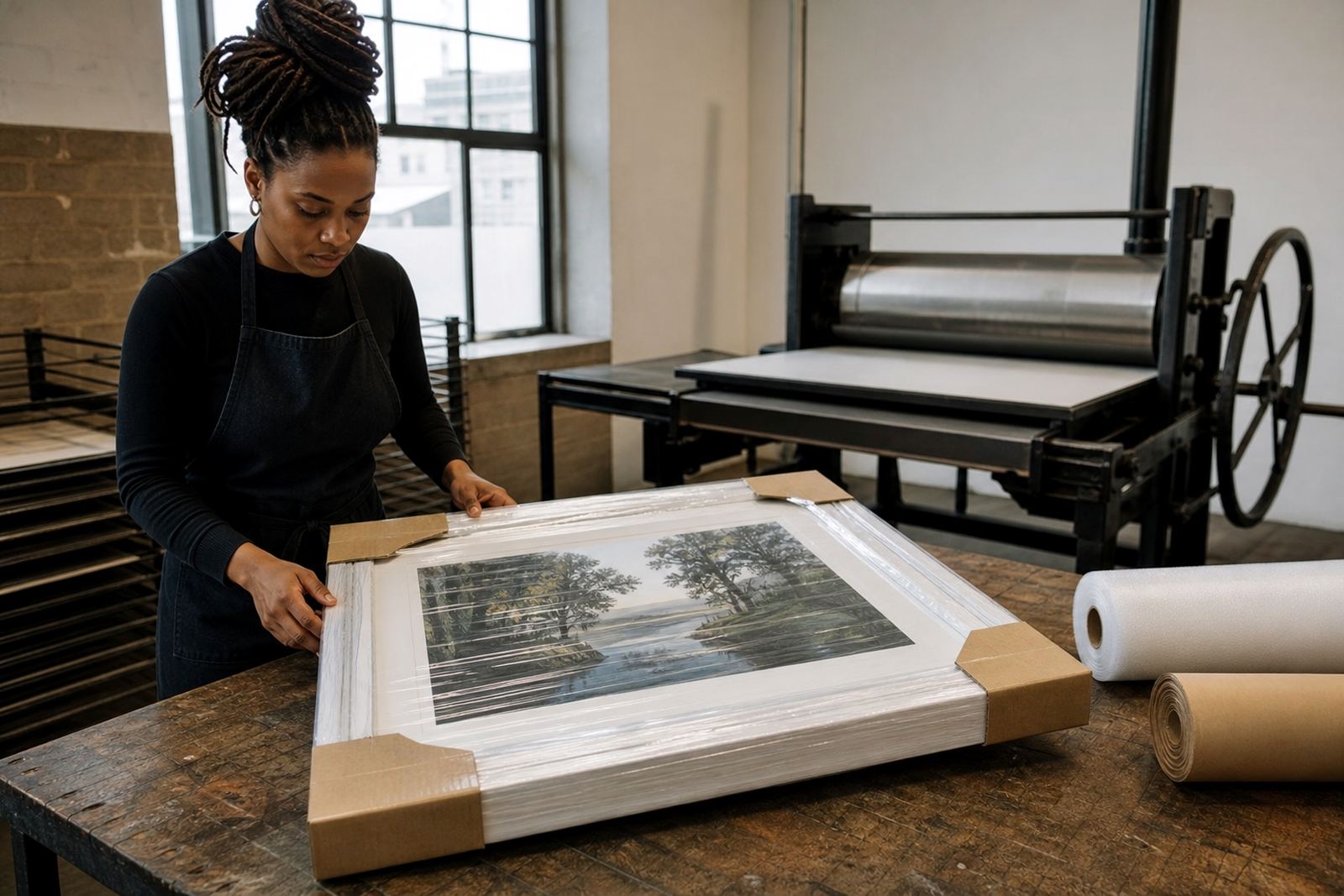
We supplied the artist with proofing sessions, colour separation guidance for the tonal layers, paper consultation and editioning support. Once the final state was agreed, each sheet was printed, inspected, signed and numbered, then packed for safe movement to collectors and galleries. We also arranged framing coordination for those who wanted the work ready for wall hanging without extra handling. The aim was not only to print the work, but to make the edition manageable after it left the studio.
- Editioning and signing support
- Archival packing for transport and storage
- Framing coordination for collectors
- Collector advice on care and handling
Results for artists and collectors
The finished edition delivered the tonal depth the artists wanted, with a calm portrait surface and enough variation in the greys to keep the images from feeling flat. The edition remained tight from first sheet to last, which is the real test in a short-run litho project. For collectors, that consistency matters because each print reads as part of the same thought, not as a separate experiment. The work went out to collectors in Cape Town, Stellenbosch, Johannesburg, Pretoria and Durban, with the edition kept intact through careful packing and handling.
For the artists, the biggest result was control. They could work within the language of stone lithography and still get a contemporary portrait finish, without losing the handmade character that makes the process worthwhile. For us, it confirmed that modest edition sizes and well-paced proofing are often the right fit for portrait-led work. Too much scale can dull the image, while a focused run keeps the energy in place.
- Consistent tonal range across the edition
- Strong hand-printed character retained
- Safe delivery to multiple South African cities
- Edition integrity protected from proof to final sheet
What we would repeat on the next edition
If we were doing this project again, we would follow the same structure: early edition planning, more than one proofing session, and a clear sign-off point before the full run begins. That approach gives the artist room to refine the image without risking delays later on. We would also keep the paper tests close to the start, because paper choice can quietly change the feel of the whole edition.
For a neighbourhood collaboration in Woodstock, the best outcome came from keeping the process practical and tightly managed. Stone lithography works best when everyone knows the order of the job, from the first drawing marks to the last signed sheet. The result here was a short-run portrait edition that stayed faithful to the stone, held together as a body of work, and reached collectors in the right condition. That is the standard we aim to keep, whether the edition is going to Sea Point, Newlands or farther afield.
- Start with paper and edition size decisions early
- Allow space for proof review before final printing
- Keep packing and collection plans in step with the print run
- Use a clear sign-off process for each state
Edition details
| Project | Woodstock Artist Edition |
|---|---|
| Location | Woodstock, Cape Town |
| Project type | Stone lithography limited edition |
| Timeline | 4 weeks |
| Edition focus | Tonal portrait lithographs |
| Services used | Stone Lithography Printing, Edition Planning, Proofing Sessions, Editioning, Signing And Numbering, Archival Packing |