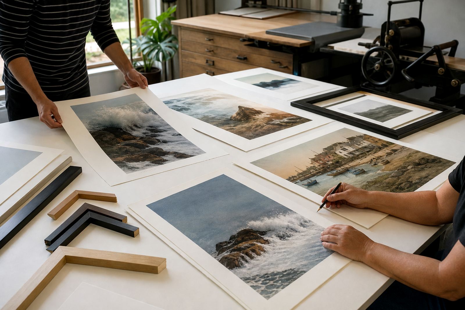
A coastal brief for guest-facing spaces
The client was a hospitality business in Sea Point looking for a series that would feel quiet, local and easy to live with in public areas. They wanted artwork that could sit in reception, corridors and guest rooms without overpowering the interiors, while still giving each space a clear sense of place. The brief called for coastal references, a restrained palette and a set of prints that would work as a group across different wall sizes.
Because hospitality interiors get constant traffic, the set had to be practical as well as beautiful. Frames would need to be consistent, paper stable and the editions repeatable if extra rooms were fitted out later. We also had to keep the look controlled enough that the series could move between natural light, warm artificial light and the softer conditions common in Sea Point near the coast.
- Project type: limited-edition stone lithograph series for hospitality interiors
- Location: Sea Point, Cape Town
- Visual direction: calm coastal themes with restrained colour
- Use: reception, guest rooms and passage walls
How stone lithography shaped the final images
Stone lithography begins with drawing directly on a prepared limestone surface using greasy materials. The image is then processed so the stone holds ink in the drawn areas and repels it everywhere else. Each colour is printed as a separate pass, which means the artist and printer can build depth through careful registration, proofing and timing rather than relying on one quick transfer.
For this set, the process suited the subject matter because it allowed fine tonal shifts and a soft edge that felt close to sea air and weathered light. Stone work also has a very tactile character, so even quiet compositions keep a handmade quality. In a hospitality setting that matters because the prints feel considered rather than decorative in a generic sense.
We worked through the colour plan by hand, adjusting densities between proofs until the balance felt right. One of the strengths of stone lithography is that small changes in pressure, wiping and ink loading can alter the mood of a print, so the edition had to be watched closely from sheet to sheet.
Edition planning and proofing without guesswork
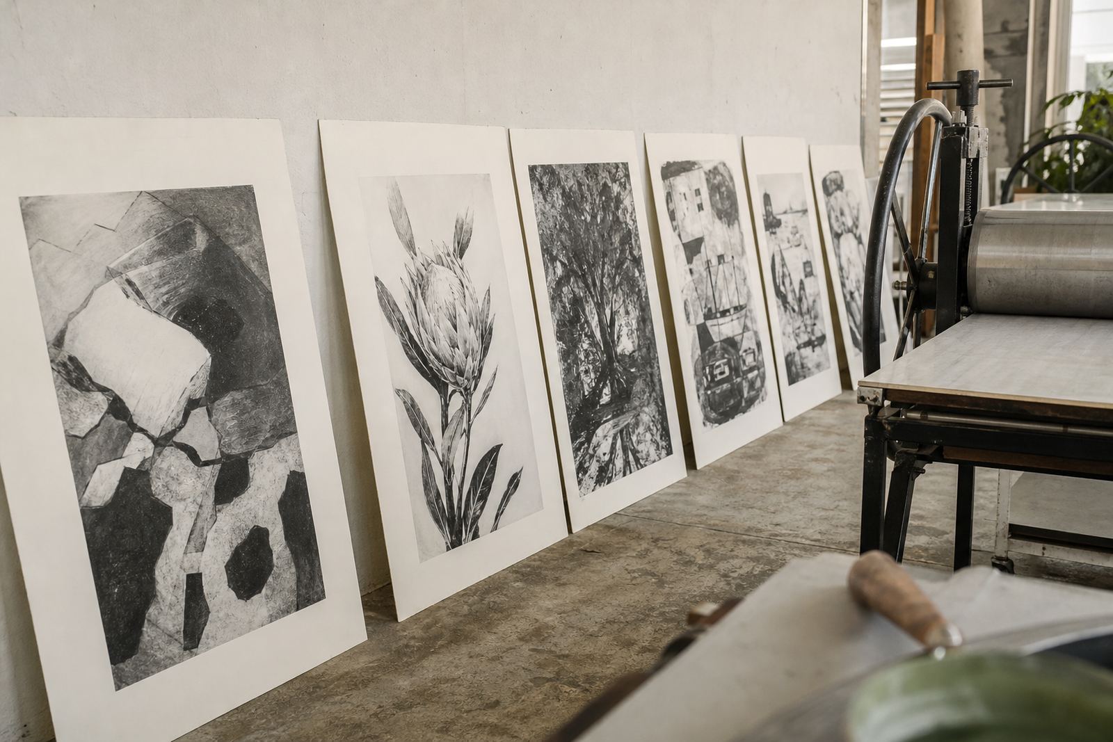
The edition was planned as a limited run with a clear numbering structure, plus an agreed proofing stage before final printing. That helped the client make decisions early on about scale, framing margins and where each image would live in the building. It also kept the work efficient, which is important when a hospitality client needs a predictable handover date.
Proofing sessions were used to compare colour, tone and registration under different light. In a coastal property, daylight can shift a lot during the day, and that can make pale blues, greys and warm neutrals read differently from morning to evening. We adjusted the series so it stayed calm without going flat, and so each print still had enough contrast to read well from a distance.
- Edition structure agreed before final printing
- Proofs checked for colour, registration and paper response
- Margins planned for framing coordination
- Final sheets signed and numbered in studio
What we supplied for the Sea Point set
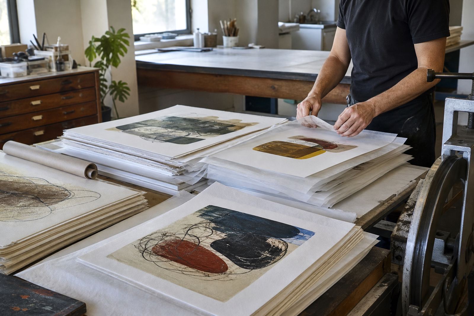
Our role covered the whole studio side of the project, from stone preparation through to archival packing. We worked on edition planning with the client, then moved into proofing, colour separation where needed, printing, signing and numbering.
The paper choice was important. In coastal areas humidity can affect how paper behaves if it is not stored and handled properly, so we selected a stock that could take the ink cleanly and remain stable through packing and framing. We also prepared the finished works for safe transport, with protection that would suit a building site or a live property where deliveries are being managed around guests and contractors.
- Stone preparation and edition printing
- Paper consultation for coastal conditions
- Signing, numbering and archival packing
- Framing coordination and collector advice
Timeline from first proof to final delivery
The full project ran over six weeks, which gave enough time for image development, proof review and the final edition. The first week was spent confirming the brief and preparing the stones. The middle weeks were used for printing and checking the colour sequence. The final stage covered numbering, packing and handover arrangements for the hospitality team.
That timeline worked well because it gave room for small adjustments without letting the project drag on. In a commercial setting, especially one tied to refurbishment schedules, there is value in keeping the process measured and clear. The client knew when proofs would be ready, when final sheets would be signed and when the framed work could be fitted in sequence.
Results for the property and what we would repeat
The finished set gave the property a consistent visual language across several spaces. The prints introduced a coastal tone without leaning on obvious resort imagery, which helped the rooms feel calmer and more local. The limited edition format also gave the client a stronger sense of ownership, since the work was made as a defined series rather than a general interior accessory.
If we were to repeat this kind of project, we would keep the same order of work: confirm placement early, proof under multiple light conditions, and plan the framing before the final edition is printed. That approach saves time and avoids last minute changes. It also lets us protect the detail in the stone work, which is what gives the set its quiet character.
- Consistent look across guest areas and reception spaces
- Calm colour balance that suited coastal interiors
- Editioned prints that can be re-ordered if the property expands
- Practical packing and framing notes for onsite teams
Edition details
| Project | Sea Point Hospitality Set |
|---|---|
| Client type | Hospitality business in Sea Point, Cape Town |
| Medium | Stone lithography |
| Edition | Limited edition, signed and numbered |
| Timeline | 6 weeks |
| Studio base | Woodstock, Cape Town |