What a tusche wash print is
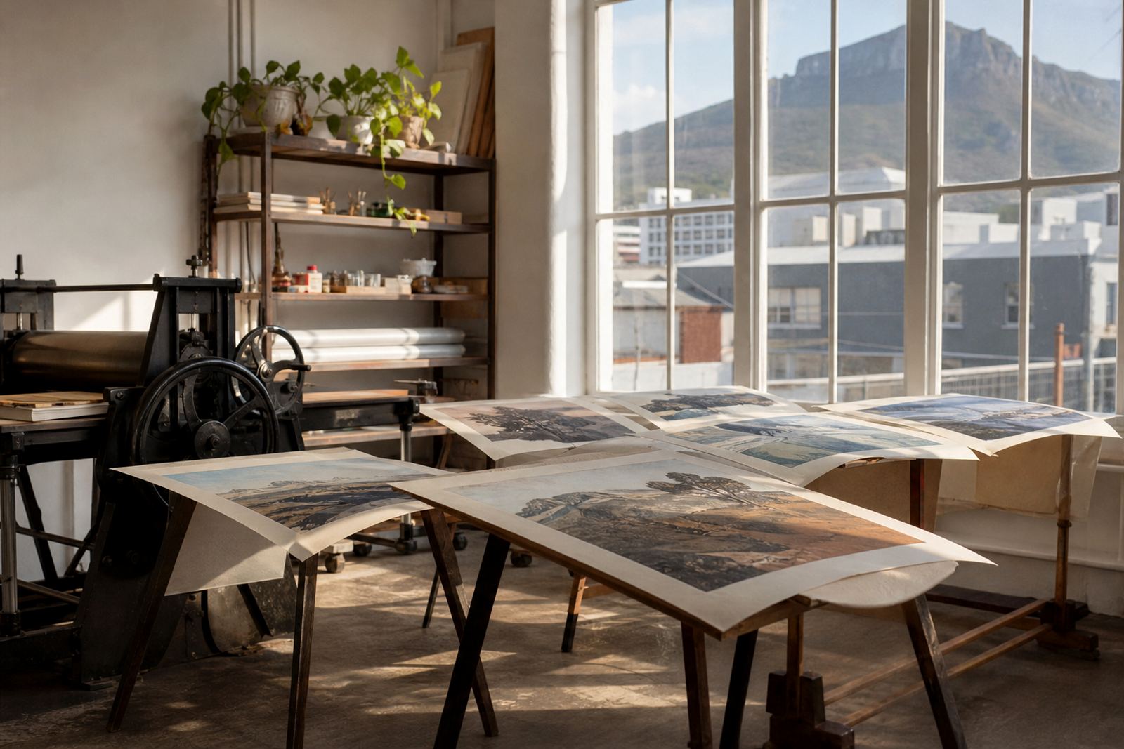
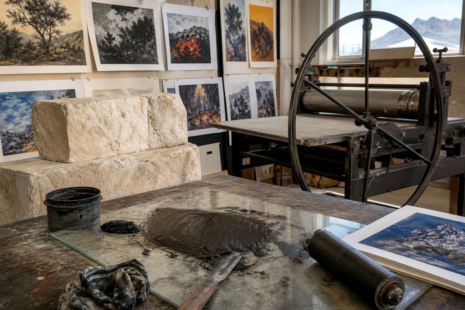
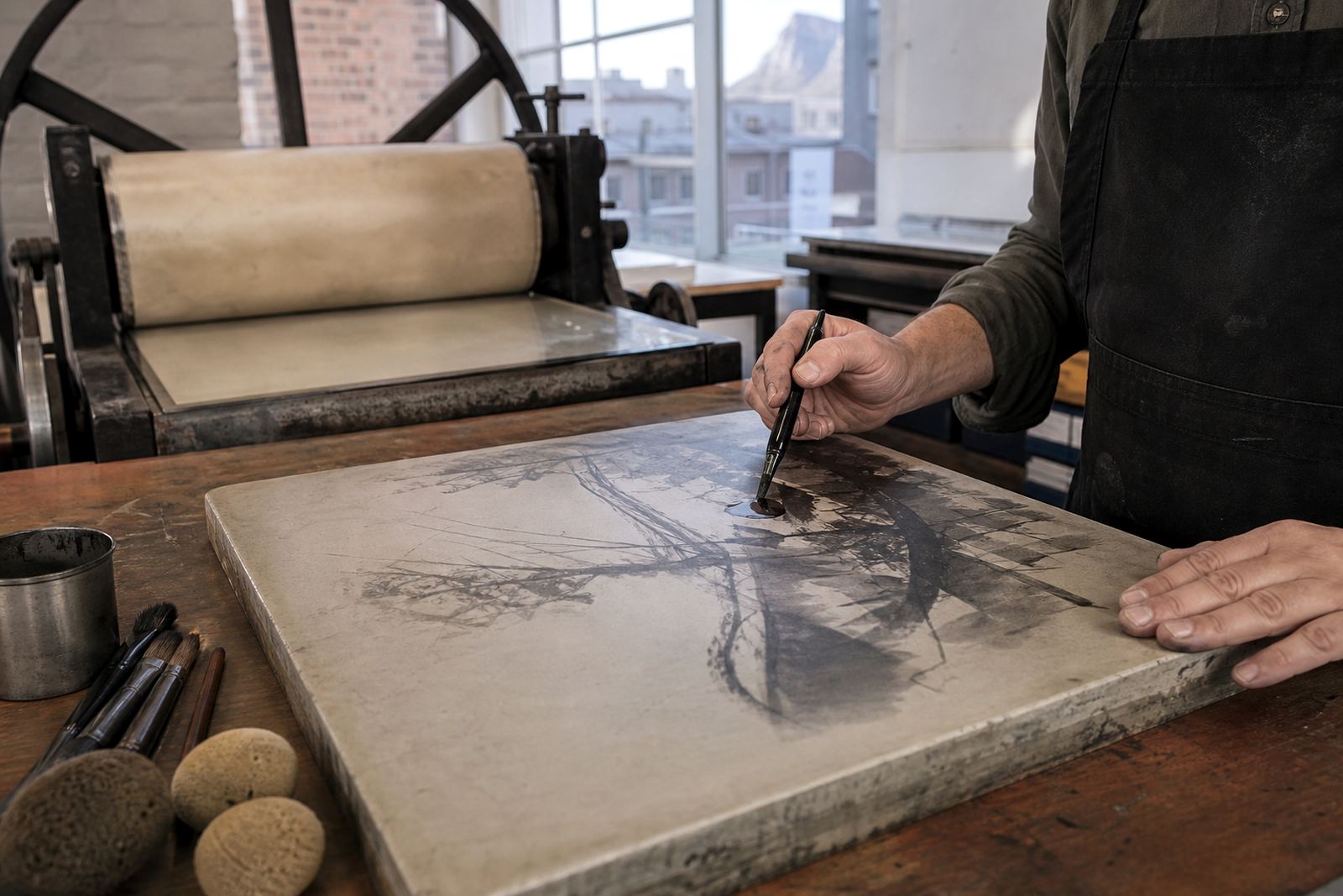
A tusche wash print is a stone lithograph made with a greasy drawing medium thinned into washes, then worked on stone so the image can hold soft edges, tonal shifts and brush-like movement. The result is a print with the feel of painting, but with the repeatability and discipline of an editioned fine-art print.
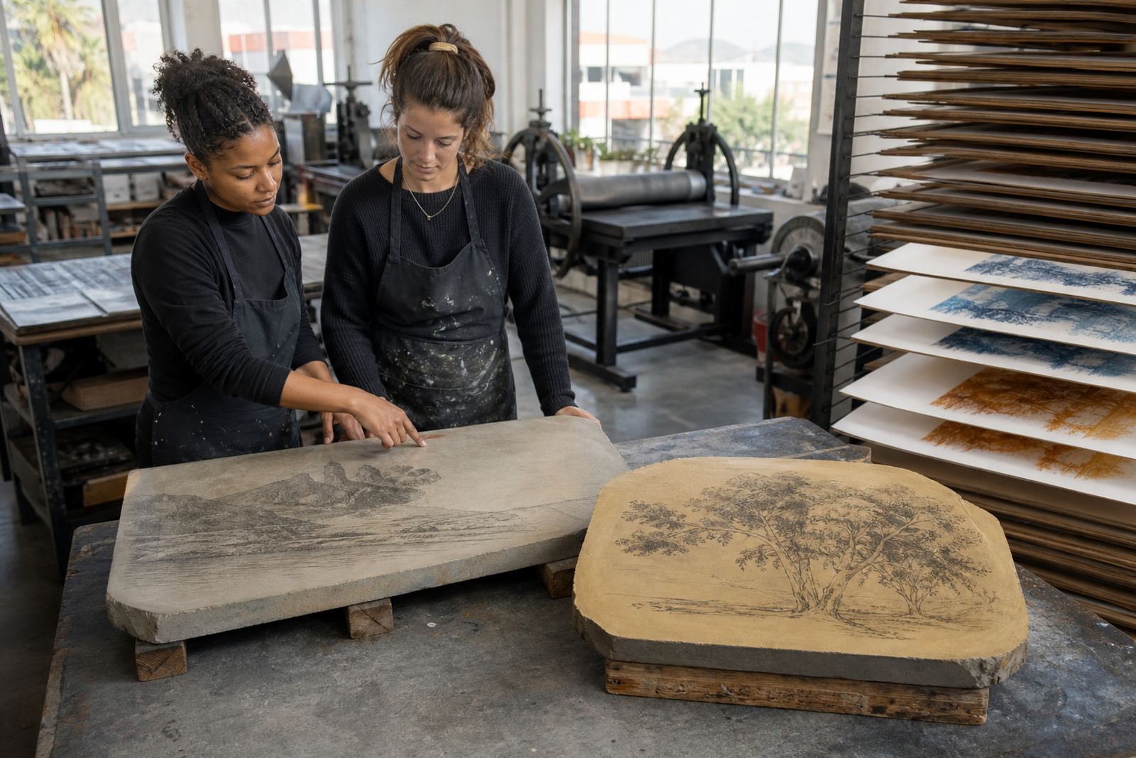
Because the image is drawn and processed directly on limestone, each mark responds differently to water, gum and ink. That is what gives tusche work its quiet grain, velvet darks and subtle transitions. It suits artists who want atmosphere, not only line. It also works well where the final image needs painterly presence without losing the honesty of a hand-made print.
Edition format, sheet sizes and paper choices
We plan tusche wash editions around the image, the stone and the paper handling needed for clean, even printing. Common edition formats include small collector runs, workshop proofs and larger artist editions where the image can carry consistent tone across the whole set. Final sizing depends on the drawing scale, the number of colours and whether the image is a single stone or built through several stones.
Paper choice makes a big difference to wash prints. Softer archival papers can hold broad tone beautifully, while smoother papers can keep delicate gradations crisp. We discuss finish, thickness and deckle edge options before the edition starts so the paper suits the image and the intended framing.
- Single-colour tusche wash prints for tonal depth and strong contrast
- Multi-stone editions for layered colour and more complex atmosphere
- Proof sets for artists needing comparison before the final run
- Large sheets for collectors who prefer generous margins and framing space
Where tusche wash prints suit best
Tusche wash lithographs suit homes, studios and curated interiors where the work can be viewed up close. They are especially effective in living rooms, entry walls, studies, gallery-style passages and corporate collections that need visual depth without loud colour. In Cape Town, many collectors choose them for airy modern interiors in Sea Point, Newlands and Woodstock, while clients in Stellenbosch often favour the warm paper tone and painterly surface in more traditional spaces.
Because these prints depend on subtle tonal shifts, they need good natural or controlled lighting. Avoid placing them in direct afternoon sun, especially on west-facing walls in Durban or near bright windows in homes along the coast. Humidity should also be managed, particularly in sea air areas, so the print stays flat and the sheet does not cockle over time.
- Best for tonal interiors and quiet, contemplative spaces
- Works well with linen, timber and neutral wall colours
- Ideal for collectors who want texture and hand-made variation
Looking after the sheet
These prints should be framed with archival materials, including acid-free mount board and UV-filtering glazing where possible. For larger sheets, a proper backing board and even support are important so the paper does not ripple. If the work is being sent to Johannesburg, Pretoria or Durban, allow for careful packaging and a short settling period before framing if the sheet has travelled through temperature changes.
The studio printing process uses hand-operated press equipment and careful drying time, not utilities in the way machinery in a factory would. If a room is cooled heavily by aircon, keep the work away from vents so the paper does not dry unevenly.
- Frame with archival mount and backing materials
- Keep the print clear of direct sun, steam and damp walls
- Use secure fittings for larger sheets and heavier frames
Care after purchase and long-term upkeep
Stone lithographs are durable when handled correctly, but they still need basic care. Keep the print in a stable indoor environment, ideally away from kitchen moisture, bathrooms and windows that get strong sun. When dusting the frame, use a dry cloth only and avoid spraying cleaners near the glazing. If the print is not framed straight away, store it flat in its protective wrapping under a clean board, not rolled in a tube for long periods.
If a collector later needs reframing, we recommend working with a framer familiar with fine-art paper. Over time, framing materials can be checked and replaced if they are showing discolouration or if the work has moved during transport. For editions with hand signing and numbering, keep the certificate or edition record with the print so provenance stays clear.
- Store flat and dry if not framed immediately
- Keep away from direct sun, moisture and heat sources
- Ask for archival materials when framing or reframing
What to check before ordering a tusche wash edition
Before placing an order, check the edition size, the paper dimensions, the image area and whether the work is part of a standard edition or a proof sequence. It also helps to confirm if the margins are intended to be wide, trimmed closely or kept with deckle edge showing. For collectors, that detail affects both the look of the work and the framing budget. For artists, it affects how the image sits on the sheet and how much handling is required during editioning.
Ask how the print was made, how many stones were used, whether any hand colour was added and whether the sheet has been signed and numbered. If you are ordering for a project in Cape Town, Stellenbosch, Johannesburg, Pretoria or Durban, check delivery timing and whether the print should be sent flat or collected from the studio in Woodstock. A little planning upfront avoids damage and saves time later on.
- Confirm edition size and whether you are buying a proof or final edition
- Check sheet size, image size and margin treatment
- Ask about signing, numbering and any hand-finished colour
- Confirm packing method for local or national delivery
Tusche wash for tonal stone work
Tusche wash gives artists a way to move between drawing and painting without losing the character of lithography. The stone holds fine tonal detail, but it also lets the hand remain visible in the wash marks and lifted areas. That balance is useful for editions where mood matters as much as structure. In the studio, we work closely with the artist through proofing, colour separation where needed, and final editioning so the print keeps its intended voice from first proof to last sheet.
Clients who collect these prints often appreciate the quiet variation inside the edition. No two sheets are identical in feel, even when the edition is tightly controlled, and that hand-made character is part of the appeal. It is printmaking with restraint, pressure and timing, not just reproduction.
Edition details
| Process | Stone lithography with tusche wash drawing and hand press printing |
|---|---|
| Edition type | Limited edition, proof sets available by arrangement |
| Paper | Archival printmaking paper selected for tone, absorbency and handling |
| Typical format | Small to large sheets, depending on the image and stone size |
| Display conditions | Indoor display, away from direct sun, damp and heat vents |
| Care | Framed with archival materials, stored flat if unframed |