What architectural stone lithography gives a building
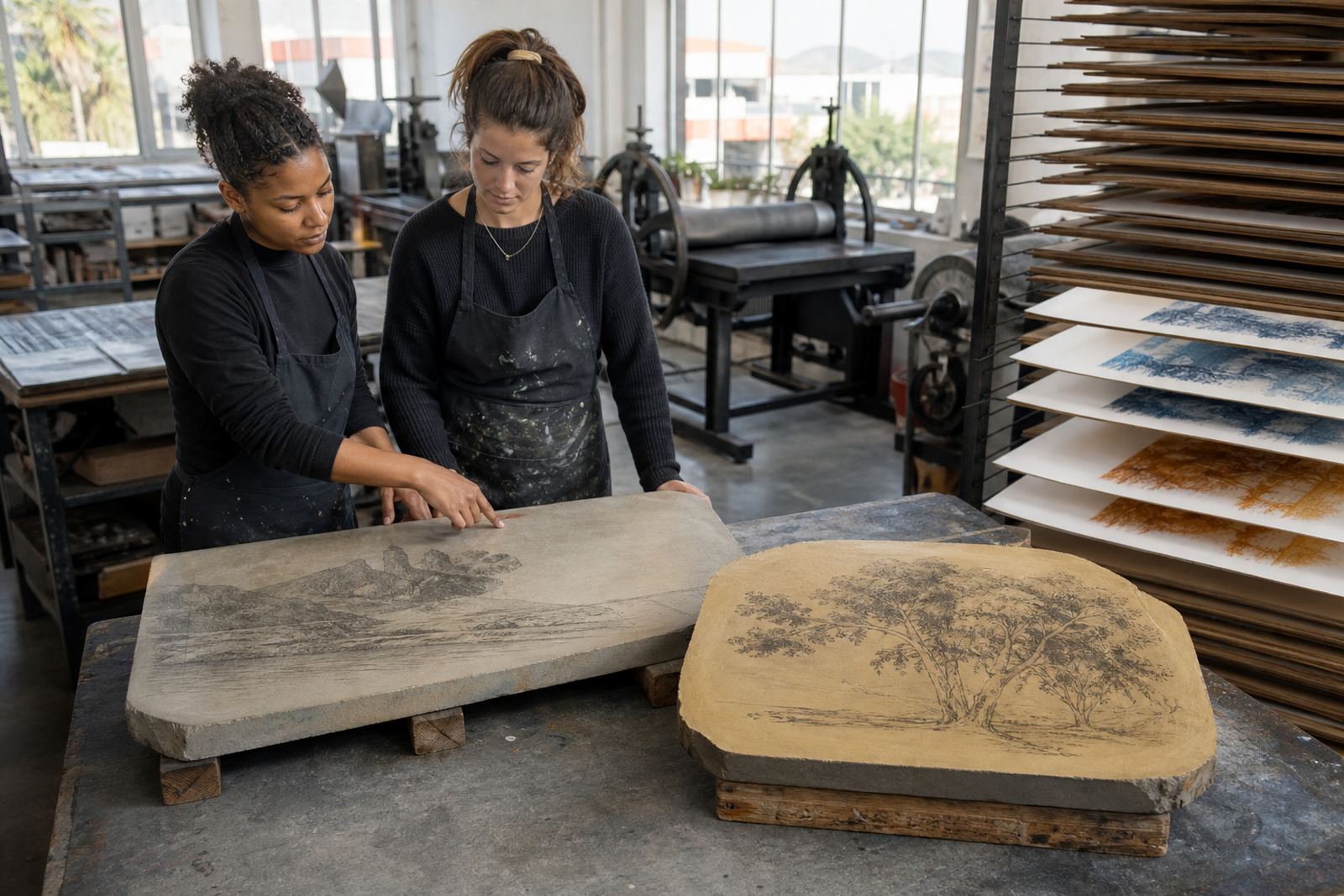
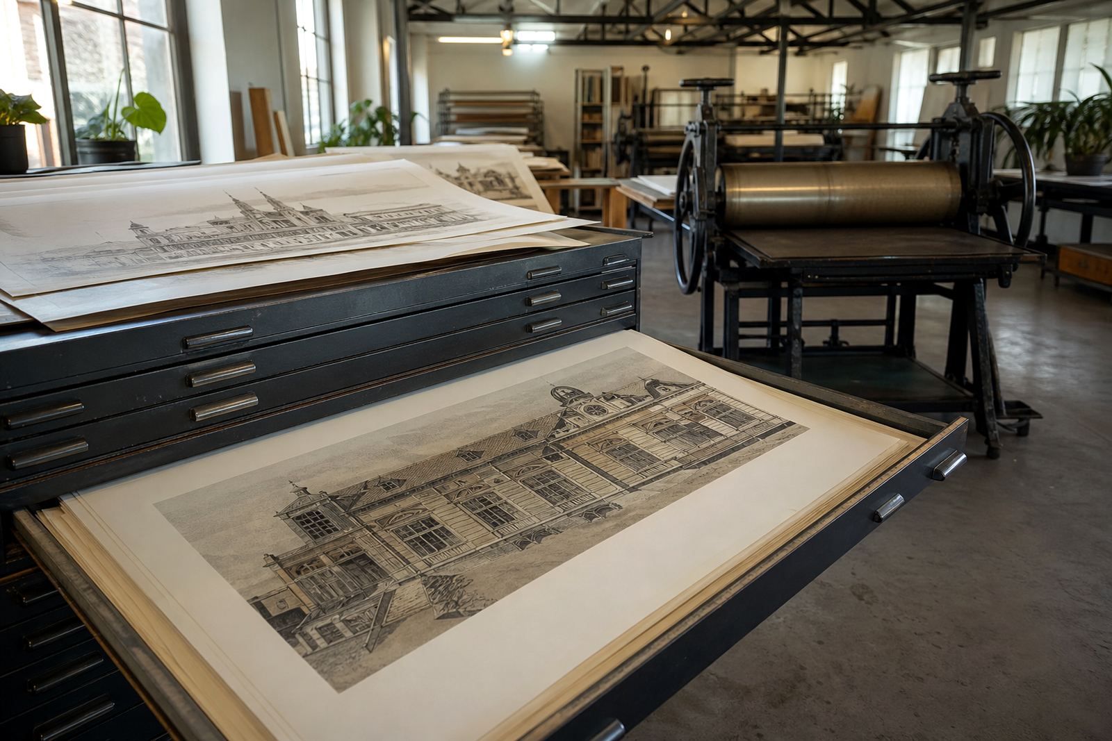
Prepared limestone sits at the centre of stone lithography as a direct printing process. The artist draws on the stone with greasy materials, the image is chemically fixed, then each colour or tonal layer is printed one at a time. For architectural subjects, that method suits the subject matter well because it holds crisp linework, measured perspective and the quiet detail found in windows, cornices, rooflines and shadow. It is a process that rewards accuracy, and also leaves space for atmosphere, which is why city scenes and building studies sit so naturally in it.
These prints are often chosen for elevations, streetscapes, civic buildings, warehouse fronts and private homes with strong geometric form. The finished work can feel precise without becoming cold, and textured without losing clarity. That balance matters when the subject is a familiar Cape Town street or a building with local history, because the print needs to read clearly from a distance and still offer detail up close.
Edition planning, proofs and colour control
We work with artists to plan the edition before the first print is pulled. That includes deciding the edition size, the number of artist proofs if any, and whether the image will be printed in one colour, several colours, or built up through layered tones. Proofing sessions help check line weight, register, paper response and how the image sits on the sheet. For architecture this step is important, because small shifts in line or ink density can change the way a façade reads.
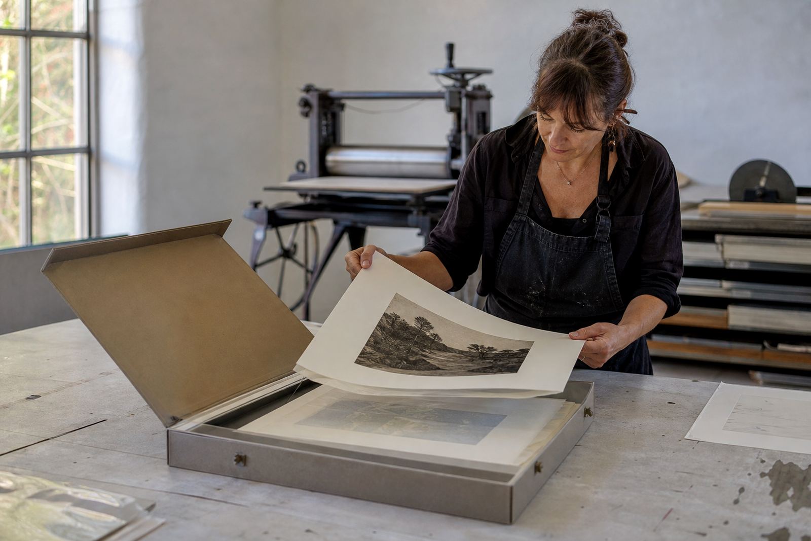
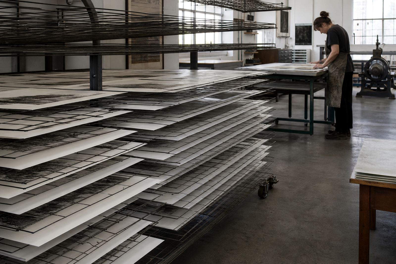
At our Woodstock studio, editioning is handled with care from first proof to final signature. Each print is numbered, signed and checked for consistency before archival packing. If a building study relies on exact alignment or subtle colour separation, we keep the process tight and measured. A missing half millimetre in register can throw off the whole structure, so we do not rush that stage.
- Limited editions for collectors and galleries
- Single colour line work or layered colour editions
- Artist proofs available where agreed at planning stage
- Numbering and signing completed after approval
Sizes, paper choices and framing options
Architectural lithographs are available in a range of sheet sizes, from intimate formats suited to study walls to larger presentation sheets for entrance halls, boardrooms and double-volume interiors. The right size depends on the detail in the image and the space where it will hang. Smaller works suit narrow passages and group hangs, while larger sheets give facades and streets enough breathing room. We also guide artists and collectors on how much blank margin to leave around the image, because that can change the overall feeling quite a bit.
Paper choice matters too. A good cotton rag paper supports even ink transfer and handles the pressure of the press well. For architectural subjects, we often recommend papers with a clean white or natural tone so line and shadow stay clear. If a collector plans to frame the work under glass, the paper should also handle archival mounting without cockling or yellowing. Framing coordination can be arranged so the final presentation suits the image and the room, whether that is a townhouse in Sea Point, a studio in Newlands or an office in Johannesburg.
- Small, medium and large sheet formats available by edition plan
- Portrait and landscape orientations to suit the subject
- Cotton rag papers for stable printing and archival handling
- Framing can be planned for plain mounts or float presentation
Where architectural lithographs work best
These prints suit rooms where line, order and form matter. They work well in living rooms, study walls, reception areas, stair landings and private collections. In commercial spaces they can help anchor a room with local identity, especially when the subject is a recognisable building or a streetscape with a strong urban rhythm. They are also a practical choice for interior schemes that need artwork without heavy colour, since the stone lithograph surface can carry a lot of character with very little fuss.
Collectors often choose architectural lithographs because they sit comfortably in both contemporary and traditional settings. A good print can hold its own above a console, along a passage, or as part of a larger grouping of works. In South African homes, where light changes through the day and summer humidity can be hard on paper, framed archival prints are a sound choice. If the room gets strong coastal sun, position the work away from direct rays to protect the image and paper.
- Homes, offices, galleries and hospitality interiors
- Suitable for coastal and inland environments when framed properly
- Strong fit for monochrome schemes and restrained colour palettes
- Works well as a single feature piece or in a grouped hang
Hanging the print at home
Once framed, architectural lithographs hang like any fine-art print, using proper wall fixings suited to the wall type and the frame weight. In plasterboard, brick or concrete walls, the hanging method should be selected carefully so the frame sits level and secure. For larger sheets, use two hanging points where possible to keep the work steady. Avoid placing framed prints directly above heaters, under aircon drip lines, or in areas that get regular cooking steam.
In Cape Town winters or Durban humidity, moisture can affect the paper if it is left unprotected. We recommend archival packing right up until the frame is ready, and gloves or clean hands when handling unframed sheets. If a client is organising a group of prints for a new space, we can advise on spacing, sightlines and how much wall width to allow so the work breathes. A rushed hang can make even a fine print feel cramped, so it is worth planning properly.
Care and what to check before ordering
Print care starts with light control. Keep the work out of direct sun and away from damp walls. Dust the frame gently with a soft cloth, and if the sheet is unframed store it flat in archival tissue and a sturdy folder. If the print is framed behind glass, do not spray cleaning liquid near the frame edge. For collectors who move often, or who live with coastal humidity, periodic checking of the mount and backing board is sensible. That sort of basic upkeep keeps a print looking right for years.
Before placing an order, check the following so the edition is right for the space and the project. It saves time later and avoids rework, which is never ideal when an artist is preparing a limited edition.
- Final sheet size and image area
- Edition size, artist proofs and signing plan
- Paper type and whether the sheet is white, warm white or natural tone
- Framing intention, including mount colour and glass choice
- Deadline for proofing and final print run
- Delivery address, especially for Cape Town, Stellenbosch, Pretoria, Johannesburg or Durban
Clients in Woodstock, Sea Point, Newlands and across South Africa can reach us through the enquiry form on our contact page. Lithography Art works with artists and collectors and our studio team handles stone lithography, editioning, packing and collector advice with care from first proof to final delivery.
Edition details
| Process | Stone lithography on prepared limestone with hand-drawn image, proofing and edition printing |
|---|---|
| Edition format | Limited editions, signed and numbered, with artist proofs where agreed |
| Typical sizes | Small, medium and large sheet formats planned to suit the image and hanging space |
| Paper | Archival cotton rag paper selected for colour hold, surface strength and framing |
| Finish options | Unframed sheets or framed presentation coordinated for the final setting |
| Care | Display away from direct sun, moisture and heat, with archival packing for storage or transport |